10 Useful Kerning Tips That Can Help Improve Your Typography


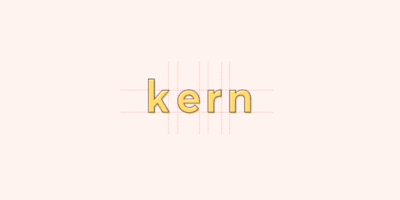
What Is Kerning?
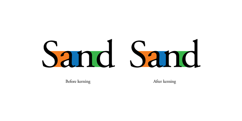
In the simplest of terms, kerning in typography is the adjustment process of a space between two letters in terms of their shape. It’s also applied automatically in most cases. However, you may consider changing the settings of kerning when you’re adding a tagline on websites or designing logos to ensure they’ll accommodate your requirements.
It’s not uncommon for designers to neglect kerning when their grueling deadline is near. The majority of your clientele may not be aware of kerning, but they’ll notice that something is not right in your design. The key to a professional-looking design is to do kerning properly. And as a professional designer, it’s vital to spend a few minutes of your time kerning your typography.
Here are ten useful kerning tips that can help you.
Get to know the typefaces you’ll use.
Your choice of font can make or break your design. Different font types have various styles and widths, meaning their fit will be different even if you give them the same amount of space. Employing your default letters and then substituting them with the actual fonts afterward will not help you figure out kerning. What you’re doing is graphic suicide. So when you kern, make sure to use the actual typefaces you’ll use in your design.
Additionally, you’re more likely to use different fonts for your headline, subheading, and body text. If that’s the case, it’s crucial to note that every font you’ll use will have different kerning also.

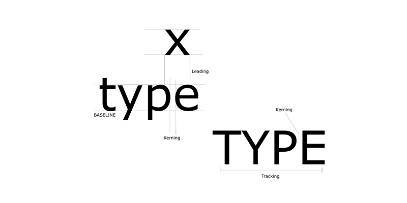
Before moving to kern, take care of leading and tracking first.
You may be wondering what’s tracking and leading have to do with kerning. In the design world, every element needs to fit together to create a whole.
Similar to kerning, tracking also deals with spacing. But instead of individual letters, it’s between groups of letters. On the other hand, leading refers to your font’s vertical spacing between lines.
It is essential to adjust your tracking and leading first. Doing it after kerning can affect the balance in the adjustments you’ve previously made to your kerning.
Kern your letters yourself, not your software.
Software such as Photoshop, Illustrator, and InDesign comes with settings for automatic kerning. However, our eyes are much better at judging something than the mind of computers. Also, in terms of logotypes and headlines, kerning the letters manually instead of relying on what your font software provides as the default spacing is a must do.
Each typography you’ll use will have varying spatial relations to its letters, so you need to adjust the kerning individually for each font. It’ll be extra work, but with practice, you’ll get the hang of it.
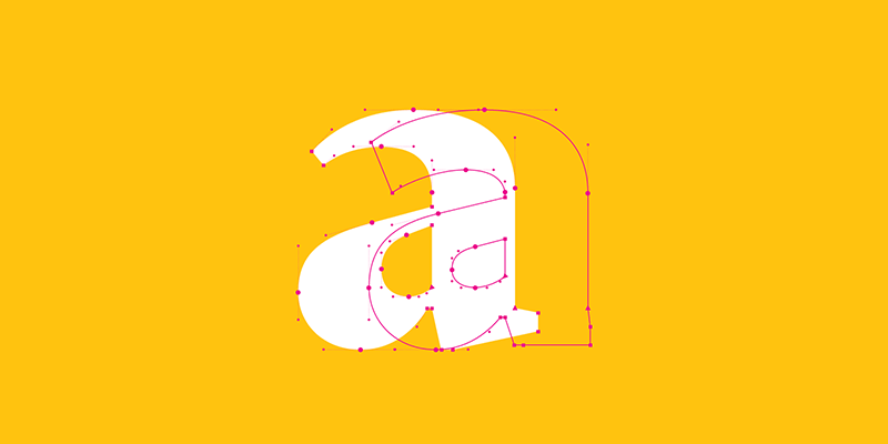
Understand the spatial relationships among letters.
Every letter is a blend of round, straight, and diagonal edges. Knowing their basic relationships is a good place for you to start. One of the things you can do to measure the right kerning of letters is to look at the space within two letters as one unit.
Think of the space between a round and straight letter as somewhat less than one unit. On the other hand, think of the space between two round letters as even less than that.
A, V, Y, and other letters with diagonal sides are the most difficult to kern since they create a more open negative space. You need to pay extra attention to these. However, you shouldn’t use them as your guide to the entire spacing of a word.
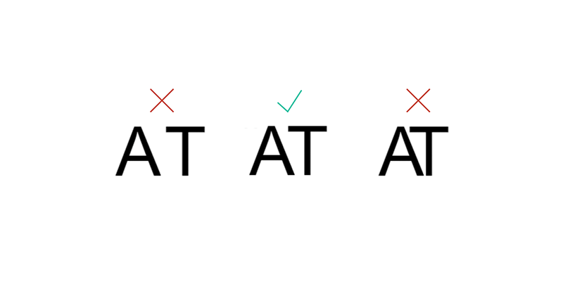
Think about visual space and not actual space.
If you have an extreme case of OCD, you may take a bit of a tumble on this one. You may see yourself having a hard time contemplating between perceiving that visually everything seems perfect, and recognizing that the distance between your letters are not the same.
In this battle, no doubt, visual space takes the victory. Your readers will not look at your designs while holding a ruler in their hands to measure if all your spacings are equal. What matters to them is that it’s highly readable.
Grouping your kerning in threes.
Often, it’s easy not to notice some little details that are not correctly in place when looking at groups of words as a whole, especially if you have longer words.
Kerning your letters in groups of three is a great way to ensure your eyes are not deceiving you. For example, when kerning the word B3Multimedia, kern “B3M” first, and then move to “3Mu,” then to “Mul,” and so on. Applying this technique means you’re dropping off some of the letters that may be distracting you. Thus, it lets you look at every small detail.
Do not forget about your word spacing.
Some designers tend to neglect the words because they’re focusing too much in kerning letters. Never forget the spacing of your words just because of the importance of letter spacing. Both aspects matter in the overall outcome of your design.
If your words have wide spaces between them while your letters are tightly kerned, then your entire line or sentence will not only look awkward but challenging to read as well. So make sure to mind your word spacing when kerning your letters. You need to be consistent with everything.

Remember that less is always more.
The differences in kerning are not that obvious in smaller font sizes. However, they tend to become more apparent in logotypes and headlines. That’s why if you want to make every aspect of your design perfect, avoid overdoing things and getting carried away with your typefaces.
Keep in mind that your letters will be tighter the more you kern. As a result, your very tight letters will be difficult to read and unattractive as well. So, if you think that visually, everything looks fine, then stop obsessing about it and leave your design as it is.
Kern your characters upside down.
Flipping your words upside down can help you see them as an equally-spaced group of shapes minus the distraction of the meaning of the words. You can also do it in other ways such as mirroring your type sideways. The point here is to see them from different perspectives and angles. You’re not limited to just upside down.

Create several versions of your designs, two at the very least.
When it’s time to present your final design, make sure you have several versions in place. It’s ideal to have at least two versions, a smaller and larger version to provide your client with different perspectives of what the graphic would look like in various sizes.
So where does kerning fit here? Well, if there’s a need to adjust your design down the road, the process will potentially affect your text. You also need to loosen up its kerning a bit if you need to reproduce a smaller version to make the words legible.

Practice
Before these techniques become second nature to you, you’ll need to practice them a lot. Keep in mind that kerning is about being consistent and understanding the spatial relationships between letters. Also, if you want your typography to have more unity and rhythm, you have to be more consistent with your spacing.
Aileen Cuaresma
Aileen is a Technical and Creative writer with an extensive knowledge of WordPress and Shopify. She works with companies on building their brand and optimizing their website. She also runs a local travel agency with her family. On her free time, she loves reading books, exploring the unknown, playing with her two adorable dogs, and listening to K-pop.
Use coupon code SLIDER15 at checkout!


0 Comments