10 Wellness, Beauty, and Fitness Websites Built with Divi
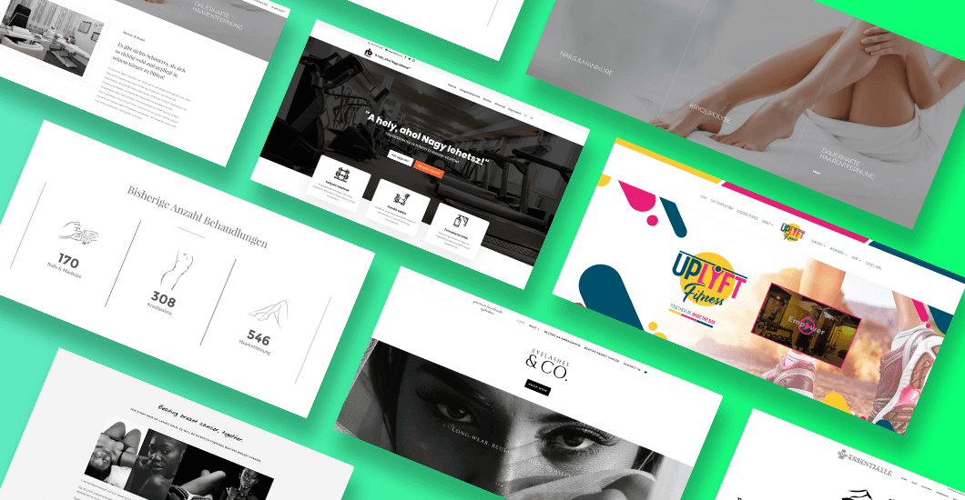

Health and fitness is a booming industry on the Web today. It’s everywhere, and you can’t deny it’s popularity. All wellness, beauty, and fitness businesses, from major companies to specialist trainers, need a website with a beautiful, well-thought-out design. Some of the most attractive fitness sites out there are built with the help of Divi.
Using the Divi theme can help you achieve these qualities. And with that in mind, here’s a list of the 10 best health, beauty, and fitness websites made with Divi. You will be able to find inspiration for your next project, from page design and which colors work well to the choice of images and fonts, and a whole lot more.
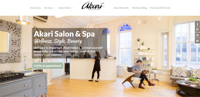
Akari Salon & Spa
Akari Salon & Spa is a wellness, style, and beauty company. They help you pamper and rejuvenate yourself, as well as restore and realign your balance. They offer all the services you need to relax and feel beautiful such as massage, nail, hair, face and skin care. They even offer bridal packages and signature day spa.
Their website uses neutral tones as its color scheme combined with a brick textured background. It gives you a sense of relaxation right away. You’ll see a brief history of the company on the home page with a CTA for booking a treatment or appointment. It’s a good move on their part since clients will not have a hard time looking for a way to contact them.
Aside from the pull-down menu at the top of the page, each of their services is also highlighted using provocative images. It is followed by client testimonials, another appointment booking CTA, and a slideshow of their team.
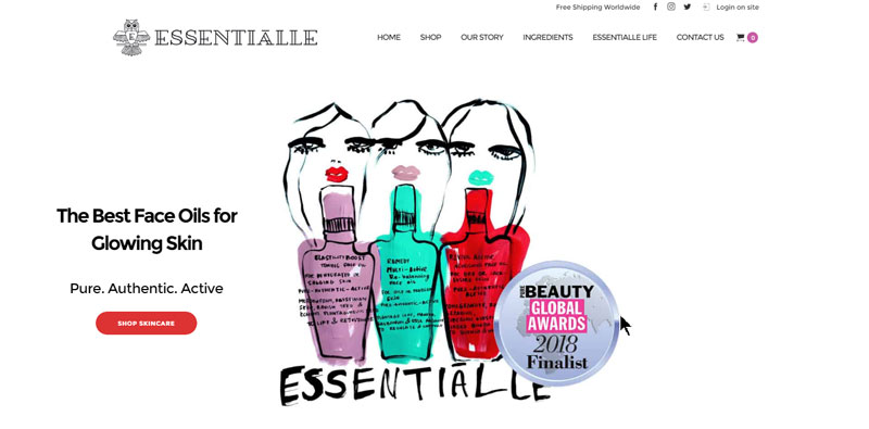
Essentialle
Essentialle is a beauty brand which offers face oils to make your skin glow. The products are made from botanical plants and aimed for the evolving, modern women who seek great results from as little rituals as possible.
Just like with the Essentialle women, their site is modern and interesting. It’s black and white theme adds a touch of edginess to it as well. The styling makes great use of the color scheme branding as well.
Right away you’ll find a CTA linking to their online shop and essential features of their products. The font combination on the site is simple and easy to read even against the photo background.
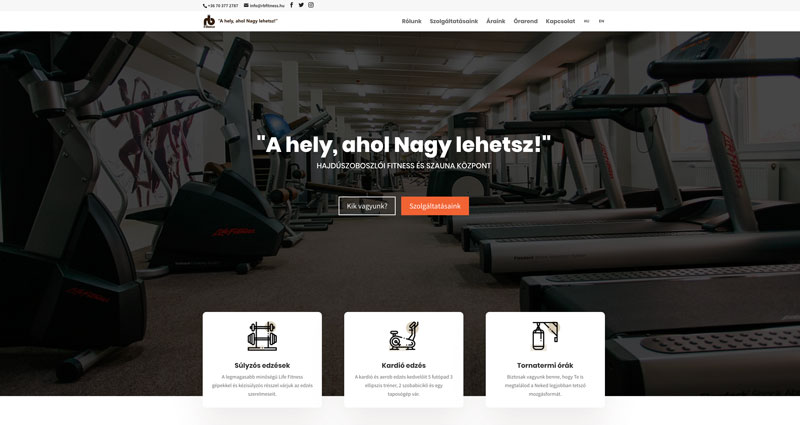
RB Fitness
RB Fitness is a fitness center based in Hungary. They offer services and group lessons such as weight training, cardio improvement, gym workouts, and functional and interval circuit training.
The site includes a homepage with several sections including a hero image, contact details, location map, special offers, and a list of their services and partners. They also have photos of their coaches and trainers with a link on their bio. Each profile contains everything you need to know about their team, such as the training they can provide you with. There are also photos of them in action, as well as contact information.
The entire website is very informative but not overwhelming. You’ll only find essential details about their services and courses. Everything is straightforward and you will be able to find what you need in a single click.
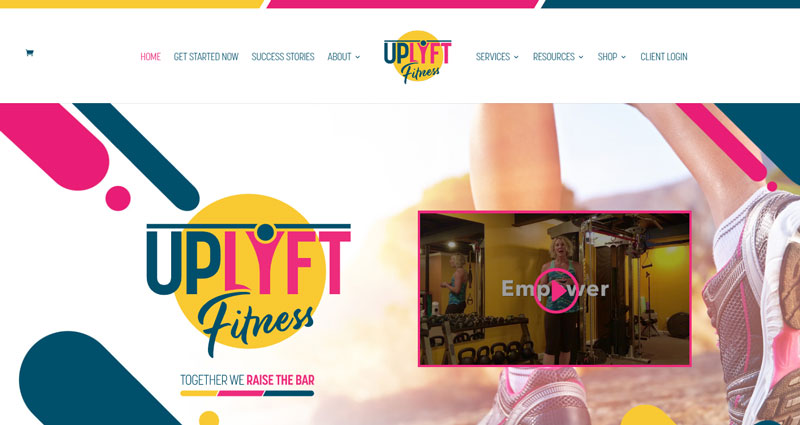
Uplyft Fitness
A website by Alight, Uplyft Fitness is a vibrant and dynamic website. You’ll feel the energy coming out of the website the moment it uploads. It has a contemporary design combined with readable font pairings and really cool images. The yellow, blue, and fuschia pink color theme and layout is also consistent with their raising the bar motto.
The homepage features videos, links to their specialized courses, success stories, details about their company mission, trainer, and programs. They also have plenty of resources in the form of blog articles and videos to help you get started on your fitness journey. Additionally, you’ll love their easy-to-navigate minimal menu.
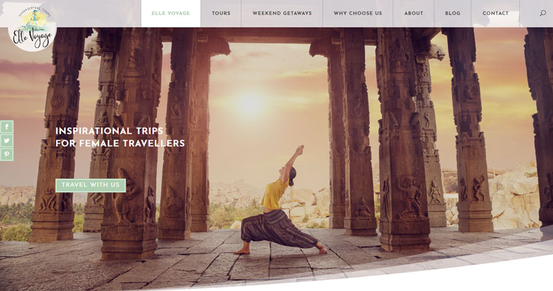
Elle Voyage
Elle Voyage specializes in inspirational trips for female travelers. Their goal is to bring women together to experience amazing adventures around the world. They offer weekend getaways and tour packages that allow women to discover the world.
The website gives out that sense of being a wanderlust. It includes an elaborate homepage, multiple pages about the countries they’re offering, a blog, contact, and an about page describing who the Elle Voyage woman is.
The images used on this site are stunning, they speak to you on a personal level. You’d definitely want to click that view tour button to learn more about the package. It’s a good example of a website which uses the power of photography to convey a message without the need for too much text.
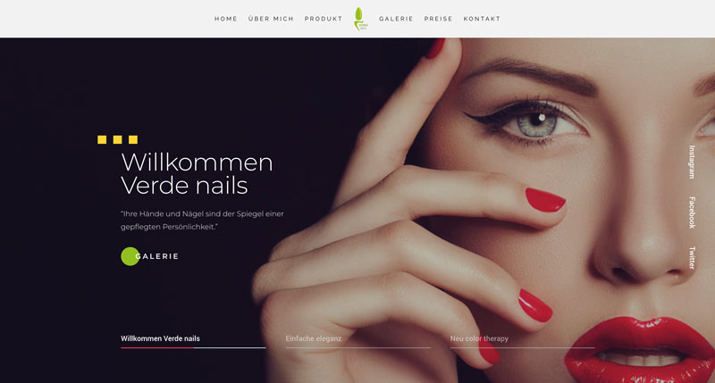
Verde Nails
At first glance, you’ll think that Verde Nails has multiple pages because of its navigation menu at the top of its home page. However, it’s actually a unique one-page nailcare website. Clicking each menu will bring you right down to the corresponding category on the home page.
The hierarchy of the site’s content is organized smartly. Everything is ultimately guiding you to book an appointment. The first part is a sliding hero image featuring their products and a welcome message for visitors. Following it is a two-paragraph explanation of what the company does. Afterward, you’ll see information about their products and their benefits.
Up next is a beautiful gallery of their works. You can also click each photo to enlarge them. The last part of the page is a clean and straightforward pricing table, a booking appointment form, and their contact details. Overall, the website stayed true to the company’s motto of simple elegance.
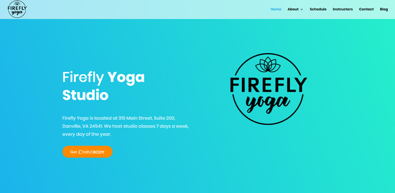
Firefly Yoga Studio
Firefly Yoga Studio in Danville Virginia is perfect for those looking to make a change in their life through yoga. It’s a great way to get in shape, relieve yourself from stress, and stay healthy.
The company uses cool hues of turquoise and sky blue in gradient form. It’s very simple, minimal, and with a clean layout. They put every essential detail on the home page, including online registration, classes offered, and how to find a class. They also have the schedule of classes for the entire month here as well as a booking button.
The minimalistic approach continues throughout the pages of the site, from instructor profiles to their pricing page. Their FAQs also come in a simple dropdown style with high legibility. Overall, the site is a breeze to navigate, it loads fast, and has a fresh vibe.
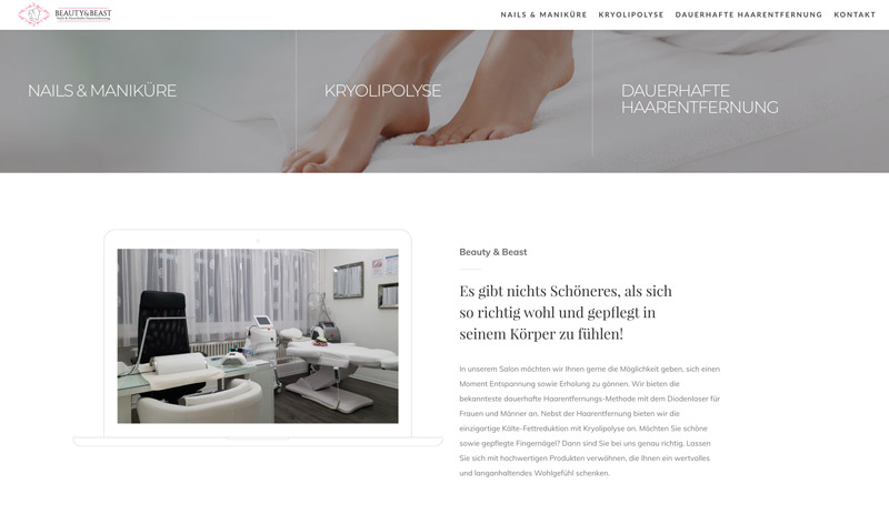
Beauty & Beast
Beauty & Beast is a beauty company offering services such as nail care, permanent hair removal, and fat removal without surgery. It uses a hero image with a hovering effect wherein the image will change when you hover on a service.
The website only comes with four pages including info about their services and a contact page. Their main focus is to provide the audience with an insight into their offers, benefits, and prices. The home page features the number of clients they’ve served and testimonials. Their contact, on the other hand, includes several ways by which you can reach them, including an online form and a number you can call.
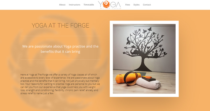
Yoga At The Forge
Yoga at the Forge is a company located in West Sussex. They are passionate about yoga and taking advantage of its benefits. Their website brings about a sense of tranquility and strength thanks to the light orange, white, and gray color combination, as well as the images they use.
The website has several pages such as about, instructors, timetables, fees, styles, and contact. However, you’ll also find all of these on the home page itself. The great thing about the site is that, even though you’ll find everything on a page, its loading time is superb.
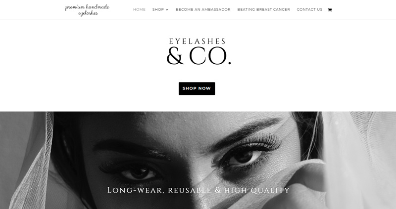
Eyelashes & Co.
If you want gorgeous lashes while helping a good cause, Eyelashes & Co. is the company for you. They promise to donate £2 towards beating breast cancer for every lash product they sell. Who wouldn’t want to take advantage of that, right?
Aside from their charitable cause, one of the best things about the business is their website. It has a clean, modern design, and uses white spaces strategically. So even if they used a handful of typefaces, it’s still readable and not chaotic. The home page holds their FAQs and a form if you want to become their ambassador.
The contemporary site has a black and white color scheme giving it a mysterious appeal. That’s a good move on their part since their product is for the eyes, which usually conveys mystery and secret. Each of their black and white or colored photos tell a story and they capture the essence of their handmade eyelashes.
These 10 best wellness, beauty, and fitness websites built using Divi only show that you can use the Divi theme to create amazing websites that will fit your brand and niche. I hope these websites were able to provide you with ideas for your next project, from layout and navigation to colors and use of videos and images. Let us know if you’ve incorporated some elements in your design by leaving a comment below!
Aileen Cuaresma
Aileen is a Technical and Creative writer with an extensive knowledge of WordPress and Shopify. She works with companies on building their brand and optimizing their website. She also runs a local travel agency with her family. On her free time, she loves reading books, exploring the unknown, playing with her two adorable dogs, and listening to K-pop.
Use coupon code SLIDER15 at checkout!

0 Comments