Top Web Design Trends to Follow in 2022
Web design is the first mode of interaction where your visitors decide whether they want to stay or leave the website. Thus, any issues like outdated designs, overused images/icons, or page cluttering can be a major drawback.
While neglecting these elements is important, a high-quality website should also stick to the industry trends. That’s because keeping up with the web designing trends is a good practice. It also ensures better leads and more conversions. Here’s a list of web design trends that’s popular in 2022.
Read more about previous trends:
• 2018 Web Design Trends
• 2019 Web Design Trends
• 2020 Web Design Trends
• 2021 Web Design Trends
Oversized/Bold Typography
Using large and bold typography, especially for logos and CTAs, instantly catches visitors’ attention. In addition, it implies that the particular word/sentence is worth reading. So, instead of scrolling down the web page, visitors read through the content.
Bold texts are appropriate for emphasising the headers. They make the important parts of the website clearer and more readable. This works as a great marketing strategy where visitors can remember your website for the long term.
While bold typography is effective, do not overuse it throughout the website. Mark the crucial points for highlighting and use them accordingly. Currently, fonts like Open Sans, Roboto, and Montserrat are in trend. However, select a font style and color that fits your brand’s aim and audience needs.
Incorporate Contrast Colors
Using contrast colors in web design ensures a better website outlook and user accessibility. Besides being a lead magnet, they can help your website stand out amidst competitors. They are a great way to highlight the CTAs and navigation menus. When used efficiently, they can encourage the users to sign up or log in. Once the users sign up, you can use the information for marketing the services/offers to potential customers.
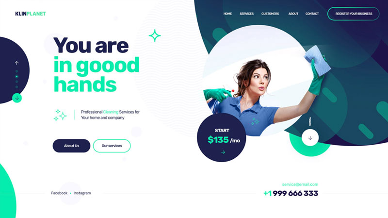
At present, color schemes of dark and light shades are pretty popular. You can select navy, dark blue, or yellow as the main color for your website. For accents, you can choose pink, white, or green. Ensure that both foreground and background color blends well together. Go for dark shades like grey, brown, or black for font texts.
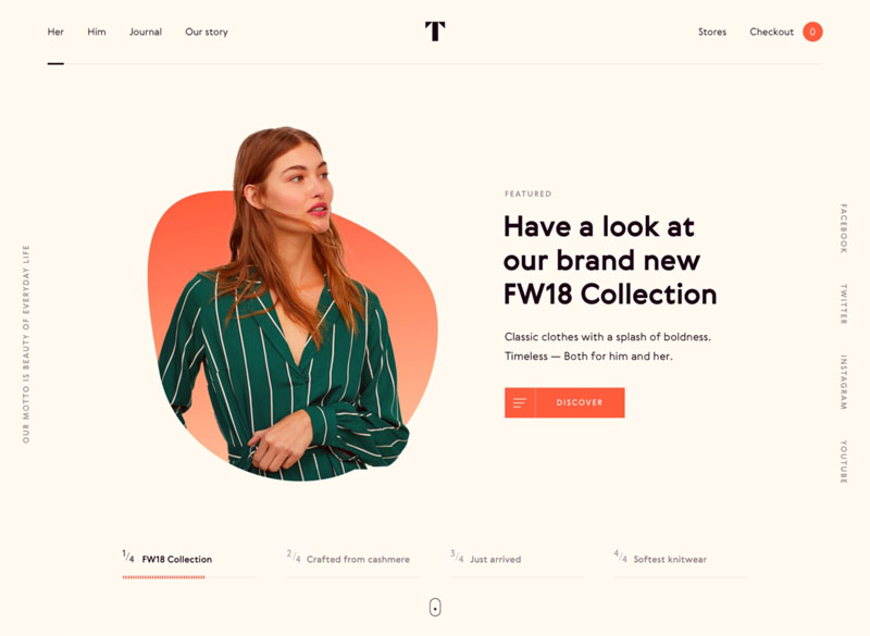
Klinplanet by Marcin Trojanowski
Conscious by Jesper Dahlqvist
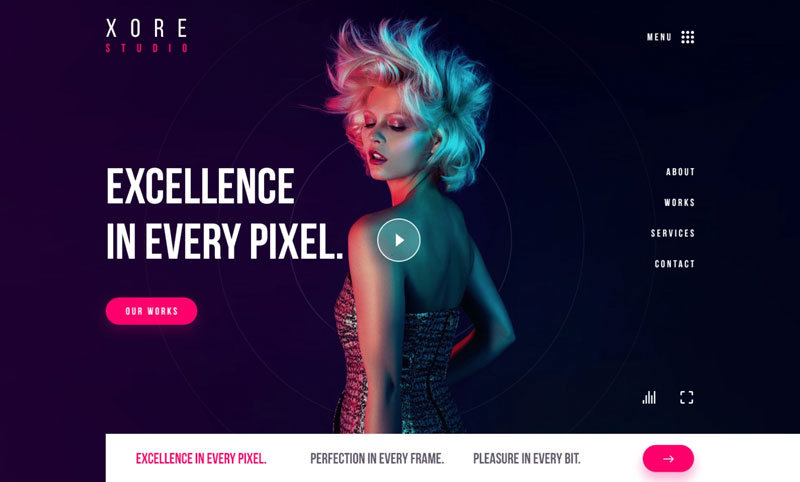
Studio Website by Ali Sayed
Create One-Page Websites
Clear by its name, one-page websites are single-page websites with no sub-pages (ex: about, services, etc.). Instead, it includes menu bars that direct users to a predefined HTML anchor on the same page after clicking. Developers nowadays use this approach to boost user engagement and simplify the navigation on the website. It is an excellent web design tip to improve the bounce rate, conversion rates, and user experience of the website.
With one-page websites, you can create an attractive layout with recurrent high-quality images. This could boost your website SEO and search rankings. These websites also ensure a mobile responsive design. So, you can stay assured of high traffic and better leads from mobile users!
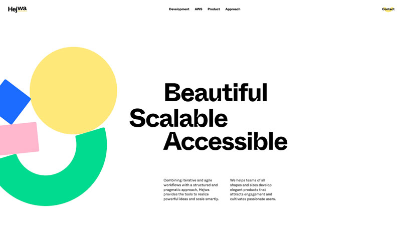
Landing Page by Hejwa
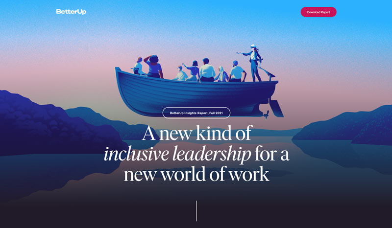
Landing Page Pack by BetterUp
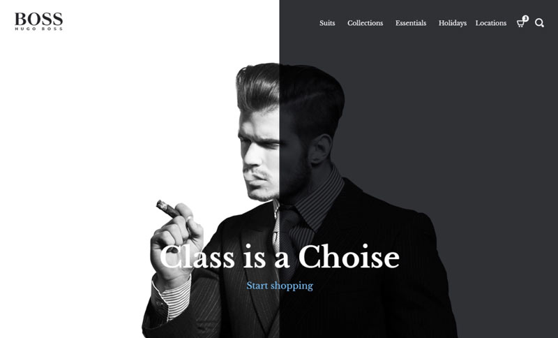
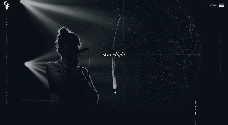
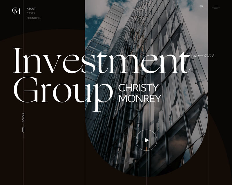
Black-and-White Color Schemes
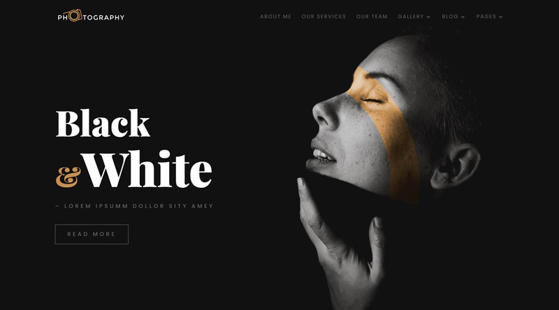
If you are hesitant to experiment with contrasting colors, stay on the safe side with black and white color schemes. Not only does it look crisp and clear but also seems intriguing to the visitor’s eye. Also, if you want users to focus more on the content instead of colors, this combination makes a classic choice. With this scheme, visitors will concentrate more on the layout, fonts, and content than vibrant hues.
Regardless of your business aim, you can try these schemes on any website. If used correctly, it can give a modern and influential touch to the design. The best thing is that it’s simple yet sophisticated. It does the job, i.e., lead generation without being too extra!
Hugo Boss concept by Arnas Jonikas
Star light album website by Christian Smith
Investment Group in Kyiv by Julia Smal’
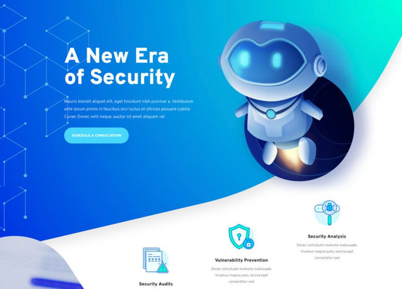
Incorporate Even More Gradients
Gradients in web design add dimension, authenticity, and depth to a website. From typography and texts to UI, they are useful for visually appealing page layout. A gradient is where a color blends with another color to create a new shade. You can use them in different sections, including the features and image coverings. They are also worth adding from page to page, diagonally, or even horizontally.
A diverse color gradient ensures better graphic designs and unique color tones. Both of these attributes help the visitors to remember your website clearly. For an exceptional color gradient, avoid incompatible hues. Also, make sure to use two pleasant colors but do not overdo it!
Cyber Security Layout Pack by Elegant Themes
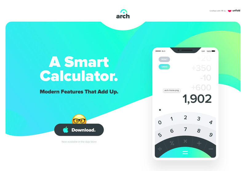
Arch Landing Page by David Kovalev
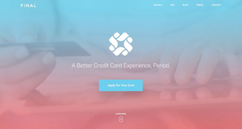
Final Card by Eric Hoffman
Split-Screen Aesthetics
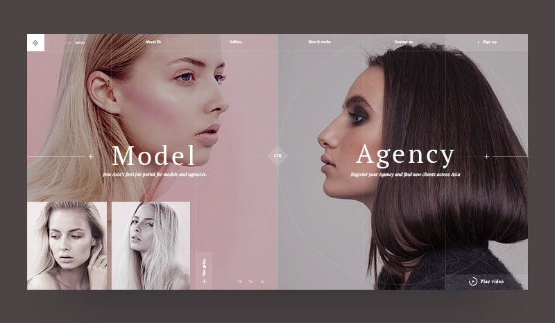
Split-screen aesthetics are appropriate for the pages where it’s important to show two interrelated content side-by-side. Through this design, it becomes easy for the visitors to make choices or take action. For example, if a website mentions a test on the page, the side section should have a test link button. This makes it easier for the user/visitors to make choices.
Split-screen aesthetics also emphasize vertical images and generate smooth visual flow. It helps to create a simple layout where users can navigate easily. As it’s suitable for responsive frameworks, you can use them for both mobile and desktop screens.
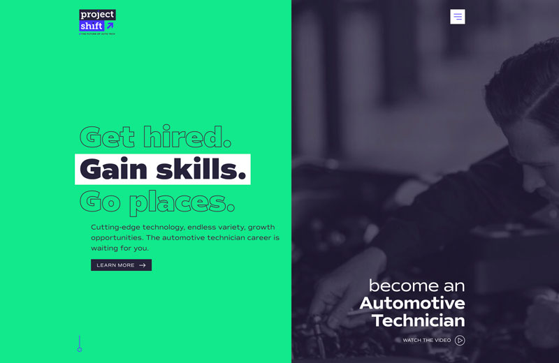
Landing Page by Project Shift
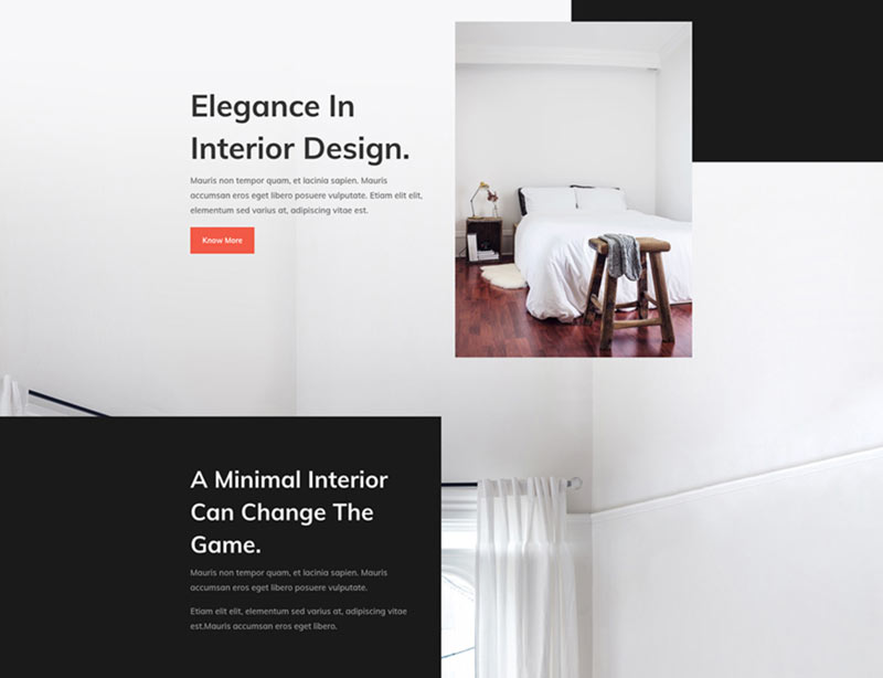
Interior Design Layout Pack by Elegant Themes
Modelnisa by Art Lemon
Have More Glassmorphism
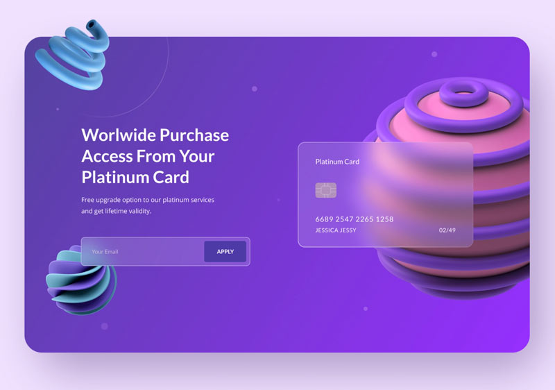
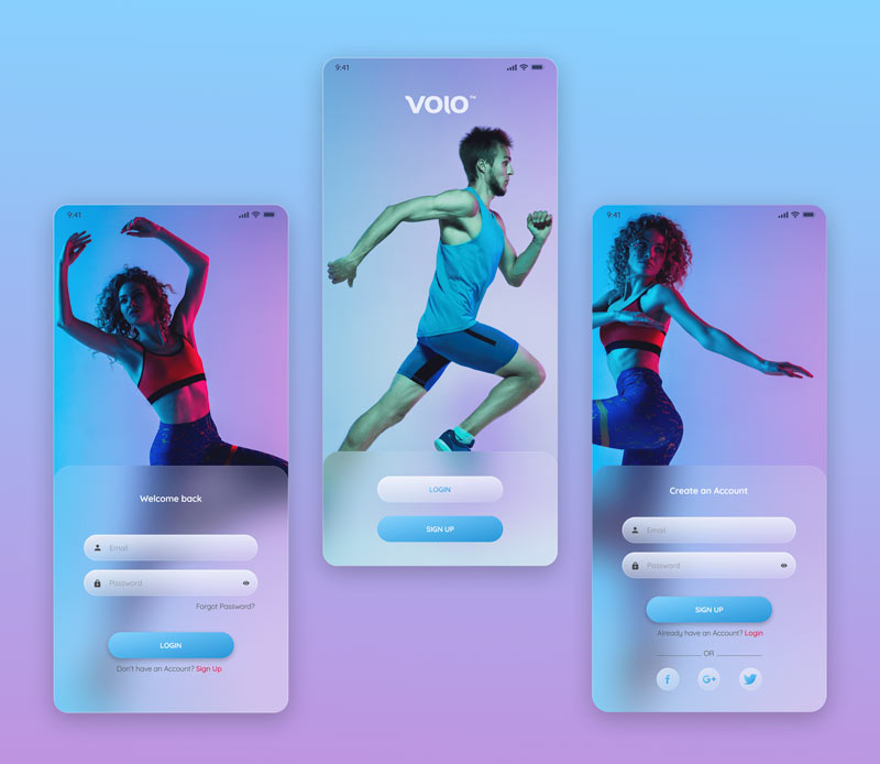
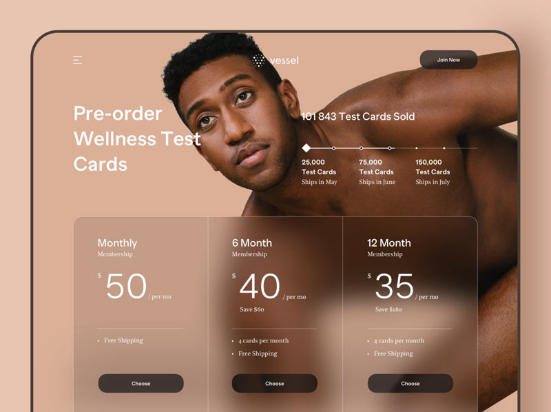
Glassmorphism is a UI trend that gives a transparent and frosted-glass-like appearance to the website elements. It’s more or less similar to the blur effect that you use in pictures. Besides providing an attractive see-through design, it ensures better user accessibility. It is also useful for generating a visual hierarchy and interface depth.
Web designers use this effect in landing pages, login screens, mobile app interfaces, and other sections. It’s worth applying this effect on dark and colorful backgrounds. That way, it will contrast better with images, texts, and CTAs of the page. Likewise, you can select subtle background colors for an aesthetic vibe. Make sure to maintain adequate transparency in the shape fill for a good Glassmorphism vision.
Glassmorphism Header Concept by RH
Login UI Design Divi by Stefan Brown
Pricing and Plans Overview by RD UX/UI
Use Abstract Illustrations
Adding abstract illustration ensures an attractive visual effect to the website. It includes vibrant colors, gushing lines, and interesting shapes to create a stunning design. The blend of these elements effortlessly conveys complex ideas. Besides providing an innovative web design, it can help you to build your brand identity.
An abstract illustration is also useful for highlighting necessary features, services, and sections of the page. It ensures that the visitor does not skip the content and stays for long. You can also include your company colors in abstract form for better illustration.
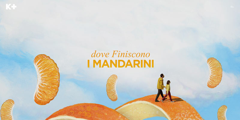
Landing page by KPLUSFILM
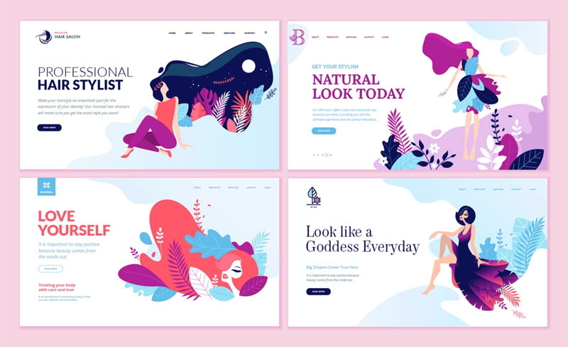
Design templates for beauty and nature by PureSolution
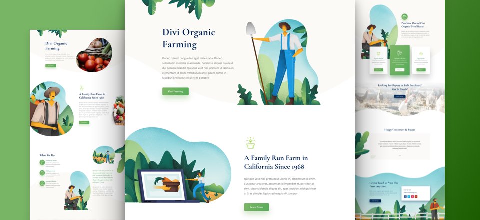
Farmer Layout Pack for Divi by Elegant Themes
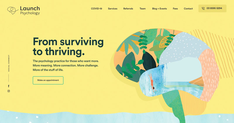
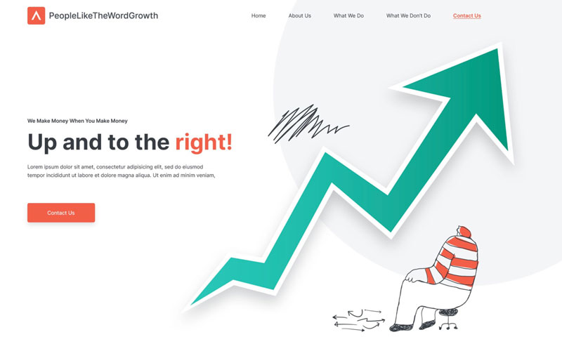
Go for Handmade Graphics
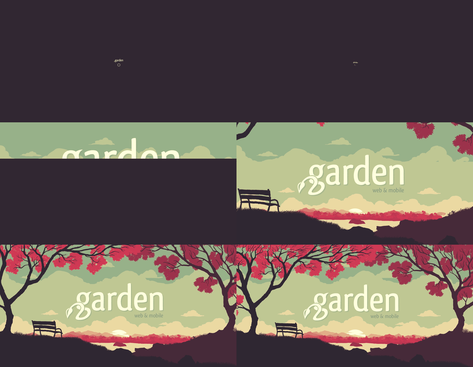
Custom-build or handmade graphics add a unique touch to your website. Designers can brainstorm ideas to develop extraordinary self-made designs for logos, buttons, and banners. These elements can then be implemented on the websites for better visual aids.
Conventional and original graphics attract visitors and make your website look different from the competitors. It helps to maintain consistency, boost brand trust with transparency, and promote better communication. If you want the best functions and aesthetics simultaneously, handmade graphics are worth trying.
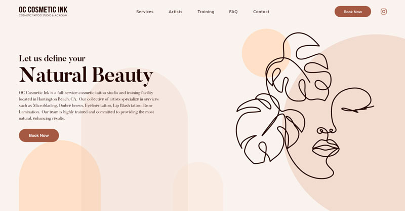
Cosmetic Tattoo Studio by Sudip Dutta
Launch psychology by Realysys
Marketing Agency by andrei2709
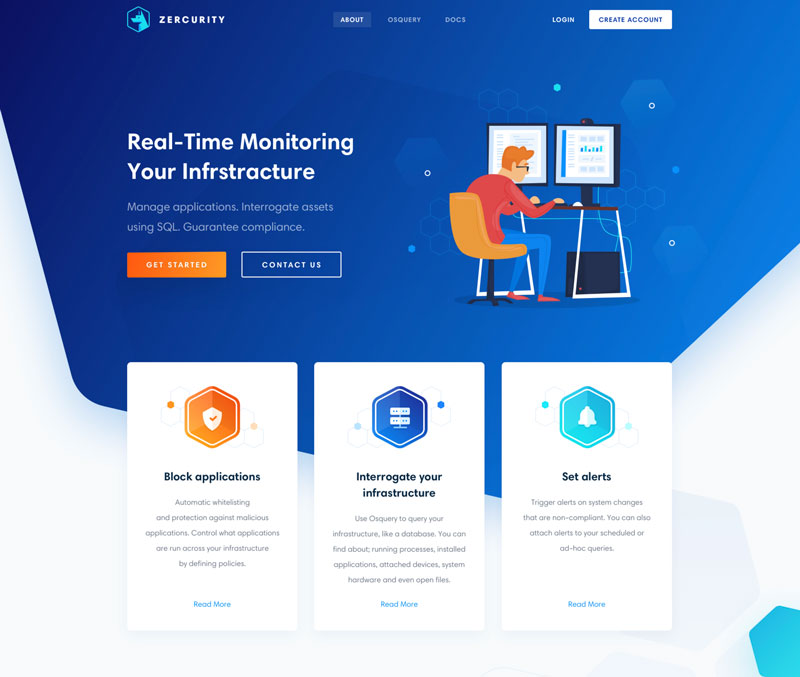
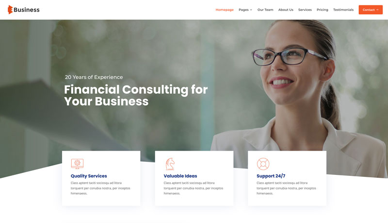
Material Design
With Google as its creator, material design is the set of guidelines or standards for website design. It encourages using efficient elements like transitions, grid-based layouts, and depth effects for better design. The approach helps to create an intuitive design system and maintain uniformity throughout different platforms. It also helps users to understand the visual and make it more interactive.
Zercurity homepage by Anton Avilov
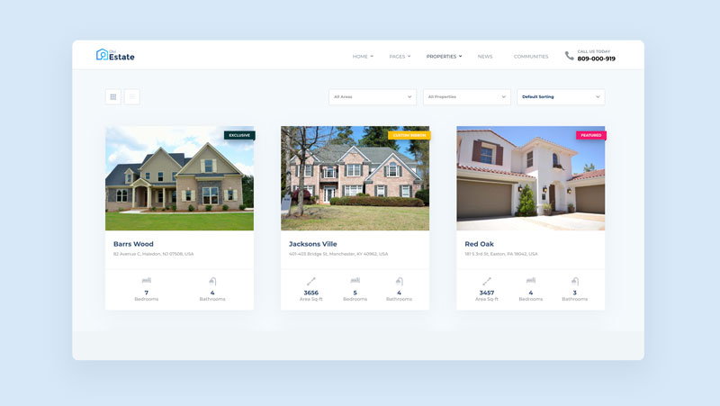
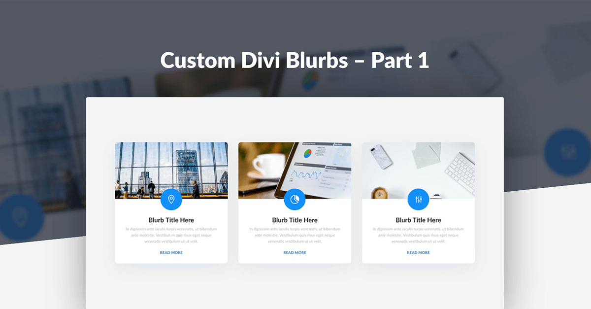
Business Layout Pack for Divi Pixel
So, these were the web design trends for the year 2022. If you are missing out on any of these, add it today! If you want to get more web design resources directly into your mailbox, don’t forget to sign up for our newsletter!
Navkiran Dhaliwal
Navkiran is an experienced technical writer with 10+ years of industry experience. Her writing skills and technical knowledge may be confirmed by reputed clients all over the world.
Use coupon code SLIDER15 at checkout!



Thank you for this useful information