Top 10 Web Design Trends for 2018

As 2017 fades into memory, the web design world is ready to push forward and embrace a new year and all the challenges and developments it may bring.
In a tech-savvy world, web design will always be racing to catch up, get ahead of the curve, and deliver the best results possible. As we enter into the next 12 months, what web design trends might we expect to see emerge? Let’s peer into the crystal ball…
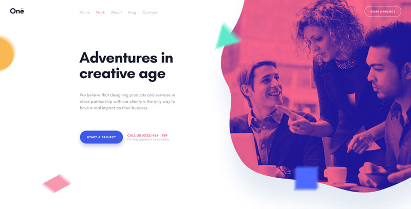
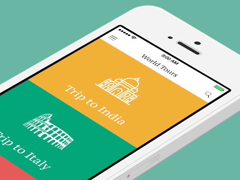
Fluid shapes
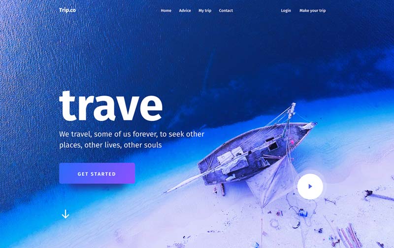
Social media behemoth Twitter surprised users when they introduced circular user photos, but this signalled the start of a trend. Web design has always been rather “boxy”, focusing on lines, hard edges, polygons, and rectangles– or at least, this was the case until 2017. The preference for fluid shapes and circles is already beginning to develop, so expect to see this continue through the new year as website design trends towards being pleasant to look at, smooth, and flowing freely. This is in direct contrast to the “boxed in” feel of the past few years’ design trends, and should seem more natural to mobile browsing, which takes place on devices with rounded corners.
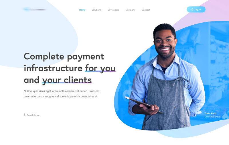
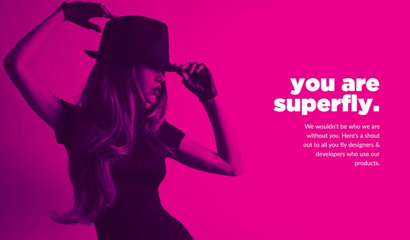
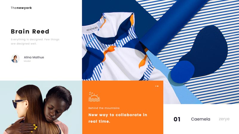
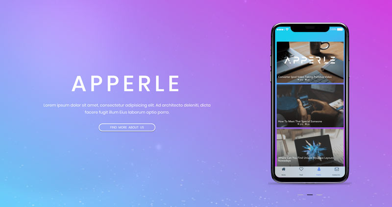
An explosion of color
For years now, color has been seen as the antithesis of good web design; colorful websites were seen as a throwback to the 90s, when we were all just getting used to hex codes and thus chose the biggest and boldest looks. ‘Muted’ has been the color theme of choice for the past few years, but websites are now beginning to blend into one another, losing their distinctive edge; 2018 is set to be the year when color begins to creep into design once more.
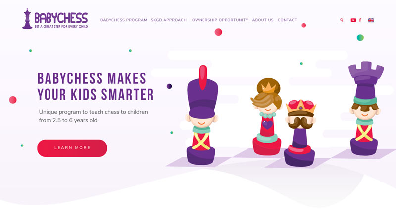
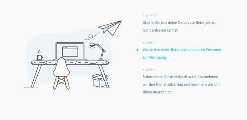
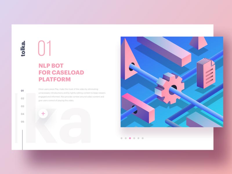
Illustrations and SVG images
A standard stock photo isn’t going to continue to cut it in 2018; the trends are leaning towards images that are custom-made and resize perfectly across platforms. It seems that 2018 may be the year of distinctive design and abandoning general trends, with more and more designs seeking to be unique rather than conforming to an unofficial set of web design rules. Illustrations have a huge role to play in this, helping to solidify a site’s identity and promote its individual merits.

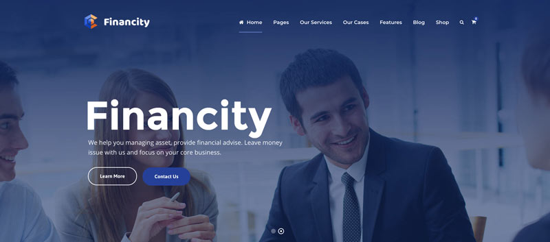
Large typography
A huge number of sites switched to small, unobstructive logos and typography several years ago, but the general trend is now beginning to reverse. In an effort to counteract high bounce rates, typography is getting bigger and bolder than ever before. The need to capture the attention of viewers is ever-present, and large typography should be one of the best tools to help achieve this.
Broken layouts
Websites have been much the same since the internet first came into existence; a single page which you scroll down to read, usually arranged on a grid system. However, 2018 could be the year when broken layouts begin to really make their mark. Following the 2017 success of half-and-half screens, asymmetrical grids and split layouts could make their mark.
Subtle animations
Animations have always been useful for grabbing the attention of a reader, but they also have a tendency to annoy the reader. No one wants to have to sit and watch for a page to load an animation that they’re not going to use, after all. 2018 design trends will seek to fix this problem, moving into a realm of subtle animations that don’t compromise the overall performance of the website.


Inventive typography
It’s not just the size of typography that’s going to change; a style shift is beginning to emerge, too. For years, major websites have focused on the same small set of fonts, but typography is now beginning to embrace its artistic possibilities. This will continue into 2018, taking advantage of improved screen resolution allowing custom fonts to become as readable as their standardized equivalents. More sites will embrace the possibility of their own fonts, helping to distinguish themselves from their competitors and craft a unique identity right across their site.
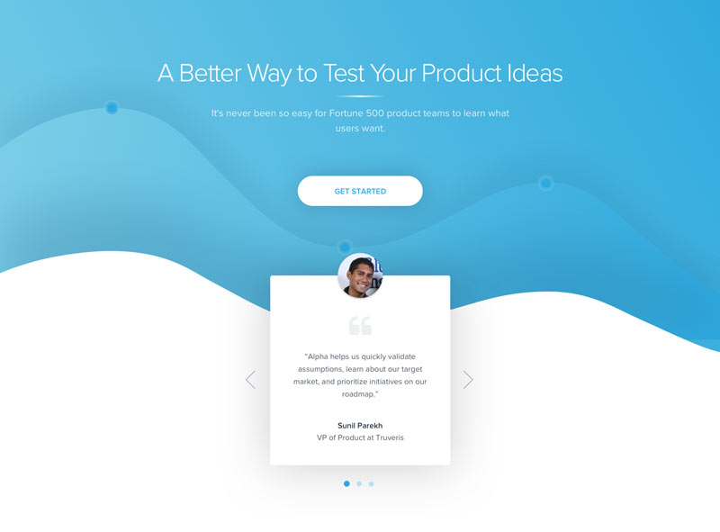
Dynamic gradients
‘Flat’ background colors — background colors that are a single color — have been the norm for many years now. Gradient backgrounds are often associated with older websites that haven’t moved on, but 2018 may be the year when gradients make their comeback. The reason for this is simple; screens are better now, resolutions are better now, and colors appear vividly across all devices. This means that gradients can be more subtle and elegant, rather than striking “white into green” gradients that were all the rage in the first decade of the 2000s. Dynamic gradients also allow images to “pop” more, helping to keep the interest of ever-wandering web viewers, so they look certain to make an appearance next year.
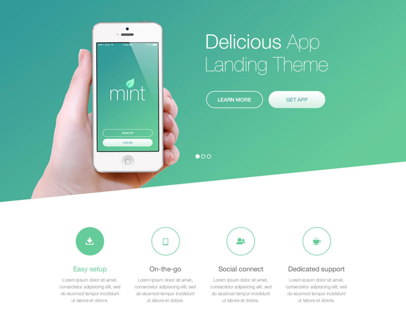
Mobile first
It’s fair to say that the web design industry took a long, long time to adapt to mobile web browsing. Websites were designed to be viewed on PCs and laptops, so site design was sprawled, text size was small, and navigation was often intricate and layered. Eventually, the trends changed, and websites were adapted to be responsive to mobile devices. However, 2018 may see a real change in attitudes; no longer will websites be adapted for mobile viewing, they will be created for mobile viewing and adapted to suit PCs and laptops.
Drop shadows and extra depth
In another nod to the smaller screens of mobile browsing, drop shadows and depth in graphic and overall design are going to make a comeback. Drop shadows may feel very 1990s, but they offer a depth and a sense of texture that makes the mobile viewing experience all the more enjoyable. These design quirks will also be look fantastic on modern PC and laptop screens, taking advantage of their higher resolution to produce more complete images.

In some ways, it seems that 2018 will take us back to the future; many of the mainstays of 1990s early web design could be set to return. This might sound worrying, but our devices are better able to handle these designs now, and the web will be a more interesting place for their presence.
Maciej Ekstedt
Creative Director
Maciej is the founder and CEO of B3 Multimedia Solutions. He is a self-made web designer and marketing expert, and he loves his job so much that he barely leaves the office. He transforms creative ideas into effective strategies for his company and for his clients. Maciej is fascinated by the phenomenon of megalopolis. He notices patterns and details which make up the whole thing, and he uses these skills in his work.
Use coupon code SLIDER15 at checkout!
Great article! Thank you for your very useful insight into the future of web design in the coming year.
This is very good!
Thanks for this article, good job!
Appreciable article. Thank you for sharing.
I bookmarked this to come back to – and I’m glad I did. Some really insightful and no doubt spot on stuff here, thank you very much for this Maciej.
Thank you Alan. I’m glad that you like and if it was helpful 🙂
wow. it`s informative
nice article Thanks a lot
Hii.Good blog, i like it, thanks for sharing good knowledge, hope u also like this blog, check it https://goo.gl/F7ZyJ9
Hi Paul, thanks for sharing your blog here 🙂
I Love Your Blog….I Use DIVI THEME and your work is very beautiful. This insights is very useful for my next projects. Thank You
Hi Carlos 🙂 Glad to hear it was helpful. Greetings from Ireland!
excellent post..
thanks
Nice Article & Design 2018 Top Trends!
good info but i think parallax scrolling should be in there
Thanks for sharing this post! Very useful informations!
Thank You For Sharing This Awesome Blog. The Infographic Used In This Blog Is Completely On Different Level.