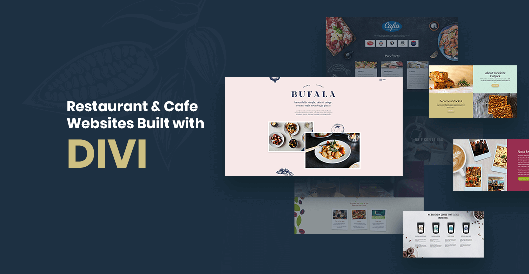
12 Examples Of Restaurant & Cafe Websites Created With DIVI

If you’re thinking of building an amazing Divi restaurant or cafe website, it’s a good idea to look for inspiration from other websites out there. Whatever type of food and drinks website you want to build, there is a plethora of sites in your niche which you can check out, and we’ve listed some of the best in this article.
If you’re a restaurant or coffee shop owner who thinks that a Facebook page is enough to keep your online presence thriving, think again. Nowadays, customers want to check things online before visiting a business. They want to see if the menu is good enough to book a place for any time.
You’ve put up a great cafe or restaurant. However, if you want to go head to head with your competitors, you need a great website also. It’s an effective way of attracting new customers to visit your shop and to showcase your tasty food and delicious drinks to millions of people.
Aside from having enticing photos of steaming coffee, mouthwatering dishes, and Instagram-worthy dining areas, you also need to take care of practical things. Make sure your customers have a way to access your menus easily, as well as essential details about your business such as location, opening hours, and booking info.
So if you’re looking for inspiring websites, take a look at our list of Divi restaurant and cafe website examples that can help you with your project. If you’re new to the world of Divi, here’s a helpful article on How To Build Your Website With The Divi Theme.
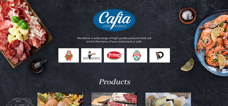
Cafia Food Service
Cafia Food Service is a fantastic one-page Divi site with straightforward navigation. The theme they use is simple yet unique and stylish. Their products have a brief description, and to highlight it, they use a subtle hover effect.
The about us section following is just as short and sweet. Below, you’ll find contact information and forms. The highlight of the entire website is its full image background. Not only did they use high-quality images of their products, but the use of drawings of animals with part categories is genius!
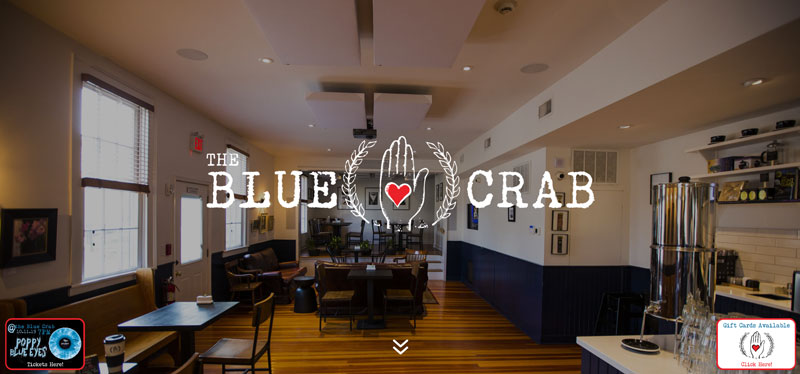
The Blue Crab Coffee
The Blue Crab Coffee is another stunning one-page website. It has a full-screen image with the company logo and a chevron arrow that once you click, will slide you down to their menu and display a smaller version of their logo above. It’s a pretty cool and fun animation. You may see yourself playing around and clicking the arrow over and over again.
The three-column menu has everything you need to know about their dishes and drinks. It uses the same font as the logo and the prices are highlighted with the color red, which goes well with the entire color scheme. The middle includes their offerings, while the left and right parts are images of their sumptuous food and coffee, that will surely make you hungry.
Following this is a little section of their upcoming events and a subscription form for their mailing list. The last part has their contact information and opening hours with an image background of their shop. The overall feel of the site is in perfect harmony with the ambiance of their physical shop.
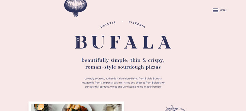
Bufala
Just like their thin, crispy, Roman-style sourdough pizzas, the Divi Theme website of Bufala is beautifully simple. The color scheme of the website is also as fresh as its ingredients. The site menu on the side is a pop-up window that contains a link to Home, Menu, Find Us, and Contact.
The site opens up with a beautifully-crafted description of their ingredients. It is followed by an image slider of high-quality photos with a white border. Scroll down a bit, and you’ll find their table-style menu list, which uses a highly readable font. The layout of the menus is quite interesting, and they made the right choice of using a well-balanced sans serif typeface.
The bottom of the page contains their location and contact details, as well as links to their social media accounts.
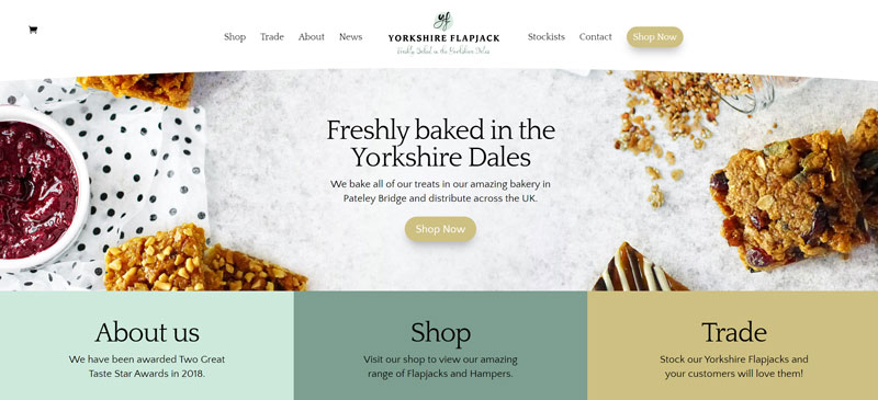
Yorkshire Flapjack
The website of Yorkshire Flapjack is simple and yet very effective at making sure their delicious flapjacks get the attention they deserve. The choice of colors complements the sweet dense cake beautifully.
The navigation menu at the top of the page as well as the logo are just the right size. These are followed by a flat lay image of their products with a Shop Now CTA button linking to their online shop. And then another menu linking to important sections with a brief description including About Us, Shop, and Trade
The homepage also features their most popular products. So if it’s your first time to try them out, this will narrow down your choices. Scroll down and you’ll see a section highlighting the latest news and events of Yorkshire Flapjack, as well as an email subscription form. The footer, on the other hand, includes links to all pages of the site.
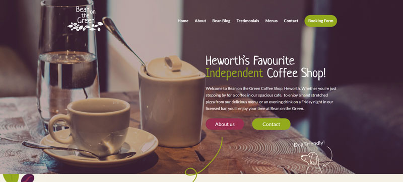
Bean On The Green
Bean On The Green is a fun, modern coffee shop Divi website with multiple pages. Right away you’ll get this comfortable and cozy vibe, thanks to their color scheme choice. Its full image header even uses a filter evoking the same vibe. Browsing the site will give you a nostalgic feeling, where you’ll want to give your friends a call and invite them for a cup of coffee.
The header is followed with a slightly angled table element for their about, menu, and blog pages. The tables are also incorporated with lovely photos. While the about and blog will open on the same page, the menu will open in a new tab in PDF form.
The homepage contains information about their team, opening times, services, customer testimonials, a Google map of their location, and contact details. The website has plenty of beautiful elements, but the load time and speed is superb, which is vital for any website.
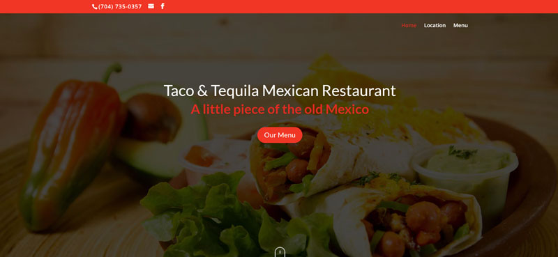
Taco And Tequila Mexican Restaurant
The Taco And Tequila Mexican Restaurant website includes a full-screen image with a CTA for their menu. You’ll also find a cool animated computer mouse that will send you sliding down to the about section just below the header when you click it. The homepage and its other pages are in agreement, the colors and font combinations are chosen very well.
Scrolling down you’ll find a straightforward shadowed section of their delicious menu. Under it, you’ll find customer reviews in a simple Divi table element with a shadow effect. This is followed by a thumbnail gallery of their physical shop, which will enlarge in the same window when you click them.
You’ll find out how to get in touch with them in the last part of the site which includes a form, their address, contact number, and opening times. The website is clean, simple, and makes excellent use of images and colors.
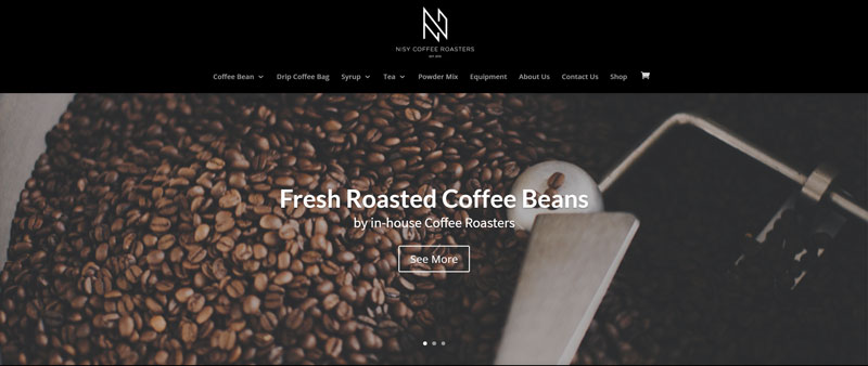
Nisy Coffee Roasters
The website of Nisy Coffee Roasters is a contemporary website with a black and white color scheme that goes really well with their logo. The top navigation drop-down menu will provide you with all the links to their products.
The sliding header features stunning images of their products that include a CTA if you want to know more about them. Below it are three short sentences describing what they do and offer, as well as their signature house blends.
Breaking down the dark portion of the homepage is a list of their other featured products in a white background. Then the website finishes off with a black footer that contains their contact details and a Google map of their location.
The entire website focuses on the products of the company. The details are concise and include all the essential things you need to know about them, and an add to cart CTA. It’s the kind of Divi site that means business.
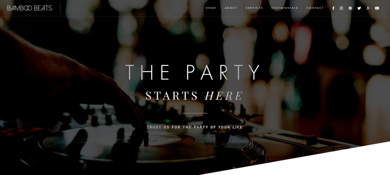
Bamboo Beats
Like its name, the Bamboo Beats website is unique and playful. Once the site loads, the party scene will jump right out of your screen. The black and white color combination is injected with just the right amount of teal to make it highlight important details. The font pairing they use here is modern and very readable.
The website features a full-image slider header in a unique shape. Scrolling will send you to the about section of the page with a CTA to check their availability. It is followed by what they can offer you, their story, and their team. Technically, it’s a one-page website, but they have a dedicated page for the bio of their team. It just goes to show how they value their crew.
Below those, you’ll find a section with a CTA to sign up which will open up in a new window. That’s a good thing since you still want your potential clients to stay on your site and learn more about your business.
The section about their services comes with an excellent sliding animation where the description will slide from the right side of the screen and stop in the middle. The website already includes every piece of information you need to know about their services. There’s even a FAQ section that potential clients can check out.
The web page has a lot of effects and elements on it, but they were placed strategically, so it doesn’t look cluttered and loads pretty fast.
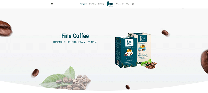
Fine Coffee
Fine Coffee is a Vietnam-based company. And just like their Vietnamese coffee milk products, their website is just as fine and sleek. The site uses a full-width header with a simple font pairing and image. Even the color scheme this Divi website used is uncomplicated.
The homepage contains a straightforward story of the business. It is followed by a description of their products and then the reasons why you should buy them. Scroll down a bit, and you’ll find an explanation of their chosen ingredients. The last part includes links to their latest blog entries, contact details, and a contact form. Overall, the modern website is clean and uses plenty of white space, making it easy on the eyes to browse.
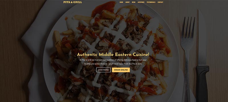
Pita & Grill
The first thing you’ll notice about the website of Pita & Grill is its cool menu layout and high-quality, mouth watering images. The photos are so amazing that you’ll want to order right away.
The single-page website uses a full-width image with text overlay with CTAs for the menu and order online. Below is a brief story about the restaurant, followed by a beautiful two-column menu. Aside from the amazing photos, the menu alternates the colors black, which eases its readability. It is then followed by customer testimonial, location and operation info, as well as a Google map, and a contact form.
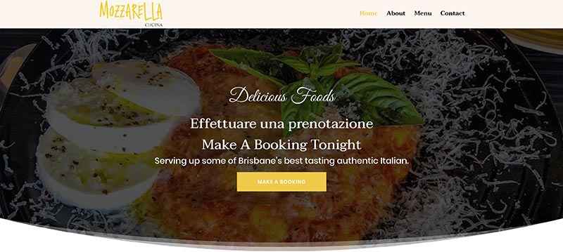
Mozzarella Cucina
Mozzarella Cucina combines a full-screen image with the company logo, tagline, and a CTA to make a booking. The next section provides a short description of the Australian company with a link to read more. Next is their information about their ingredients and a CTA to view their full menu. It is followed by a booking form and another column where you can find and contact them, as well as the opening hours of the business.
Below it is image thumbnails of their foods and restaurants, wherein it’ll open on the same window in a slow sliding effect once you click them. The Divi website is quite simple with only four navigational menus at the top. But it gives out a fun vibe thanks to its secondary font and hovering effect on its menu.
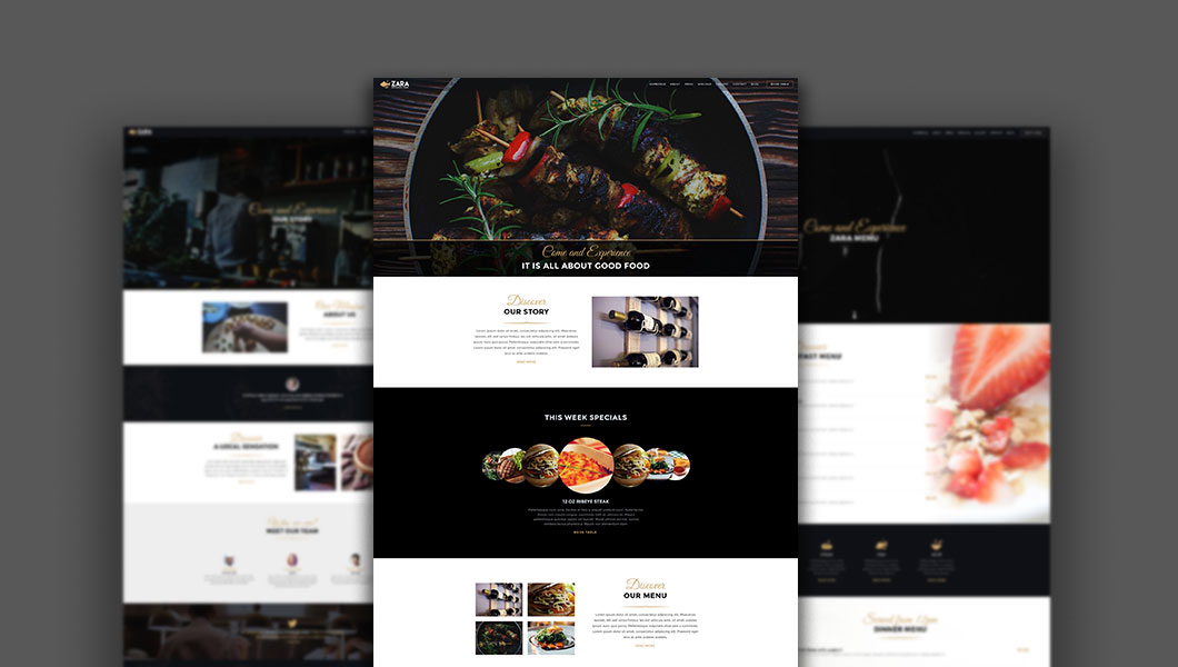
ZARA
ZARA is a premium Divi child theme designed for restaurants, bars, cafes and any other eatery businesses. It comes with 9 unique page layouts that will attract your website visitors. Easily get our demo pages imported to your website with one-click. Each page is designed with the latest design principles. This child theme is fully responsive and looks great on phones and tablets as it does on desktop computers.
These restaurant and cafe websites showcase how versatile the Divi theme can be, and what it can offer you and your business. If you have some amazing examples of Divi sites, share them with us by commenting below.
Aileen Cuaresma
Aileen is a Technical and Creative writer with an extensive knowledge of WordPress and Shopify. She works with companies on building their brand and optimizing their website. She also runs a local travel agency with her family. On her free time, she loves reading books, exploring the unknown, playing with her two adorable dogs, and listening to K-pop.
Multipurpose Restaurant Theme
ZARA is a premium Divi Child Theme built for restaurants, bars, cafes, bistros and any other eatery businesses. Start building your dream website with ZARA Divi theme today! Get 10% dicount with coupon code ZARA10 at checkout!

Beatiful designs. Have you some childs themes for ecommerce with Divi 4.0
Hi Diseño web Sevilla please check our resources page https://www.b3multimedia.ie/resources/ thank you