17 Best Divi Fonts and Combinations
Did you know there are 900+ Divi fonts? Well, that’s because Divi integrates with Google Fonts, bringing you a surprisingly wide range of choices. You need to choose the right typography and fonts for your Divi website.
But sorting through 900+ fonts can be a challenge. So, we took the time to carefully review and handpick the best 17 Divi fonts for your creative project. Don’t forget the power of psychology when choosing fonts for your designs. These fonts will keep your Divi website look organized, impressive, and engaging.
Let’s take a look:
Lato
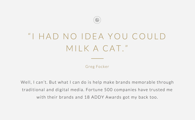
Lato belongs to the Sans Serif typeface family. Started in 2010 by Warsaw-based designer Lukasz Dziedzic, the font can be used to convey a friendly or serious message. It’s both feminine and masculine, thanks to slightly semi-rounded details. With the feeling of the Summer, Lato font can be used for both heading and body font.
Best Pairing: Open Sans, Roboto, and Oswald
Montserrat
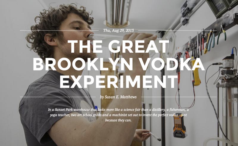
Montserrat is one of the most popular Divi Google fonts. This urban typeface has roots in Buenos Aires and is widely used in the United States.
It’s recommended for fun websites that need a majestic look that hooks instantly. Montserrat is perfect for bold heading fonts and short pieces of all caps.
Best Pairing: Raleway, Open Sans, and Roboto
Roboto
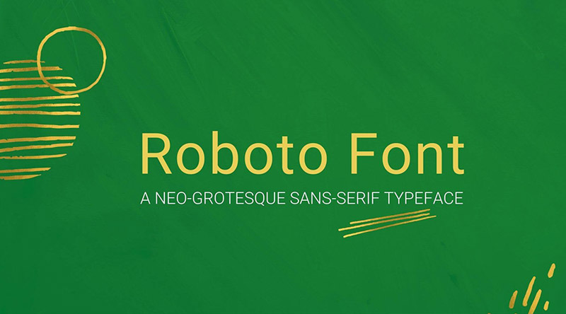
Roboto Google font has more than six trillion total views, and its popularity comes from its usefulness and lots of styles. It has a dual nature, a mechanical skeleton, and mostly geometric forms.
Other things that make the font attractive are its friendly, open curves. It allows letters to easily settle into their natural width. As a result, Roboto makes a natural reading rhythm in humanist and serif types. It’s best for heading or body font.
Best Pairing: Open Sans, Lato, and Montserrat
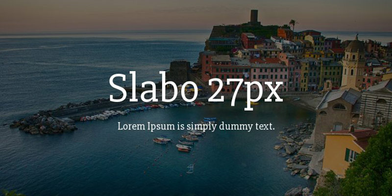
Slabo 27px
Slabo 27px is a preferred serif font choice among digital advertisers and website designers. In addition, it’s fine-tuned for use as a heading font.
Best Pairing: Roboto, Lato, and Open Sans
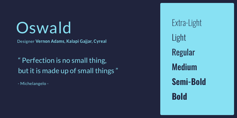
Oswald
Oswald font is intended for use across web browsers on laptops, desktop computers, and mobile devices. This free, open-source Sans-Serif typeface is based on classic gothic and grotesque styles. Fortunately, Oswald allows making a lot of Divi font combinations, giving you enough choices.
Best Pairing: Arial, Roboto, Oxygen, Garamond Premier, Open Sans, Manus, Merriweather, Eczar
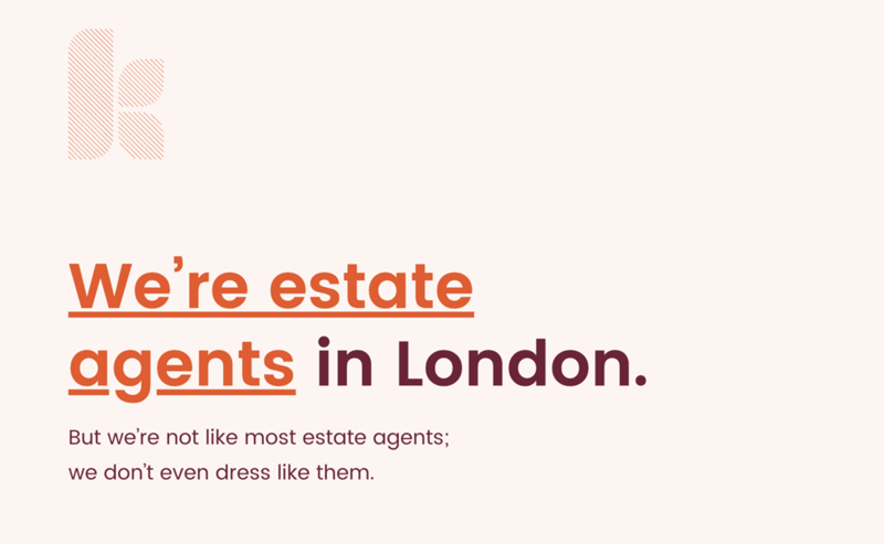
Poppins
Poppins is a newcomer to the list of geometric Sans Serif typefaces. This is one of the most popular modern fonts for designers. It’s based on the Devanagari and Latin writing systems, making each letterform almost monolinear. The font comes in 18 different styles, ranging from Thin to Black with italics.
Best Pairing: New Caledonia, Gravitas One
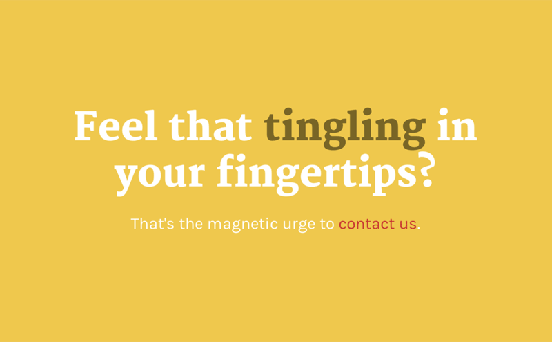
Merriweather
Basically, designed for text faces on screens, Merriweather has a very large x-height. In addition, it has condensed letterforms, slight diagonal stress, sturdy serifs, and open forms. You can also use Merriweather Sans, which harmonizes with the styles and weights of this Serif family.
Best Pairing: Futura PT, Proxima Nova, Replica, Open Sans, Brandon Grotesque, Unit, Avenir Next, Roboto, LL Replica Mono
Inconsolata
Inconsolata is one of the most popular Divi fonts in the United States. This programmer font is suitable for screens and can be used everywhere. In addition, Inconsolata is well-suited for body text and heading.
Best Pairing: Montserrat, Noto Sans, Merriweather, Rooney Sans, Montserrat, Playfair Display, Karla, Fira Sans, Quicksand, Futura PT
Kanit
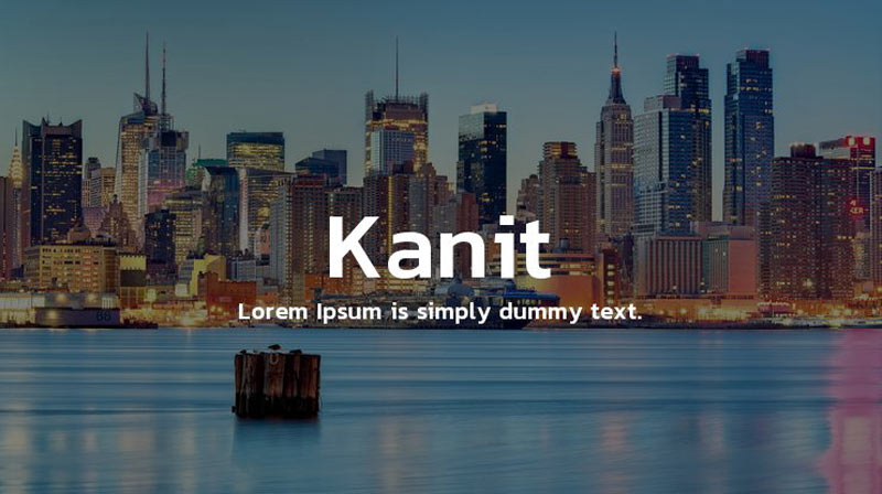
Kanit (which means mathematics in Thai) has a formal Loopless Thai and Sans Latin design. It’s a combination of Humanist Sans Serif motifs and curves of Capsulated Geometric styles. This makes Kanit suitable for contemporary and futuristic uses.
The font has a unique geometric look that lends your design a techy and masculine feel. That’s why it works great for creative projects within the Technology or Automotive industries.
Best Pairing: Martel Sans
Playfair Display
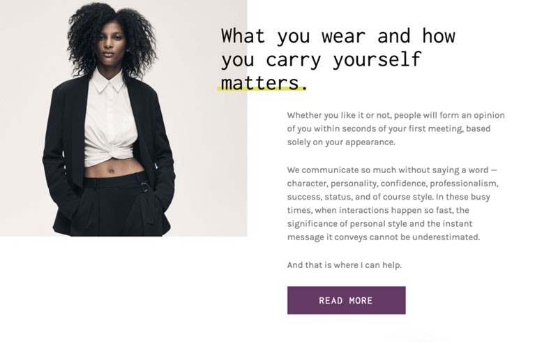
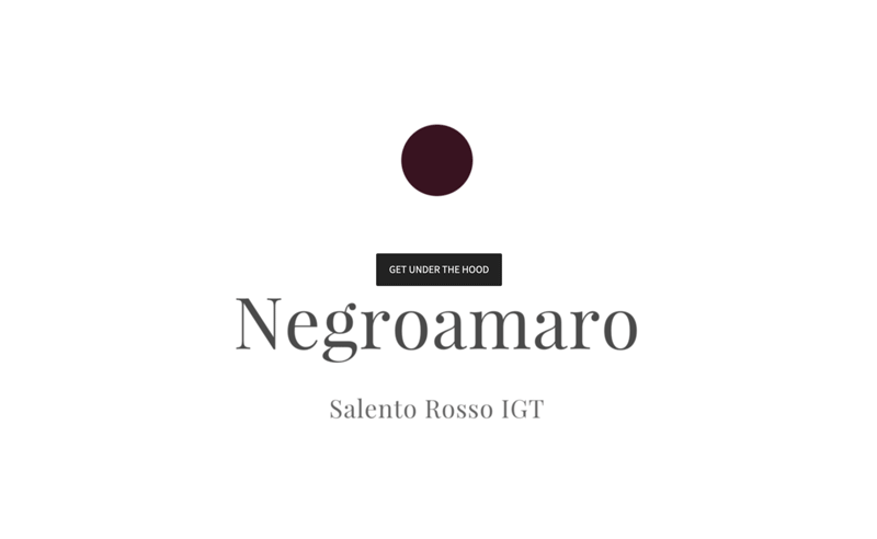
Playfair Display is a transitional design. It’s an ideal font for titles and headlines. It’s a great serif for fashion and editorial.
Best Pairing: Poppins, Georgia, Roboto, Muli, Montserrat, Work Sans, Open Sans, Heebo, Circular, Lato
Fira Sans
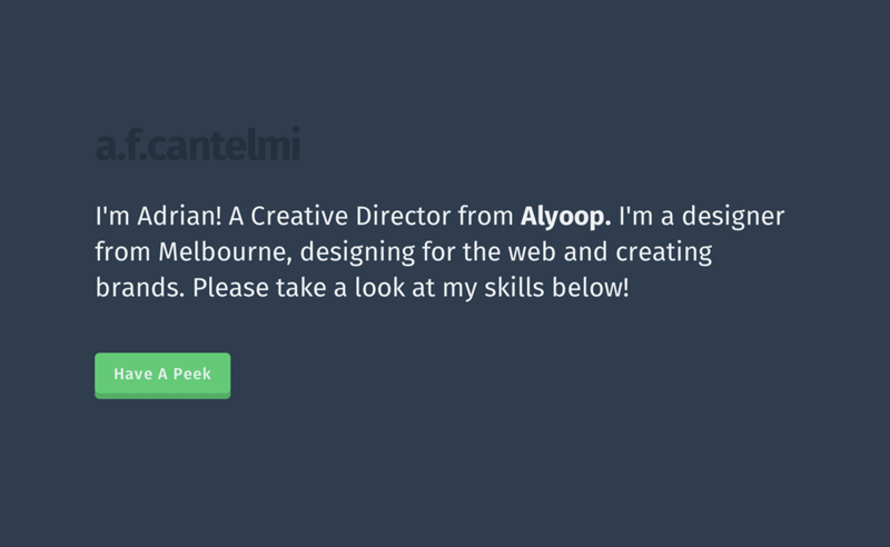
Fira Sans is another one of the best open-source fonts that can accommodate a wide variety of devices. It’s very popular in Poland and the United States. Fira Sans is best for heading and body text font. The Fira Font family is available in three different widths, and each is accompanied by italics styles.
Best Pairing: Roboto, Open Sans, and Montserrat
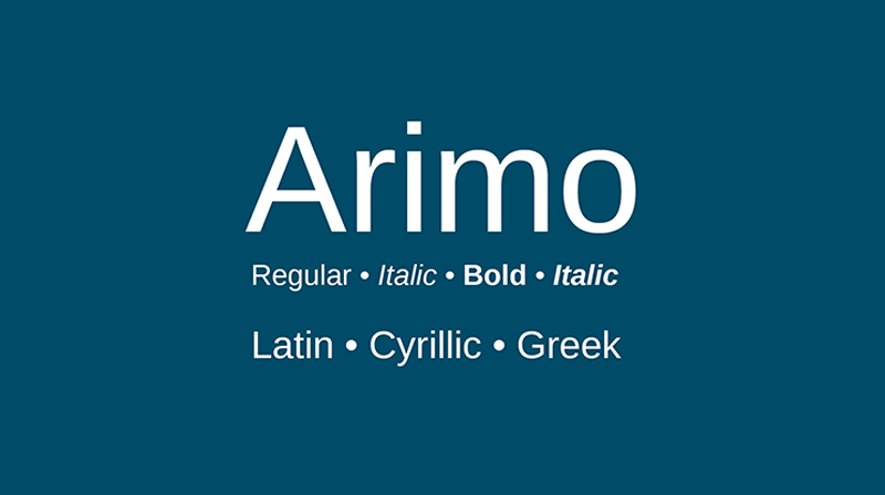
Arimo
Arimo font is a Sans-Serif font designed by Steve Matteson. This innovative, refreshing version of the Sans-Serif design is compatible with Arial™. You can use this font for enhanced on-screen readability.
Best Pairing: Aleo and FS Sinclair
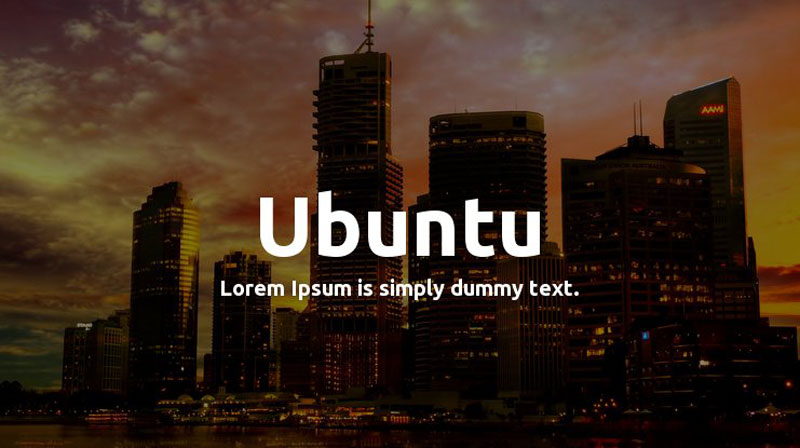
Ubuntu
Ubuntu is an OpenType-based humanist typeface. This Sans-Serif font was designed as the default font for Ubuntu operating system for clarity on desktop and mobile computing screens.
Best Pairing: Prompt, Kreon, Source Sans Pro, Cabin, Rokkit, Lora
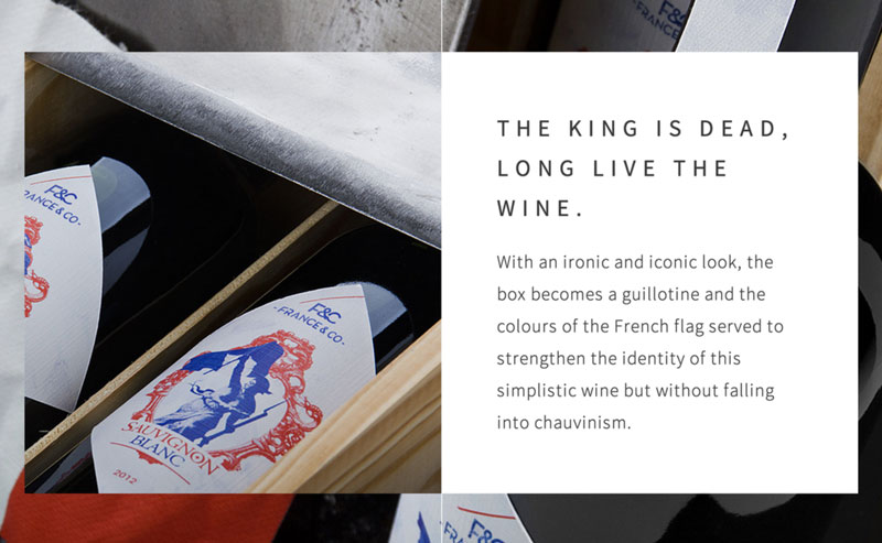
Noto Sans
Designed by Google, Noto Sans is intended to remove tofu from the Internet. The font is visually attractive across different languages. In addition, it works well as a heading and body font.
Best Pairing: Open Sans, Noto Serif, and Inconsolata
Source Sans Pro
Source Sans Pro is the first open-source typeface family by Adobe. It’s very popular in the United States and is mainly used in user interfaces. Source Sans Pro works well when used as a heading and body font.
Best Pairing: Open Sans, Lato, Merriweather, Bitter, Cabin, Roboto, PT Sans, and Open Sans
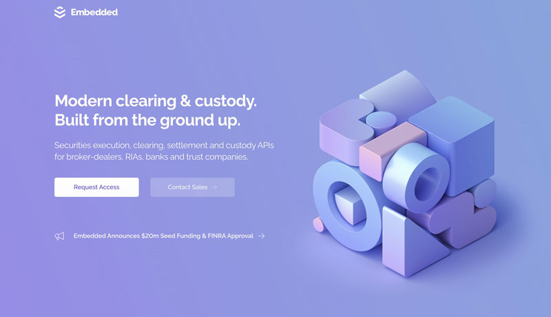
Raleway
Raleway is a well-designed sans-serif typeface family designed by Matt McInerney. This relatively new font includes many styles. It’s well-suited for body text and headings. Nine weights of the Raleway Font Family make it great for bold headers and subheaders.
Best Pairing: Montserrat, Open Sans, and Roboto
Lora
Lora is another best font for Divi websites. This well-balanced font performs equally well in print and on screens. This brings an outstanding contrast and a memorable look to your creative projects. In addition, it’s a wonderful font for body text.
Best Pairing: Alegreya, Montserrat, Ubuntu, Nunito, Merriweather, Source Sans Pro, Roboto, Open Sans
Font choice is very important for website designs. As you see, some fonts feel serious and warm, while others lend a sense of comfort and friendliness to your designs. So, be careful when choosing fonts for your website.
Navkiran Dhaliwal
Navkiran is an experienced technical writer with 10+ years of industry experience. Her writing skills and technical knowledge may be confirmed by reputed clients all over the world.



A precious collection, thank you.
On my phone, would love to be able to pinch zoom into the examples.