8 of the Best Landing Page Design Tips to Use in 2023


From alluring products to reliable services, everything can be promoted online. Wondering what helps with the promotion? Well, the answer is landing pages.
Landing pages are renowned for being a helpful marketing strategy. These pages help in better promotion of products and services. Besides its benefits, a landing page should be developed in an efficient manner. It should have all the relevant entities to convert the visitors into clients.
Today, we will be talking about the same. In this article, we will be discussing eight effective practices for designing a landing page.
Best Practices for a Landing Page Design
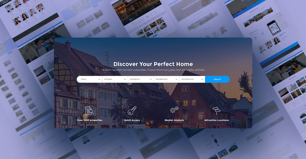
Landing pages are one of the best ways to get user traffic and brand buildup. One can also consider it as a sound PPC strategy for their business. Not only will it help in creating conversions, but it will also make a good customer base.
These pages render a great first impression. It is efficient for solid customer relationships and successful marketing campaigns. Here are some of the effective practices you can try to design a landing page.

The Minimal the Better
When it comes to web designing, it’s best to keep things less complex. Presenting information in a simplistic manner is way better than an invasive approach. You should keep the design clean and simple.
It helps the visitors to stay focused on the product and call to action. It’s also recommended to select a large font for easy reading. To ensure better quality, you should check the pages in different resolutions. This will help people to view the content regardless of their monitor. And, of course, you should check whether the layout is mobile-friendly or not.
Readers do not like additional inputs all over the page. That’s because they lose their focus from the primary information. So, make sure that the page is filled with white space.
Also, maintain a proper layout symmetry for an attractive outlook and accurate guidance. It helps the users to comprehend where the page intends to lead them. You can also research some web designing trends to get some idea about impressive page layouts.

Page Content
Now that you know the layout let’s move on to the next most important thing in a landing page. And that is the content. When it comes to the content of the landing page, it’s always better to be on-point. Readers do not like unnecessary information.
It should be related to the services or products you are selling. Too much information can irritate the reader, making them leave the page instantly. Also, it’s best to use plain and simple language. They should connect with your content without any hassle. Here are some of the entities that affect the conversion rate
Heading
Think like a reader. What is the first thing you see on opening any content? Of course, the heading. The heading is the first entity to impact the conversion rate. However, you have to be creative with that too. The heading should involve the thing you provide on the landing page. It must clearly signify the perks of the products.
Subheading
Now that your client knows what your services offer, they will move to the subheading. There they will comprehend further about the services. It’s also an efficient way to share unique value propositions or UVP. However, UVP can be pushed to the headings as well.
There should be a connection between both the headings and subheadings. This will help encourage the users to click the CTA button immediately.
Short Forms
After impressive landing-page content, the user would surely want to choose your services. However, a never-ending form can turn the table otherwise. A user likes short forms with fewer sections to fill. If you go overboard with the sections, it’s likely to backfire.
While the name and email addresses are acceptable, it’s best to eliminate unnecessary fields like DoB and contact numbers. The users might hesitate to provide such information.
To determine the form length, you should try filling the forms yourself. Make sure to keep a client-like approach to comprehend the entire scenario.
Call to Action
CTA or call to action buttons can convert visitors into customers. Just like any other entity of a landing page, it’s essential to be creative with these too.
It would be best if you always placed the CTA button at the page bottom or top. If not so, you can go for a distinct approach with a floating CTA button. Make sure to double-check the CTA precisely. It should be promising and free from any confusion.

Build Your Reliability
Your landing page is useless if it’s not trustworthy. There should be an efficient use of press mentions, testimonials, statistics, and customers.
Be it testimonials or trust badges, each of these entities influences the users. You can always look for examples of testimonials and badges to get a better understanding.
With that being said, make sure to feature the logos for the famous brand (you have worked with) as trust badges. You can also add the achievements or any received endorsement on the page. Overall, these entities will render confidence among the users to opt for your services.
They will scroll down to hit the CTA button and try your assistance. Make sure to clean and precise with the display of the logos. It’s best to keep it appealing for a better result. Remember that people are still hesitant about choosing unknown business services. Thus, if you do not look reliable, they might not move forward.
Apart from adding genuine reviews, you can incorporate safe payment options and a money-back guarantee. However, these options should be visible at an appropriate place.

Add Appropriate Images
Just like textual content, you can certainly enhance the landing page with images too. Human beings have the tendency to grasp information in a better way with pictures. With that being said, this concept can be utilized for presenting the content. Visual prompts can be used for rendering extra information.
It’s best to opt for professional photographers who have experience in distinct visual tactics. These techniques can be utilized to show the product and services in an efficient manner. As landing pages require a minimalistic approach, images are likely to gather extensive attention. So, make sure that the image you use is high-in-quality. It should be crisp and clear in appearance.
Adding large images can influence the website’s performance. It can also affect the conversion rates negatively. So, you should maintain a balance between high-resolution pictures and performance.

The Correct Font
Another common complaint of users concerning landing pages involves the font/font size. So, besides other entities of the landing page, you have to pay much focus on the content fonts. Another common complaint of users concerning landing pages involves the font/font size. So, besides other entities of the landing page, you have to pay much focus on the content fonts.
As CTAs are the main entities of a page, make sure that it has the appropriate font too. To simplify things, here we have mentioned some of the tips that you can follow
- Select a font that supports distinct screen sizes.
- Add white space within the content to enhance its readability.
- Do not complex the landing page with diverse fonts.
- Some fonts work well for a larger section—for example, serif fonts.
While these are some of the suggestions, it’s best to see which ones work for your landing page.

Go for A/B Testing
Besides creating a landing page, you must know whether it’s working precisely or not. Regardless of adding every relevant entity, it’s pretty pointless if the landing page crashes for some reason. Besides creating a landing page, you must know whether it’s working precisely or not. Regardless of adding every relevant entity, it’s pretty pointless if the landing page crashes for some reason.
Thus, check if the page can bring conversions. For that, you can use A/B Testing. A/B testing is an efficient way to collect helpful analytics related to users’ interaction with the landing page. As per the user traffic, you can comprehend the areas for testing. From watching a video to sending lead forms, anything could be checked.
There are numerous tools available for the same. Here are some of the entities on which you can perform A/B testing
- Headings
- Call to actions
- Images/graphics
- Trust signals
- Press quotes
- Navigation links and many more

Include Social Sharing
Wondering the best way to enhance your brand name? Well, it’s easy. Start including social sharing icons for the landing page.
It’s one of the best ways to promote the campaign. Now, it’s not necessary to involve all the platforms. You can opt for the ones which your customer uses. It’s best to retain any cluttering. Besides, you can also add an email forwarding option. That’s because people still opt for such modes too.

Videos for USP
In the case of video landing pages, you can utilize videos for an efficient illustration of UVP. While adding video content is voluntary, it can render a better product/service illustration. The view is not possible with the text or images.
Adding something emotional and alluring can render much traffic. It can encourage the viewers to click on the CTA without thinking twice. Videos are a great way to provide value and better promotion. From short films to reviews, a lot can be done to market the services.

Landing Page Designing: 3 Mistakes to Avoid
Besides these practices, you should also be familiarised with the common mistakes related to landing page designing. Here are some of the mistakes to watch out for (with its solution)
Say no to the Bland Language.
Watch out for the language you use on the landing page. That’s because a landing page renders an in-depth knowledge of the brand personality. If you end up using bland language, you might lose customers instead of gaining them. Readers do not like boring content.
Any unusual additions in the content can make you lose the clients instantly. So, it’s recommended to keep the language friendly and engaging. Your CTA should be inviting and impressive. There should be explicit mentions of all the relevant information.
Large Text Chunks
Nobody likes a never-ending piece of content when looking for something urgently. Customers want a concise and precise way to render the information.
With that being said, you should keep the sentences and paragraphs short. You can add headings and subheadings to break the contents. Apart from that, try to add more bulleted points. All these points are likely to enhance the readability of the content.
Broken CTA
A broken CTA can impact the conversion rates too. Apart from the contents and design, your CTA should work too. Make sure that the download button in the CTA does its job. In the case of emails, check if they are being sent accurately.
The forms should be directed to the correct person. For that, you must come up with reliable WordPress contact form plugins. This is important if the landing page is developed for the client.
If these parameters are not checked, it can cause a negative impact on the business. CTA buttons should be clickable and working precisely. Now, to prevent such scenarios, make sure to check the CTA buttons for yourself. It will give you a detailed idea of its working principle.
Other Errors Concerning Landing Page
Apart from the ones given above, there are a few things that can go wrong with a landing page. Let’s take a quick look into the same for a better idea
- Slow page loading speed
- Not being mobile-friendly
- Clumsy copy content
- No use of image or videos
- More than one CTA
- Complex page layout
- Poor typography
By implementing these practices and eliminating the errors, you can end up with a desirable landing page. Make sure to be considerate of every essential entity when creating these landing pages. Besides, if these steps sound chaotic, you can consult professionals to provide proper assistance with the same.
So, that’s it. These were some of the best ways by which you can design a landing page. From a simple layout to social sharing, a lot could be done with these practices.
You should also keep your landing page free from bland language use, large text chunks, and broken CTAs. Overall, these entities will help you get an appropriate landing page for the business. If you liked this article, stay glued to us for more exciting reads.
Navkiran Dhaliwal
Navkiran is an experienced technical writer with 10+ years of industry experience. Her writing skills and technical knowledge may be confirmed by reputed clients all over the world.
Use coupon code SLIDER15 at checkout!
Nice articles here, thank you.
Just a wee note – on points 5 and 6 you’ve duplicated your first sentence or two.