9 Divi Gradient Buttons You Can Download for Free
Buttons are an essential part of your user experience. This element will impact your website’s interaction design heavily. It’s like a middleman between your products or services and your target customers. Buttons are powerful enough to compel your audient to convert and take action.
Regardless of what type of Divi website you have, whether it’s e-commerce or a personal blog, you must create journeys that end in goal conversion to achieve success. And using buttons is one of the best ways to improve your conversion rate.
Buttons have always been a major part of a website’s earlier functions that web developers apply. The design element helps visitors better comprehend how to make their way around the new online environment. As websites and its design evolved, so did buttons.
Nevertheless, it seems like the number of sites taking advantage of its effectiveness is declining. But if you want to encourage your visitors to take action and improve conversion, you must have a clearly-identifiable button.
In this tutorial article, we’ll show you how to easily create a nice, animated gradient button in Divi. On top of that, we’ll provide you with a freebie where you will be able to download a Divi section. Also, you can import it to the Divi Library to use straight away.
- You will need to have the Divi Theme by Elegant Themes installed.
- You can follow this tutorial or download our Ready-To-Use Divi Layout with all code embedded.
Best Practices To Remember When Designing Buttons
➡️ Buttons Should Look Like Buttons
At first glance, a button should be very clear that it is a button. Being creative is always a good thing. But avoid getting too excited with your design and going over the top. You want the style of your button to look actionable to your users. Likewise, you also don’t want to make something too basic.
Also, links are not buttons. Bold text or those with underline may have caught the attention of users during the good old days, but that’s no longer impressive these days. Basically, you want to separate your button from the entire text and give it is its own space. Additionally, you want it to be bigger than the surrounding text. Lastly, its background color should be different, or at the very least, have a border.
➡️ Buttons Should Have A Uniform Design
Although all the buttons on your website do not have to look alike, their design principles should be similar to be recognizable. It’s fine to use a variety of colors. You can get away with as long as it serves a purpose. For instance, to indicate moving forward, you can use green. Meanwhile, red indicates moving backward.
The same concept applies to font style, size, and weight. You should apply these cleverly in a way that they emphasize the course of action you want your audience to take. So if the “buy now” button of your product is not the most noticeable CTA on that particular page, then you may want to redesign and make it more obvious.
➡️ Users Should Not Guess The Meaning Of The Button
Any user will not likely press a button labeled as “cancel.” What exactly are you asking them to cancel? The entire chain of actions on your Divi site or simply the last action they took? A well-designed button always contains a brief explanation of what its function is. So instead of cancel, you can put something like cancel the booking or cancel your subscription.
➡️ Make Your Buttons Engaging
Every button on your Divi website should offer visual feedback or interaction. When your users tap or click the button, they’ll be expecting its user interface to respond with relevant feedback. The feedback may either be visual or audible. When site visitors do not have any feedback, they may think that the system did not accept their command and do the action again. This usually causes several actions that are unnecessary.
Why is this important? Well, as humans, we always expect some kind of feedback after interacting with an object. It may be in visual, audio, or haptic form, or just about anything that confirms the interaction was registered.
Awesome Animated Gradient Button Tutorials
In this tutorial, we will show you how to craft beautiful yet functional animated gradient buttons in Divi. By default, the Divi button mode enables you to add a gradient background to the button. Likewise, you can set different gradient backgrounds when you hover your mouse over the button.
However, one issue you’ll encounter is that these gradients will not animate as smoothly as you’d want them to be when you mouseover. Moreover, the gradient will change without any transitions, breaking the ever-important user experience.
So for this tutorials, we will not utilize the button module settings of Divi. Instead, we will add all customization with a bit of help from CSS. To do this, we will use “before” pseudo-class to display the default button background. Then, we will modify the opacity of “before” class to 0 with a pretty neat fade-out transition. Doing so will allow the button to change smoothly from one background to another when hovering the mouse over it.
To achieve the final result we cannot use default Divi Button customization settings so Use Custom Style For Button in Design → Button should remain disabled. Enabling this option will result in losing our customization.
For generating gradients, you can use the free Gradient Generator from Colorzilla, which we used in this tutorial. We also have an article about beautiful color gradients to inspire you on your next design project you can check out.
So without further ado, here are 9 stunning animated gradient designs you can try.
Animated Gradient Button with Grow Hover Effect
For this button sample we will use a nice orange gradient and add a zoom-in animation on hover.
In firts step we will add custom classes to our Button. To do that, open Button module settings and go to Advanced → CSS ID & Classes and add gradient_btn_style_1 gradientButton class to the CSS Class field.
We will also use modules Custom CSS fields to add some general button styling, like border-radius. Go to Advanced → Custom CSS tab and add the following code to Main Element field:
There is one more thing we will do in Button module settings. By default, our button will display an arrow button icon. For this tutorial, I have decided to remove it, as I think there are enough whistles with gradient animation and grow effect, but if you want to keep the icon, you can skip this step. I will also show how to change this icon in 3rd tutorial.
The icon is added to the button via after class. To remove button icon go to Advanced → Custom CSS and add display:none; to After field.
Our button is almost ready. We only need to add some custom CSS to make it fully working.This CSS can be added to Divi → Theme Options → Custom CSS or to the Divi child theme style.css if you are using one.
|
1 2 3 4 5 6 7 8 9 10 11 12 13 14 15 16 17 18 19 20 21 22 23 24 25 26 27 28 29 30 31 32 33 34 35 36 37 38 39 40 41 42 43 44 45 46 47 48 49 50 51 52 53 |
/*------------------------------------*/ /**** Gradient Button Style 1 Grow ****/ /*------------------------------------*/ .gradient_btn_style_1 { background: #e34458; /* Old browsers */ background: -moz-linear-gradient(left, #e34458 0%, #ee9345 100%); /* FF3.6-15 */ background: -webkit-linear-gradient(left, #e34458 0%,#ee9345 100%); /* Chrome10-25,Safari5.1-6 */ background: linear-gradient(to right, #e34458 0%,#ee9345 100%); /* W3C, IE10+, FF16+, Chrome26+, Opera12+, Safari7+ */ filter: progid:DXImageTransform.Microsoft.gradient( startColorstr='#e34458', endColorstr='#ee9345',GradientType=1 ); /* IE6-9 */ padding: 15px 40px; color: #fff; box-shadow: 0 10px 30px #210f3840; } .gradient_btn_style_1:before { /* Permalink - use to edit and share this gradient: http://colorzilla.com/gradient-editor/#ee9245+0,e34558+100 */ background: #ee9245; /* Old browsers */ background: -moz-linear-gradient(left, #ee9245 0%, #e34558 100%); /* FF3.6-15 */ background: -webkit-linear-gradient(left, #ee9245 0%,#e34558 100%); /* Chrome10-25,Safari5.1-6 */ background: linear-gradient(to right, #ee9245 0%,#e34558 100%); /* W3C, IE10+, FF16+, Chrome26+, Opera12+, Safari7+ */ filter: progid:DXImageTransform.Microsoft.gradient( startColorstr='#ee9245', endColorstr='#e34558',GradientType=1 ); /* IE6-9 */ } .gradient_btn_style_1:hover { padding: 15px 40px !important; transform: scale(1.04); box-shadow: 0 15px 40px #210f3840; } .gradientButton { display: inline-block; background-size: 100%; position: relative; z-index: 100; } .gradientButton:before { border-radius: inherit; content:''; display: block; margin: -15px -40px; height: 100%; width: 100%; position: absolute; z-index: -100; opacity: 0; -webkit-transition: all .5s ease-in-out; -moz-transition: all .5s ease-in-out; -o-transition: all .5s ease-in-out; -ms-transition: all .5s ease-in-out; transition: all .5s ease-in-out; } .gradientButton:hover:before { opacity: 1; } |
Square Gradient Button with Rotate Animation
For this button style we will use green gradient and rotate animation.
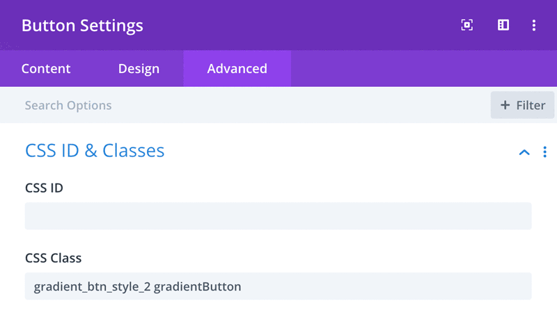
In firts step we will add custom classes to our Button. To do that, open Button module settings and go to Advanced → CSS ID & Classes and add gradient_btn_style_2 gradientButton class to the CSS Class field.
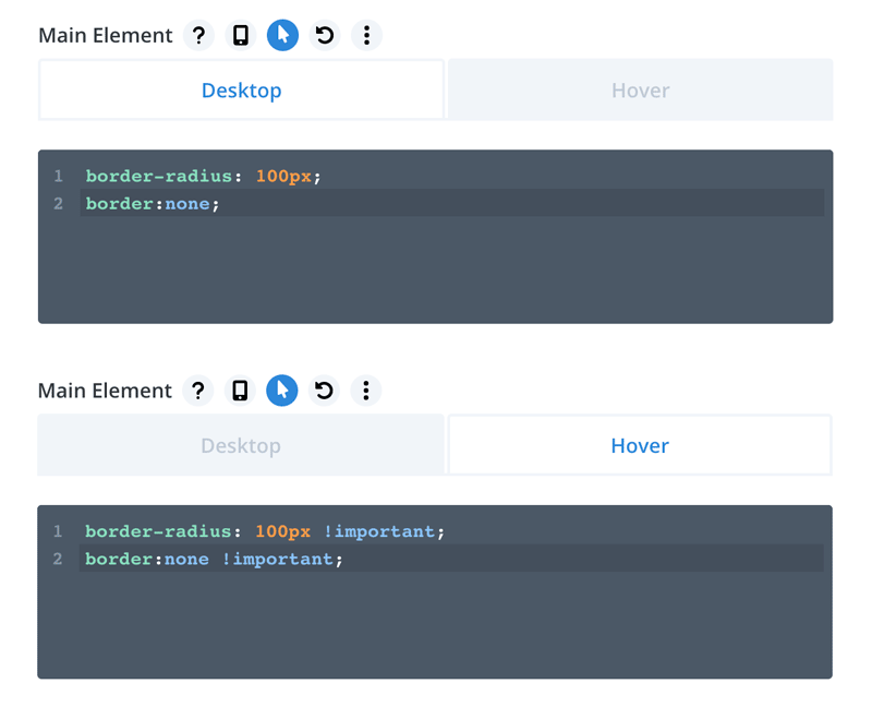
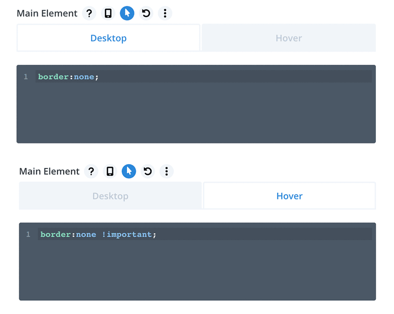
We will also use modules Custom CSS fields to remove border and icon from the button. Go to Advanced → Custom CSS tab and add the following code to Main Element field (for Desktop and Hover):
To remove icon go to Advanced → Custom CSS tab and add display:none; to After field:
Add the following CSS to Divi → Theme Options → Custom CSS or to the Divi child theme style.css:
|
1 2 3 4 5 6 7 8 9 10 11 12 13 14 15 16 17 18 19 20 21 22 23 24 25 26 27 28 29 30 31 32 33 34 35 36 37 38 39 40 41 42 43 44 45 46 47 48 49 50 51 52 53 54 |
/*--------------------------------------------*/ /**** Gradient Button Style 2 Rotate Left ****/ /*-------------------------------------------*/ .gradient_btn_style_2 { background: #02AABD; /* Old browsers */ background: -moz-linear-gradient(left, #02AABD 0%, #00CDAC 100%); /* FF3.6-15 */ background: -webkit-linear-gradient(left, #02AABD 0%,#00CDAC 100%); /* Chrome10-25,Safari5.1-6 */ background: linear-gradient(to right, #02AABD 0%,#00CDAC 100%); /* W3C, IE10+, FF16+, Chrome26+, Opera12+, Safari7+ */ filter: progid:DXImageTransform.Microsoft.gradient( startColorstr='#02AABD', endColorstr='#00CDAC',GradientType=1 ); /* IE6-9 */ padding: 15px 40px; color: #fff; box-shadow: 0 10px 30px #210f3840; } .gradient_btn_style_2:before { background: #00CDAC; /* Old browsers */ background: -moz-linear-gradient(left, #00CDAC 0%, #02AABD 100%); /* FF3.6-15 */ background: -webkit-linear-gradient(left, #00CDAC 0%,#02AABD 100%); /* Chrome10-25,Safari5.1-6 */ background: linear-gradient(to right, #00CDAC 0%,#02AABD 100%); /* W3C, IE10+, FF16+, Chrome26+, Opera12+, Safari7+ */ filter: progid:DXImageTransform.Microsoft.gradient( startColorstr='#00CDAC', endColorstr='#02AABD',GradientType=1 ); /* IE6-9 */ } .gradient_btn_style_2:hover { padding: 15px 40px !important; -webkit-transform: rotateZ(-5deg); -ms-transform: rotateZ(-5deg); transform: rotateZ(-5deg); box-shadow: 0 15px 40px #210f3840; } .gradientButton { display: inline-block; background-size: 100%; position: relative; z-index: 100; } .gradientButton:before { border-radius: inherit; content:''; display: block; margin: -15px -40px; height: 100%; width: 100%; position: absolute; z-index: -100; opacity: 0; -webkit-transition: all .5s ease-in-out; -moz-transition: all .5s ease-in-out; -o-transition: all .5s ease-in-out; -ms-transition: all .5s ease-in-out; transition: all .5s ease-in-out; } .gradientButton:hover:before { opacity: 1; } |
Animated Gradient Button with Icon
For this button style we will use gradient animation and icon. Since we cannot use Divi default module settings to keep a nice gradient transition, we will need to tweak the icon via Custom CSS in Button module settings. Firstly lets add custom class to our button.
Open Button module settings and go to Advanced → CSS ID & Classes and add:
gradient_btn_style_3 gradientButton class to the CSS Class field.
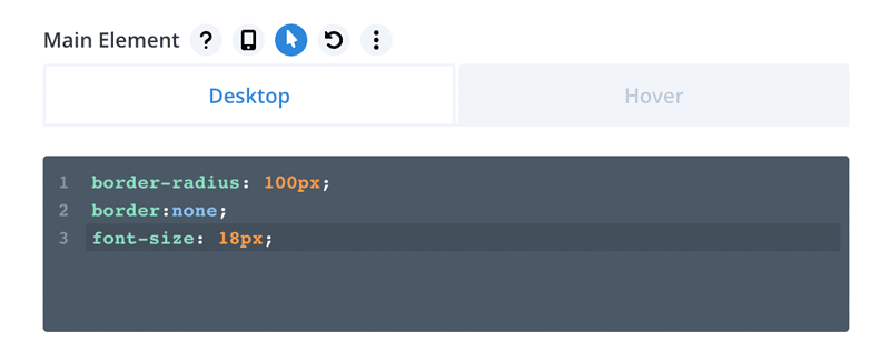
In this next step we will add some custom CSS to the Button module settings to remove button border and tweak the icon. Go to Advanced → Custom CSS tab and add the following code to Main Element field:
border-radius: 100px;
border:none;
font-size: 18px;
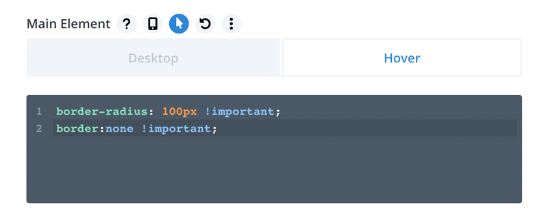
The similar code must be also added to Main Element on Hover. Click the cursor icon located above the Main Element field, then click the Hover tab and add the following code:
border-radius: 100px !important;
border:none !important;
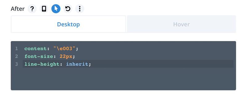
The last thing in module settings we need to do is to add some code to change the icon and improve its appearance. The full list of the Divi Icons with shortcodes you can use can be found here.
content: “\e003”;
font-size: 22px;
line-height: inherit;
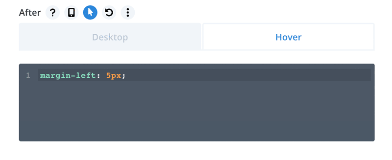
There is one more tweak needed. As you noticed, the icon on hover is very close to the button text. To fix this issue we need to add margin-left: 5px; to After field on Hover:
In this last step add the following CSS to Divi → Theme Options → Custom CSS:
|
1 2 3 4 5 6 7 8 9 10 11 12 13 14 15 16 17 18 19 20 21 22 23 24 25 26 27 28 29 30 31 32 33 34 35 36 37 38 39 40 41 42 43 44 45 46 47 48 49 50 51 |
/*-------------------------------------*/ /**** Gradient Button Style 3 Icon ****/ /*------------------------------------*/ .gradient_btn_style_3 { background: #EA8D8D; /* Old browsers */ background: -moz-linear-gradient(left, #EA8D8D 0%, #A890FE 100%); /* FF3.6-15 */ background: -webkit-linear-gradient(left, #EA8D8D 0%,#A890FE 100%); /* Chrome10-25,Safari5.1-6 */ background: linear-gradient(to right, #EA8D8D 0%,#A890FE 100%); /* W3C, IE10+, FF16+, Chrome26+, Opera12+, Safari7+ */ filter: progid:DXImageTransform.Microsoft.gradient( startColorstr='#EA8D8D', endColorstr='#A890FE',GradientType=1 ); /* IE6-9 */ padding: 15px 40px; color: #fff; box-shadow: 0 10px 30px #210f3840; } .gradient_btn_style_3:before { background: #A890FE; /* Old browsers */ background: -moz-linear-gradient(left, #A890FE 0%, #EA8D8D 100%); /* FF3.6-15 */ background: -webkit-linear-gradient(left, #A890FE 0%,#EA8D8D 100%); /* Chrome10-25,Safari5.1-6 */ background: linear-gradient(to right, #A890FE 0%,#EA8D8D 100%); /* W3C, IE10+, FF16+, Chrome26+, Opera12+, Safari7+ */ filter: progid:DXImageTransform.Microsoft.gradient( startColorstr='#A890FE', endColorstr='#EA8D8D',GradientType=1 ); /* IE6-9 */ } .gradient_btn_style_3:hover { padding: 15px 40px !important; box-shadow: 0 15px 40px #210f3840; } .gradientButton { display: inline-block; background-size: 100%; position: relative; z-index: 100; } .gradientButton:before { border-radius: inherit; content:''; display: block; margin: -15px -40px; height: 100%; width: 100%; position: absolute; z-index: -100; opacity: 0; -webkit-transition: all .5s ease-in-out; -moz-transition: all .5s ease-in-out; -o-transition: all .5s ease-in-out; -ms-transition: all .5s ease-in-out; transition: all .5s ease-in-out; } .gradientButton:hover:before { opacity: 1; } |
Animated Gradient Button with Shrink Hover Effect
In this button style we will use a beautiful and subtle blue animated gradient. We will also add a nice hover animation, so the button will shrink on hover.
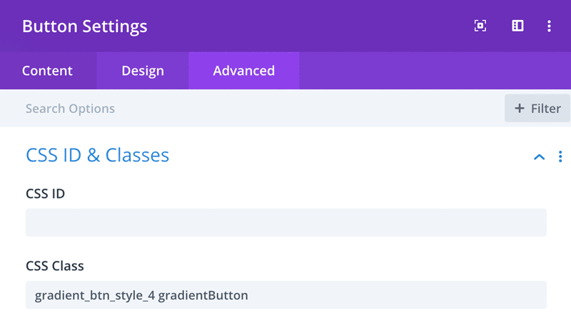
Open Button module settings and go to Advanced → CSS ID & Classes and add:
gradient_btn_style_4 gradientButton class to the CSS Class field.
We will also use modules Custom CSS fields to add some general button styling, like border-radius. Go to Advanced → Custom CSS tab and add the following code to Main Element field (Desktop and Hover):
The icon is added to the button via after class. To remove button icon go to Advanced → Custom CSS and add display:none; to After field.
In this last step we only need to add the following CSS to Divi → Theme Options → Custom CSS:
|
1 2 3 4 5 6 7 8 9 10 11 12 13 14 15 16 17 18 19 20 21 22 23 24 25 26 27 28 29 30 31 32 33 34 35 36 37 38 39 40 41 42 43 44 45 46 47 48 49 50 51 52 |
/*---------------------------------------*/ /**** Gradient Button Style 4 Shrink ****/ /*--------------------------------------*/ .gradient_btn_style_4 { background: #4E65FF; /* Old browsers */ background: -moz-linear-gradient(left, #4E65FF 0%, #92EFFD 100%); /* FF3.6-15 */ background: -webkit-linear-gradient(left, #4E65FF 0%,#92EFFD 100%); /* Chrome10-25,Safari5.1-6 */ background: linear-gradient(to right, #4E65FF 0%,#92EFFD 100%); /* W3C, IE10+, FF16+, Chrome26+, Opera12+, Safari7+ */ filter: progid:DXImageTransform.Microsoft.gradient( startColorstr='#4E65FF', endColorstr='#92EFFD',GradientType=1 ); /* IE6-9 */ padding: 15px 40px; color: #fff; box-shadow: 0 10px 30px #210f3840; } .gradient_btn_style_4:before { background: #92EFFD; /* Old browsers */ background: -moz-linear-gradient(left, #92EFFD 0%, #4E65FF 100%); /* FF3.6-15 */ background: -webkit-linear-gradient(left, #92EFFD 0%,#4E65FF 100%); /* Chrome10-25,Safari5.1-6 */ background: linear-gradient(to right, #92EFFD 0%,#4E65FF 100%); /* W3C, IE10+, FF16+, Chrome26+, Opera12+, Safari7+ */ filter: progid:DXImageTransform.Microsoft.gradient( startColorstr='#92EFFD', endColorstr='#4E65FF',GradientType=1 ); /* IE6-9 */ } .gradient_btn_style_4:hover { padding: 15px 40px !important; transform: scale(0.96); box-shadow: 0 15px 40px #210f3840; } .gradientButton { display: inline-block; background-size: 100%; position: relative; z-index: 100; } .gradientButton:before { border-radius: inherit; content:''; display: block; margin: -15px -40px; height: 100%; width: 100%; position: absolute; z-index: -100; opacity: 0; -webkit-transition: all .5s ease-in-out; -moz-transition: all .5s ease-in-out; -o-transition: all .5s ease-in-out; -ms-transition: all .5s ease-in-out; transition: all .5s ease-in-out; } .gradientButton:hover:before { opacity: 1; } |
Square Button with Rotate Hover Effect
For this button style we will use green gradient and rotate animation.
In firts step we will add custom classes to our Button. To do that, open Button module settings and go to Advanced → CSS ID & Classes and add gradient_btn_style_5 gradientButton class to the CSS Class field.
For this button we will also use modules Custom CSS fields to remove border and icon from the button. Go to Advanced → Custom CSS tab and add the following code to Main Element field (for Desktop and Hover):
To remove icon go to Advanced → Custom CSS tab and add display:none; to After field:
In this last step we only need to add the following CSS to Divi → Theme Options → Custom CSS:
|
1 2 3 4 5 6 7 8 9 10 11 12 13 14 15 16 17 18 19 20 21 22 23 24 25 26 27 28 29 30 31 32 33 34 35 36 37 38 39 40 41 42 43 44 45 46 47 48 49 50 51 52 53 54 55 |
/*--------------------------------------------*/ /**** Gradient Button Style 5 Rotate Right ****/ /*--------------------------------------------*/ .gradient_btn_style_5 { background: #C33764; /* Old browsers */ background: -moz-linear-gradient(left, #C33764 0%, #1D2671 100%); /* FF3.6-15 */ background: -webkit-linear-gradient(left, #C33764 0%,#1D2671 100%); /* Chrome10-25,Safari5.1-6 */ background: linear-gradient(to right, #C33764 0%,#1D2671 100%); /* W3C, IE10+, FF16+, Chrome26+, Opera12+, Safari7+ */ filter: progid:DXImageTransform.Microsoft.gradient( startColorstr='#C33764', endColorstr='#1D2671',GradientType=1 ); /* IE6-9 */ padding: 15px 40px; color: #fff; box-shadow: 0 10px 30px #210f3840; } .gradient_btn_style_5:before { /* Permalink - use to edit and share this gradient: http://colorzilla.com/gradient-editor/#ee9245+0,e34558+100 */ background: #1D2671; /* Old browsers */ background: -moz-linear-gradient(left, #1D2671 0%, #C33764 100%); /* FF3.6-15 */ background: -webkit-linear-gradient(left, #1D2671 0%,#C33764 100%); /* Chrome10-25,Safari5.1-6 */ background: linear-gradient(to right, #1D2671 0%,#C33764 100%); /* W3C, IE10+, FF16+, Chrome26+, Opera12+, Safari7+ */ filter: progid:DXImageTransform.Microsoft.gradient( startColorstr='#1D2671', endColorstr='#C33764',GradientType=1 ); /* IE6-9 */ } .gradient_btn_style_5:hover { padding: 15px 40px !important; -webkit-transform: rotateZ(5deg); -ms-transform: rotateZ(5deg); transform: rotateZ(5deg); box-shadow: 0 15px 40px #210f3840; } .gradientButton { display: inline-block; background-size: 100%; position: relative; z-index: 100; } .gradientButton:before { border-radius: inherit; content:''; display: block; margin: -15px -40px; height: 100%; width: 100%; position: absolute; z-index: -100; opacity: 0; -webkit-transition: all .5s ease-in-out; -moz-transition: all .5s ease-in-out; -o-transition: all .5s ease-in-out; -ms-transition: all .5s ease-in-out; transition: all .5s ease-in-out; } .gradientButton:hover:before { opacity: 1; } |
Rounded Gradient Button with Bounce Hover Effect
For this button style we will use green gradient and rotate animation.
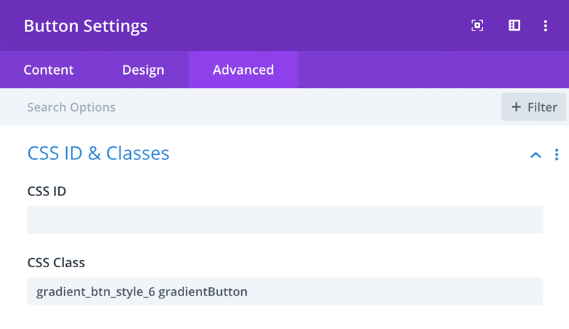
In firts step we will add custom classes to our Button. To do that, open Button module settings and go to Advanced → CSS ID & Classes and add gradient_btn_style_6 gradientButton class to the CSS Class field.
For this button style we will also use modules Custom CSS fields to add some general button styling, like border-radius. Go to Advanced → Custom CSS tab and add the following code to Main Element field (Desktop and Hover):
To remove icon go to Advanced → Custom CSS tab and add display:none; to After field:
In this last step, we will add some custom CSS with button styling and bounce animation. Add the following CSS to Divi → Theme Options → Custom CSS:
|
1 2 3 4 5 6 7 8 9 10 11 12 13 14 15 16 17 18 19 20 21 22 23 24 25 26 27 28 29 30 31 32 33 34 35 36 37 38 39 40 41 42 43 44 45 46 47 48 49 50 51 52 53 54 55 56 57 58 59 60 61 62 63 64 65 66 67 68 69 70 71 72 73 74 75 76 77 78 79 80 81 82 83 84 85 86 87 88 89 90 91 92 93 94 95 96 97 98 99 100 101 102 103 104 105 106 107 108 109 110 111 112 113 114 115 116 117 118 119 120 121 122 123 124 |
/*--------------------------------------*/ /**** Gradient Button Style 6 Bounce ****/ /*--------------------------------------*/ .gradient_btn_style_6 { background: #09203F; /* Old browsers */ background: -moz-linear-gradient(left, #09203F 0%, #537895 100%); /* FF3.6-15 */ background: -webkit-linear-gradient(left, #09203F 0%,#537895 100%); /* Chrome10-25,Safari5.1-6 */ background: linear-gradient(to right, #09203F 0%,#537895 100%); /* W3C, IE10+, FF16+, Chrome26+, Opera12+, Safari7+ */ filter: progid:DXImageTransform.Microsoft.gradient( startColorstr='#09203F', endColorstr='#537895',GradientType=1 ); /* IE6-9 */ padding: 15px 40px; color: #fff; box-shadow: 0 10px 30px #210f3840; } .gradient_btn_style_6:before { /* Permalink - use to edit and share this gradient: http://colorzilla.com/gradient-editor/#ee9245+0,e34558+100 */ background: #537895; /* Old browsers */ background: -moz-linear-gradient(left, #537895 0%, #09203F 100%); /* FF3.6-15 */ background: -webkit-linear-gradient(left, #537895 0%,#09203F 100%); /* Chrome10-25,Safari5.1-6 */ background: linear-gradient(to right, #537895 0%,#09203F 100%); /* W3C, IE10+, FF16+, Chrome26+, Opera12+, Safari7+ */ filter: progid:DXImageTransform.Microsoft.gradient( startColorstr='#537895', endColorstr='#09203F',GradientType=1 ); /* IE6-9 */ } .gradient_btn_style_6:hover { padding: 15px 40px !important; -webkit-animation: swing 1s ease; animation: swing 1s ease; -webkit-animation-iteration-count: 1; animation-iteration-count: 1; box-shadow: 0 15px 40px #210f3840; } .gradientButton { display: inline-block; background-size: 100%; position: relative; z-index: 100; } .gradientButton:before { border-radius: inherit; content:''; display: block; margin: -15px -40px; height: 100%; width: 100%; position: absolute; z-index: -100; opacity: 0; -webkit-transition: all .5s ease-in-out; -moz-transition: all .5s ease-in-out; -o-transition: all .5s ease-in-out; -ms-transition: all .5s ease-in-out; transition: all .5s ease-in-out; } .gradientButton:hover:before { opacity: 1; } /* Swing Animation */ @-webkit-keyframes swing { 15% { -webkit-transform: translateX(5px); transform: translateX(5px); } 30% { -webkit-transform: translateX(-5px); transform: translateX(-5px); } 50% { -webkit-transform: translateX(3px); transform: translateX(3px); } 65% { -webkit-transform: translateX(-3px); transform: translateX(-3px); } 80% { -webkit-transform: translateX(2px); transform: translateX(2px); } 100% { -webkit-transform: translateX(0); transform: translateX(0); } } @keyframes swing { 15% { -webkit-transform: translateX(5px); transform: translateX(5px); } 30% { -webkit-transform: translateX(-5px); transform: translateX(-5px); } 50% { -webkit-transform: translateX(3px); transform: translateX(3px); } 65% { -webkit-transform: translateX(-3px); transform: translateX(-3px); } 80% { -webkit-transform: translateX(2px); transform: translateX(2px); } 100% { -webkit-transform: translateX(0); transform: translateX(0); } } |
Animated Gradient Button with Move Up Hover Effect
For this button style we will use green gradient and rotate animation.
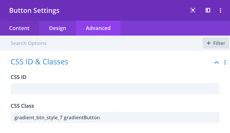
In firts step we will add custom classes to our Button. To do that, open Button module settings and go to Advanced → CSS ID & Classes and add gradient_btn_style_7 gradientButton class to the CSS Class field.
In this step we will add button border radius and will remove border. Go to Advanced → Custom CSS tab and add the following code to Main Element field (Desktop and Hover):
To remove icon go to Advanced → Custom CSS tab and add display:none; to After field:
In this last step, we will add some custom CSS with button styling and Move Up animation. Add the following CSS to Divi → Theme Options → Custom CSS:
|
1 2 3 4 5 6 7 8 9 10 11 12 13 14 15 16 17 18 19 20 21 22 23 24 25 26 27 28 29 30 31 32 33 34 35 36 37 38 39 40 41 42 43 44 45 46 47 48 49 50 51 52 53 |
/*---------------------------------------*/ /**** Gradient Button Style 7 Move Up ****/ /*---------------------------------------*/ .gradient_btn_style_7 { background: #764BA2; /* Old browsers */ background: -moz-linear-gradient(left, #764BA2 0%, #667EEA 100%); /* FF3.6-15 */ background: -webkit-linear-gradient(left, #764BA2 0%,#667EEA 100%); /* Chrome10-25,Safari5.1-6 */ background: linear-gradient(to right, #764BA2 0%,#667EEA 100%); /* W3C, IE10+, FF16+, Chrome26+, Opera12+, Safari7+ */ filter: progid:DXImageTransform.Microsoft.gradient( startColorstr='#764BA2', endColorstr='#667EEA',GradientType=1 ); /* IE6-9 */ padding: 15px 40px; color: #fff; box-shadow: 0 10px 30px #210f3840; } .gradient_btn_style_7:before { /* Permalink - use to edit and share this gradient: http://colorzilla.com/gradient-editor/#ee9245+0,e34558+100 */ background: #667EEA; /* Old browsers */ background: -moz-linear-gradient(left, #667EEA 0%, #764BA2 100%); /* FF3.6-15 */ background: -webkit-linear-gradient(left, #667EEA 0%,#764BA2 100%); /* Chrome10-25,Safari5.1-6 */ background: linear-gradient(to right, #667EEA 0%,#764BA2 100%); /* W3C, IE10+, FF16+, Chrome26+, Opera12+, Safari7+ */ filter: progid:DXImageTransform.Microsoft.gradient( startColorstr='#667EEA', endColorstr='#764BA2',GradientType=1 ); /* IE6-9 */ } .gradient_btn_style_7:hover { padding: 15px 40px !important; transform: translateY(-5px); box-shadow: 0 15px 40px #210f3840; } .gradientButton { display: inline-block; background-size: 100%; position: relative; z-index: 100; } .gradientButton:before { border-radius: inherit; content:''; display: block; margin: -15px -40px; height: 100%; width: 100%; position: absolute; z-index: -100; opacity: 0; -webkit-transition: all .5s ease-in-out; -moz-transition: all .5s ease-in-out; -o-transition: all .5s ease-in-out; -ms-transition: all .5s ease-in-out; transition: all .5s ease-in-out; } .gradientButton:hover:before { opacity: 1; } |
Animated Gradient Button with Move Down Hover Effect
For this button we will add gradient animation and Move Down hover effect.
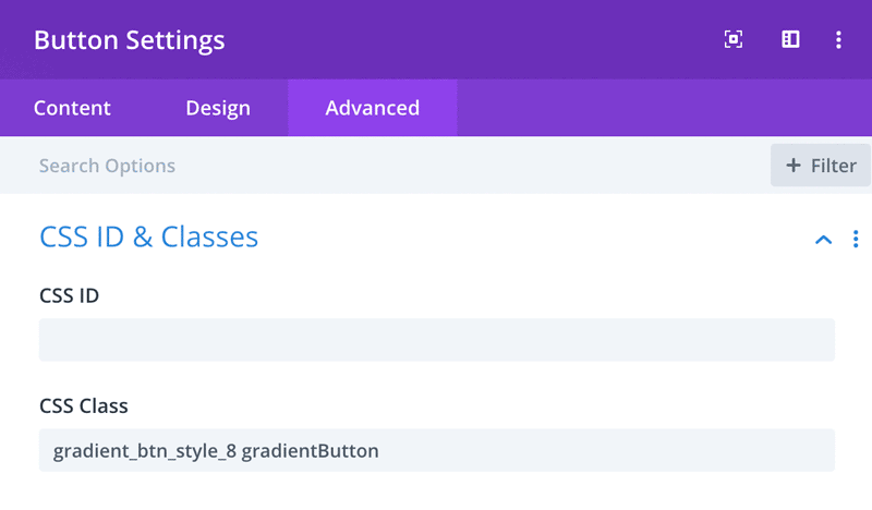
In firts step we will add custom classes to our Button. To do that, open Button module settings and go to Advanced → CSS ID & Classes and add gradient_btn_style_8 gradientButton class to the CSS Class field.
For this button we won’t add border-radius. We only need to remove the border from default button and button on hover. Go to Advanced → Custom CSS tab and add the following code to Main Element field (for Desktop and Hover):
To remove icon go to Advanced → Custom CSS tab and add display:none; to After field:
In this last step, we will add custom CSS with button styling and Move Down animation. Add the following CSS to Divi → Theme Options → Custom CSS:
|
1 2 3 4 5 6 7 8 9 10 11 12 13 14 15 16 17 18 19 20 21 22 23 24 25 26 27 28 29 30 31 32 33 34 35 36 37 38 39 40 41 42 43 44 45 46 47 48 49 50 51 52 53 54 |
/*-----------------------------------------*/ /**** Gradient Button Style 8 Move Down ****/ /*-----------------------------------------*/ .gradient_btn_style_8 { background: #FFECD2; /* Old browsers */ background: -moz-linear-gradient(left, #FFECD2 0%, #FCB69F 100%); /* FF3.6-15 */ background: -webkit-linear-gradient(left, #FFECD2 0%,#FCB69F 100%); /* Chrome10-25,Safari5.1-6 */ background: linear-gradient(to right, #FFECD2 0%,#FCB69F 100%); /* W3C, IE10+, FF16+, Chrome26+, Opera12+, Safari7+ */ filter: progid:DXImageTransform.Microsoft.gradient( startColorstr='#FFECD2', endColorstr='#FCB69F',GradientType=1 ); /* IE6-9 */ padding: 15px 40px; color: #fff; box-shadow: 0 10px 30px #210f3840; } .gradient_btn_style_8:before { background: #FCB69F; /* Old browsers */ background: -moz-linear-gradient(left, #FCB69F 0%, #FFECD2 100%); /* FF3.6-15 */ background: -webkit-linear-gradient(left, #FCB69F 0%,#FFECD2 100%); /* Chrome10-25,Safari5.1-6 */ background: linear-gradient(to right, #FCB69F 0%,#FFECD2 100%); /* W3C, IE10+, FF16+, Chrome26+, Opera12+, Safari7+ */ filter: progid:DXImageTransform.Microsoft.gradient( startColorstr='#FCB69F', endColorstr='#FFECD2',GradientType=1 ); /* IE6-9 */ } .gradient_btn_style_8:hover { padding: 15px 40px !important; -webkit-transform: translateY(5px); -ms-transform: translateY(5px); transform: translateY(5px); box-shadow: 0 5px 20px #210f3840; } .gradientButton { display: inline-block; background-size: 100%; position: relative; z-index: 100; } .gradientButton:before { border-radius: inherit; content:''; display: block; margin: -15px -40px; height: 100%; width: 100%; position: absolute; z-index: -100; opacity: 0; -webkit-transition: all .5s ease-in-out; -moz-transition: all .5s ease-in-out; -o-transition: all .5s ease-in-out; -ms-transition: all .5s ease-in-out; transition: all .5s ease-in-out; } .gradientButton:hover:before { opacity: 1; } |
Animated Gradient Button with Move Down Hover Effect
In this last tutorial we will add gradient animation and a nice 3D Box Shadow effect.
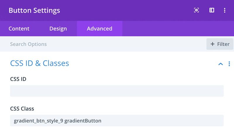
In firts step we will add custom classes to our Button. To do that, open Button module settings and go to Advanced → CSS ID & Classes and add gradient_btn_style_9 gradientButton class to the CSS Class field.
To remove icon go to Advanced → Custom CSS tab and add display:none; to After field:
And here is a bit of custom CSS with button styling and 3D Box Shadow animation.
Add the following CSS to Divi → Theme Options → Custom CSS:
|
1 2 3 4 5 6 7 8 9 10 11 12 13 14 15 16 17 18 19 20 21 22 23 24 25 26 27 28 29 30 31 32 33 34 35 36 37 38 39 40 41 42 43 44 45 46 47 48 49 50 51 52 53 54 55 56 |
/*------------------------------------------------*/ /**** Gradient Button Style 9 3D Shadow Effect ****/ /*------------------------------------------------*/ .gradient_btn_style_9 { background: #BFF098; /* Old browsers */ background: -moz-linear-gradient(left, #BFF098 0%, #6FD6FF 100%); /* FF3.6-15 */ background: -webkit-linear-gradient(left, #BFF098 0%,#6FD6FF 100%); /* Chrome10-25,Safari5.1-6 */ background: linear-gradient(to right, #BFF098 0%,#6FD6FF 100%); /* W3C, IE10+, FF16+, Chrome26+, Opera12+, Safari7+ */ filter: progid:DXImageTransform.Microsoft.gradient( startColorstr='#BFF098', endColorstr='#6FD6FF',GradientType=1 ); /* IE6-9 */ padding: 15px 40px; color: #fff; box-shadow: 0px 1px #8ed4bb, 0px 2px #8ed4bb, 0px 3px #8ed4bb, 0px 4px #8ed4bb; } .gradient_btn_style_9:before { background: #6FD6FF; /* Old browsers */ background: -moz-linear-gradient(left, #6FD6FF 0%, #BFF098 100%); /* FF3.6-15 */ background: -webkit-linear-gradient(left, #6FD6FF 0%,#BFF098 100%); /* Chrome10-25,Safari5.1-6 */ background: linear-gradient(to right, #6FD6FF 0%,#BFF098 100%); /* W3C, IE10+, FF16+, Chrome26+, Opera12+, Safari7+ */ filter: progid:DXImageTransform.Microsoft.gradient( startColorstr='#6FD6FF', endColorstr='#BFF098',GradientType=1 ); /* IE6-9 */ } .gradient_btn_style_9:hover { padding: 15px 40px !important; -webkit-transform: translateY(4px); transform: translateY(4px); box-shadow: none; } .gradientButton { display: inline-block; background-size: 100%; position: relative; z-index: 100; } .gradientButton:before { border-radius: inherit; content:''; display: block; margin: -15px -40px; height: 100%; width: 100%; position: absolute; z-index: -100; opacity: 0; -webkit-transition: all .5s ease-in-out; -moz-transition: all .5s ease-in-out; -o-transition: all .5s ease-in-out; -ms-transition: all .5s ease-in-out; transition: all .5s ease-in-out; } .gradientButton:hover:before { opacity: 1; } |
Even though buttons are a common element of design, it’s worth all the effort to make them look as good as possible. Keep in mind that the key to making the design of your button’s user interface successful is clarity, recognition, and usefulness, just like the buttons in this tutorial. So make sure to give them a try today and let us know what you think by leaving a feedback below.
Maciej Ekstedt
Maciej is the founder and CEO of B3 Multimedia Solutions. He is a self-made web designer and marketing expert, and he loves his job so much that he barely leaves the office. He transforms creative ideas into effective strategies for his company and for his clients. Maciej is fascinated by the phenomenon of megalopolis. He notices patterns and details which make up the whole thing, and he uses these skills in his work.
Get Divi Icons PRO today!
We have a sweet deal for you! You can get the best icon plugin for Divi with a 10% discount! Use the coupon code DIVIICONS10 at checkout!


















Merci beaucoup pour ces 9 boutons stylisés
Merci beaucoup c’est un vrai
cool