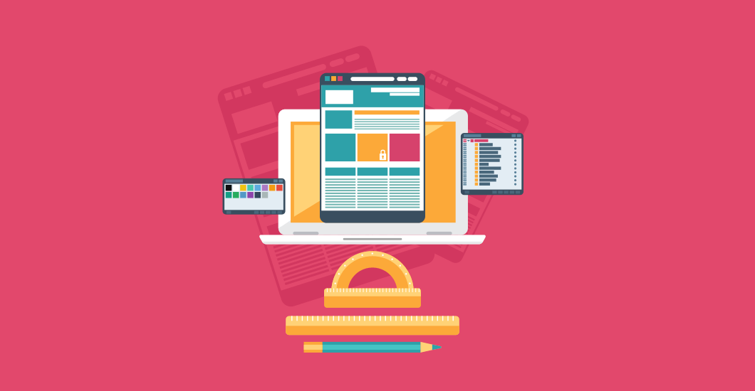
10 Tips On How To Make Your Website Look Professional

Having compelling content and design is not enough for your website or blog to survive and succeed. It has to have a style that can engage your visitors and support your site’s functionality and user experience while at the same time being understandable at first glance.
There are a lot of websites out there that are aesthetically pleasing to the eyes. However, they are not actually creating a good first impression (or even a second) to potential business associates and clients.
The first question you need to answer is how do you think someone will react when they first land on your site? The first impression is vital to potential customers. As they say, it will last forever and you only have a few seconds to grab the attention of your visitors.
It is crucial for your website to look professional in all aspects. Here are 10 tips on how you can do that.
Simplicity is beauty
It is understandable that as a web designer, you would want to show off your design skills and artistic abilities. But do not overdo it! Some designers tend to go overboard with colors, drop shadows, and
This is visual overkill and you should avoid it. You have to realize that visitors do not like this in any form. Your readers will have a hard time reading it, and will most likely leave.
We are in an era where minimalism is becoming more and more popular. As a web designer, you should adopt a more minimalistic approach to your work. Give your page some room to breathe. When thinking of incorporating flashy web design elements, make sure to include a lot of white space. Without white spaces, your page will look cramped and cluttered.
A page free from clutter
Your web page should have a single point highlight or focus. Presenting your readers with many key pointers will confuse them. Your keywords should be accurate and clearly send the message you want to convey to your readers.
Your key focus should be keeping your landing page or home as clutter-free as possible. Some research is required when adding a call-to-action (CTA) and a unique selling proposition (USP) on areas where your users engage with them. Depending on your business, most CTAs are located at the end of a page.

Easy to navigate
One of the main goals of your website should be to offer an overall awesome user experience. Designing your website in a manner that makes its navigation easy is one of the most reliable means to achieve this.
We live in a fast-paced world and the majority of users want to find stuff that they are looking for as quickly as possible. You don’t want your visitors to get lost, frustrated and go to your competitors because of a page full of clutter.
When the elements of your site are well-organized your visitors will most likely get engaged and stay. This can lead to providing your business with potential leads and conversions it needs.
It does not matter how beautiful your website is, if it is hard to navigate people will see it as unprofessional. On the other hand, your site may look simple and plain but users will find it professional if it is navigable.
Color coordination
The colors you choose for your site will have an overall impact on its design. Do not just pick any colors just because they are your favorite and throw all of them in together. It is essential that they work and blend well together.
Taking the color psychology into consideration will help you determine which colors can embody what your business or brand is all about.

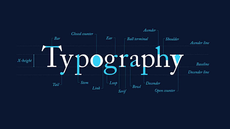
Use the right font types
Fonts are not just letters when it comes to web design. Like with colors, they can change the overall look and feel of your site. If you want to evoke a distinctive style or inject a unique flavor to it but still achieve a professional look, then choose fonts that will match the culture and style of your business.
If your brand is all about entertainment and fun, use fonts that will be able to embody these qualities. On the other hand, if your business is on the formal side, use more conventional fonts that communicate the spirit of the products and services you are offering.
Aside from choosing the right type of fonts, it is also a good idea to use them properly. For example, it is highly recommended to use bigger fonts on your headings, titles, and subheadings. Also, make sure to choose those that are easy on the eyes. You don’t want your visitors to leave your website because the font you use is too small and hard to read.
Not sure which font to use? Check out our pick for the typography trends that will be big this year.
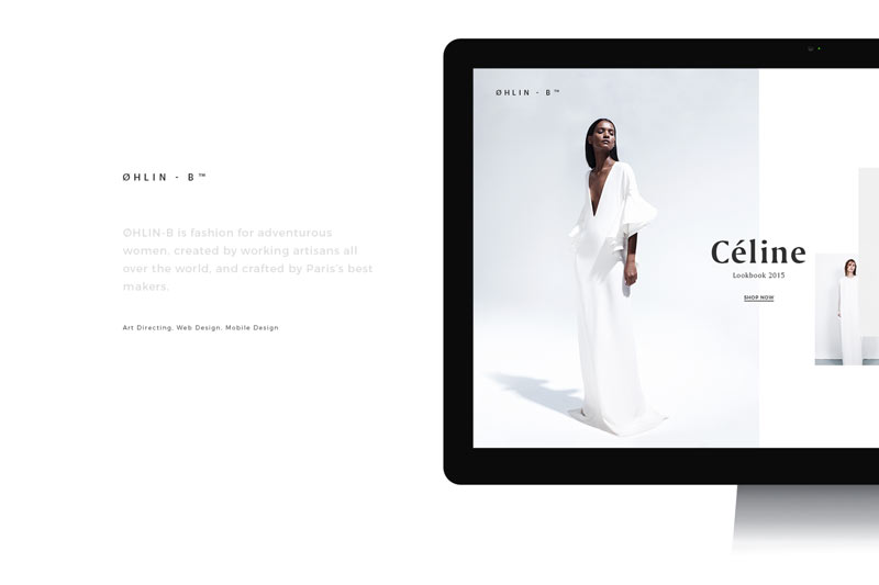
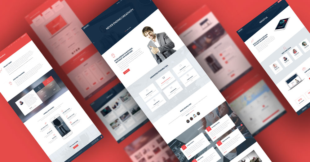
High-quality images
Large, high-quality images may affect the speed of your website, but they are a great way to make it stand out from the rest. Not only will your site look professional, but incorporating it in your landing page and your site’s overall design will attract people which can potentially lead to conversions.
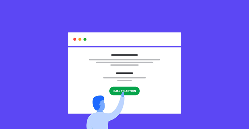
One CTA is enough
A website with multiple CTAs looks unprofessional. It may also confuse your visitors and may result in them not taking any action.
Make it easy for your users to take action by putting up one CTA button. You don’t want to confuse them with a lot of choices. Get their attention and make your site look more professional with a CTA that is placed strategically on your page.
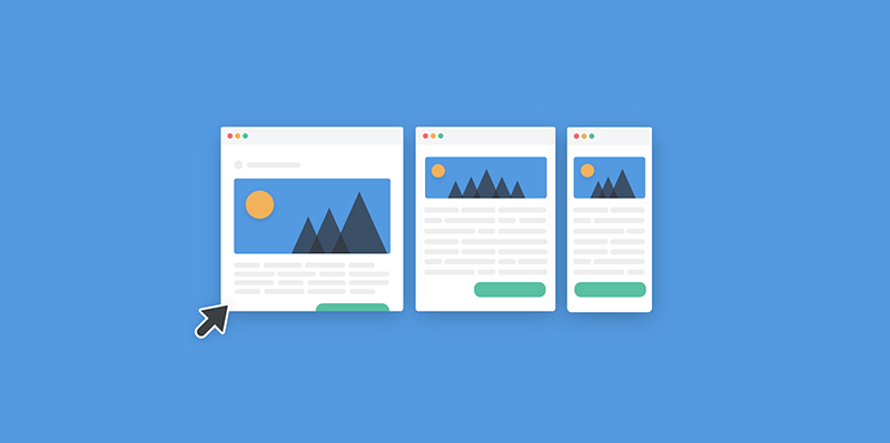
Maintain consistency
When it comes to the design and style of your website, your theme should be consistent and clear from the get-go.
The images across your site should be consistent. Avoid switching from one image to another from page to page. If you are using vintage images, stick with it. Avoid mixing them in with black and white or modern vibrant images.
Use one color palette. The color combinations for your background, graphics and images should be in the same family of colors. Also, your fonts should be cohesive ,avoid changing them up unless the design requires it.
First-rate website copy
Some people see a website copy as something that is not an element of the design. However, anything you write on the pages of your site will play a vital role in how professional it will look, even if they are just letters and words.
Your writing quality will speak a lot about your professionalism level in the real world of written communications. This also applies to what you will write on your site’s pages.
If your content is full of grammatical errors and sentences that are hard to comprehend, people who read them will make judgments regarding your professionalism based on those words and sentences. If your web copy is not good, people are more likely to turn away.
Writing is a bit difficult, but you have to ensure you present an excellent copy. If you want to have well-written content or you don’t have time to do it yourself, consider hiring a professional writer.

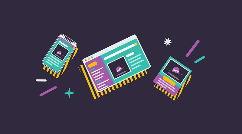
Mobile responsiveness
With Google now ranking websites based on how responsive they are on mobile devices, creating a mobile version of your site has now become necessary. Moreover, a large percentage of online users use their mobile phones to do searches and visit websites.
No matter how impressive your site looks, if it does not display appropriately on a mobile device, your professionalism will surely suffer. It will provide an impression to users that you don’t care enough about their needs, therefore how can they trust such a company?
Having a mobile responsive design will make your site accessible across various types of devices which will provide your visitors with a consistent experience no matter the size of the screen they use. If a site can be accessed easily on all platforms, it will show a high degree of professionalism and it will be recognised by your visitors.
Implement some of these tips to your website today and elevate the professional level and status of your business or brand online. What do you think of our list? Let us know by commenting below!
Aileen Cuaresma
Aileen is a Technical and Creative writer with an extensive knowledge of WordPress and Shopify. She works with companies on building their brand and optimizing their website. She also runs a local travel agency with her family. On her free time, she loves reading books, exploring the unknown, playing with her two adorable dogs, and listening to K-pop.
Use coupon code SLIDER15 at checkout!


Thanks Aileen, its a good post. Clear and simple.
Thank you and welcome Nosunelanube!