Minimalist Design Best Practices And How To Apply Them

The heart of minimalist web design is functionality. All elements, from fonts to color palette are essential. Even a simple geometric form has the power to stand out among complex concepts or objects. A well-designed minimalist website, in combination with a beautiful aesthetic, is impressive and can provide your visitors with superb user experience.
In today’s world, distractions are endless, and the attention span of site visitors is short. That’s why designers should look for ways on how to communicate their designs as clearly as possible. The level of attention our brains and eyes give to design is limited, and this is why minimalism works.
So if you give the eyes of your audience fewer elements to view, they’ll give more attention to the things that are there. Hence, the minimalist web design trend is extremely versatile. No matter what you’re designer, whether logo or app, it’ll benefit from this style.
Nonetheless, it’s a bit tricky to get minimalism right. So in this article, we’ll share some of the most effective and best practices for a minimalist design. Likewise, you’ll have a basic understanding of its concept. So keep on reading to learn more about it.
How The Minimalist Design Trend Began
We first saw the minimalist design during the 50s and 60s. Designers use this as a response to a culture that’s becoming noisy and technologically-advanced. In an instant, graphic designs, visual arts, and even architecture began to use clean and simple lines, as well as white spaces.
During the early 2000s, bright colors replaced the 90s grunge style. Then in 2010, minimalism made a massive comeback. And it is just now that we realized its full potential and power at grabbing the attention of readers.
More and more people and brands are finally embracing the minimalist design trend amidst the stylish feeds on Instagram and websites with complex layouts.

Mentory Landing page by Iftikhar Shaikh
What Is Minimalism In Web Design?
Minimalist web design is doing more with less. It has a simple interface and without any unnecessary elements.
As a designer, you very well know that there’s more to designs that aesthetics and visual presentation, but communication as well. Those who apply the minimalist approach understand that being concise is the best way for this communication to work.
Therefore, they get rid of any elements they are unnecessary for their design. Meanwhile, they focus more on the primary essentials that need to be present.
At a glance, minimalism in web design has the following key principles:
- A user-friendly interface
- Plenty of empty or white space
- Maximum of three colors at the same time
- Hidden navigation
- Experimenting with typography
- No additional buttons
- Without any excess details like textures, shadows, color transitions, etc.
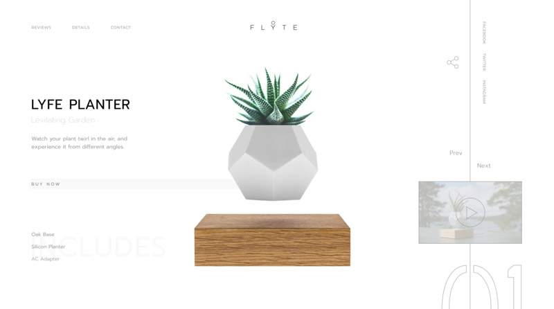
Lyfe Planter Concept by Attila Kasza
Benefits Of Minimalism
As we all know content is king, and minimalism values content by bringing attention to it. Your users will find it easier to consume content with minimalist design since you’re providing them with essential information right off the bat.
It also helps your website performs better. Since you have fewer objects or elements, your site will load faster. Furthermore, you’ll be able to build a design that will work well across all devices. This is vital since the number of mobile users is growing, so minimalism is a good solution to make your site compatible with all screen sizes.

Mobile Banking Landing Page by tubik
Essential Minimalist Web Design Principles To Follow
• Incorporate Your Design With Necessary Elements
For your website to achieve an absolute minimalist interface, you have to know what your user needs and wants. Then, prioritize the elements you need to incorporate thoroughly.
Your site design should only include elements of the utmost importance. Likewise, you must strip it off of anything that will distract site visitors from relevant things, including random decorative elements.
• Show Vital Elements
One of the main ideas of minimalism is to make your message clearer. Thereby, you have to be cautious with your main navigation, key information, and similar elements. Often, readers tend to get confused when they can’t find the navigation menu or key information right away. As a result, they may simply abandon your site.
• Use Empty Or White Space Strategically
The absence of elements is one of the most important factors in minimalism. White space or the empty space between your visual elements is a minimalist design’s foundation.
You can apply this as a way to direct the attention of your readers and enable them to absorb your content more efficiently and easily. Having more white space can help highlight the value of your elements.

Vans – Concept Illustration and Design by Leo Natsume
Visual Elements
• Colors
A color is a powerful tool for all designers. Not only can it inform users, but it can help set a particular mood. So when working on an app or site with a minimalist design, try to get the most from only a few select colors.
Keep in mind that the colors you choose for your design should be as simple as your font selection. You can use colors for a variety of purposes, including as an accent or background texture. But make sure to only apply the colors necessary to emphasize your design.
• Images
For some designers, true minimalist web design does not need any images. However, that’s far from the truth. You don’t have to remove all graphic elements to achieve minimalism. Instead, you have to be careful with your choice of where and when to apply them.
Images are a great way to communicate your ideas. Use imagery properly, and it can serve as a focal point on your website. So when choosing images for your minimalist site, be very picky. Selecting the wrong one can ruin the integrity of your design instantly.
Make sure to choose images that follow the minimalist web design principles. There are plenty of amazing free stock photos available online that will inspire your visitors to learn more.
• Typography
The font or fonts you select is crucial in minimalist design. Hence, you should be careful when choosing them. An excellent minimalist website features legible and clean typography.
Furthermore, you don’t have to limit your design to one or two font families. It is possible to utilize a variety of font style, size, and weight to craft the best visual hierarchy.
Just like with images, you can use it to create focal points that can grab the attention of your audience.
• Visual Hierarchy
Visual hierarchy refers to the relationship between your visual elements. Having an excellent visual hierarchy will move the eyes of your audience throughout the page and draws attention to specific elements.
One of the best ways to achieve this is by applying a grid system to your layout. Grids usually include columns of equal sizes. They also have a gutter or space between them.
You can place your elements inside the columns to provide the rest of your content with alignment. A grid system is effective, especially if you want to create a well-organized layout. It can help structure each of your UI elements and positions them in the most suitable proportions and sizes.
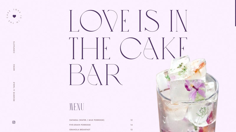
Niche Cake Bar Website by tubik
Best Practices For A Minimalist Design
Because of its simplicity, people think that it’s easy to craft a minimalist design. However, it’s actually more challenging to achieve a minimalist website with superb usability. Just like with any regular web design, a minimalist style also requires the same level of functionality and clarity minus some elements.
Moreover, it’ll require you with a solid set of design skills. There’s a thin line between a primitive and simple. And it’ll be very easy for you to build a primitive design if you don’t have the proper abilities.
• Remove All Unnecessary Elements
All elements on the pages of your minimalist website have a purpose. You strip away all features except the absolutely necessary elements.
- Get rid of purely decorative photos. Make sure to include only those images necessary to deliver your message precisely.
- Remove all unnecessary words or texts and communicate to your audience as clearly as you can.
- Your text copy should only contain a modest amount of information required to explain the message of your brand, company, service, or product thoroughly. Also, it should include all the essential details since reducing relevant information may confuse your audience, resulting in negative user experience.
• Create A Single Focal Point On Per Screen
The core of the minimalist philosophy is on the concept of designing around your content. Since content is and will always be king, your visual layout should highlight the content.
Remember that your end goal is to make your message clearer. So aside from getting rid of distractions, you also need to direct the attention of your users towards the most important factor of your site.
Some minimalist web designers suggest following the one concept per page rule. This means that you must design every screen or page to focus on a single concept at a time.
• Guide Your Audience Using Colors
Color in a minimalist design is a multi-purpose tool. It offers the benefit of making your design more consistent, as well as create a more focused experience.
You can achieve the latter by picking one color to use consistently throughout your pages. Likewise, it should match both the mood and message you want to convey to build a connection between the page’s section and various screens.
Additionally, colors can help you create areas where visuals have more weight to attract the attention of site visitors. Areas like text or graphics with high contrast can help draw the attention of your users to the vital elements of your design.
• Make Your Navigation Intuitive
When building a minimalist site, you have to prioritize every single element, including the navigation options. This should only display the most important details.
It’s a bit difficult to design navigation in a minimalist interface. Two of the most problems you have to deal with here is poor discoverability and wrong prioritization.
Keep in mind that when site visitors can’t locate your navigation elements right away, they will not be able to use your site properly. Thereby, it’s crucial to make sure that your navigation options are clearly visible. Or if it’s hidden or collapsible, people can discover it easily.
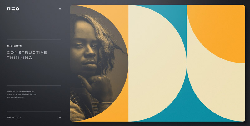
NEO by Ben Schade
The purpose of minimalism is to create a design that combines stunning aesthetics with outstanding functionality. It’s not about removing as many features and content as you possibly can but only those unnecessary ones that your users don’t really need. The result is a rich, easy-to-navigate, and compelling minimalist design that can provide your visitors with great user experience. If you find this article helpful or have something to add, don’t hesitate to leave a comment below.
Aileen Cuaresma
Aileen is a Technical and Creative writer with an extensive knowledge of WordPress and Shopify. She works with companies on building their brand and optimizing their website. She also runs a local travel agency with her family. On her free time, she loves reading books, exploring the unknown, playing with her two adorable dogs, and listening to K-pop.

Get 10% discount with coupon code ESTATE10


Very interesting post! Thank you. But what about text copy? You suggest to be minimal also in that, is this good for SEO?