Create Awesome Hover Effect Using Divi Modules


Having some exciting hover animations on your website can make the difference between you and your competitors whose website use no/or quite boring hover effects. In today’s tutorial, I’m gonna show you an easy effect you will amaze all your visitors with! I will use just a few lines of custom CSS and no JS or plugin! The rest will be done with the awesome Divi Builder features. Let’s get started!
- You will need to have the Divi Theme by Elegant Themes installed.
- You can follow this tutorial or download our Ready-To-Use Divi Layout with all code embedded.


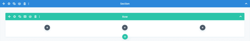
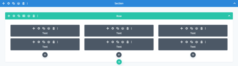
Add a Row with three columns
I this tutorial, I will be using a three-column row but you can use as many columns as you want (you would need to adjust font-size and paddings though).
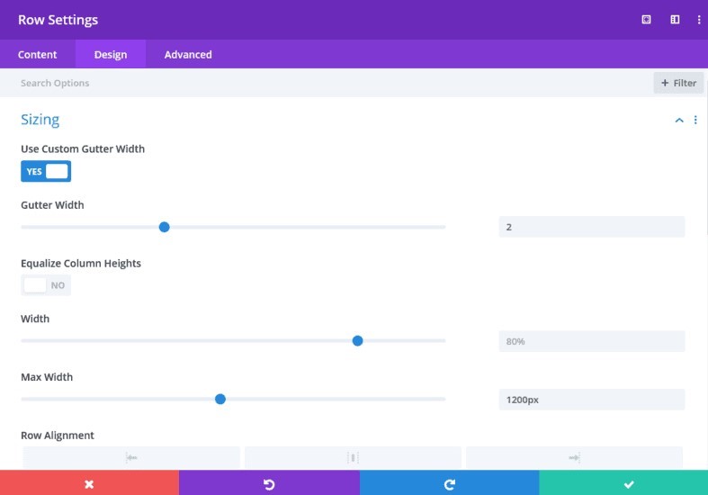
Set Row Width and Gutter Width
Go to “Design” tab of your row settings, click on “Sizing” and set the Max Width to 1200px. On “Use Custom Gutter Width” choose “Yes” and set the value to 2.
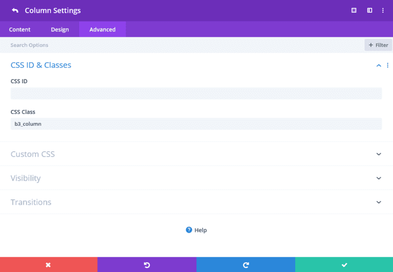
Give each column a custom class
In order to target our blurbs later with CSS, we need to give each column a custom class. My column have class of b3_column but you can choose your own prefered name. You’ll find the option to add a CSS class in the “Advanced” tab of the column settings.
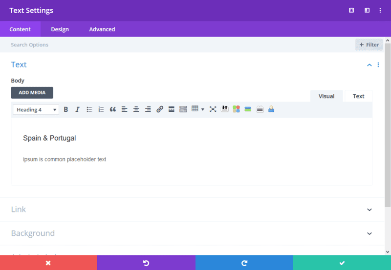
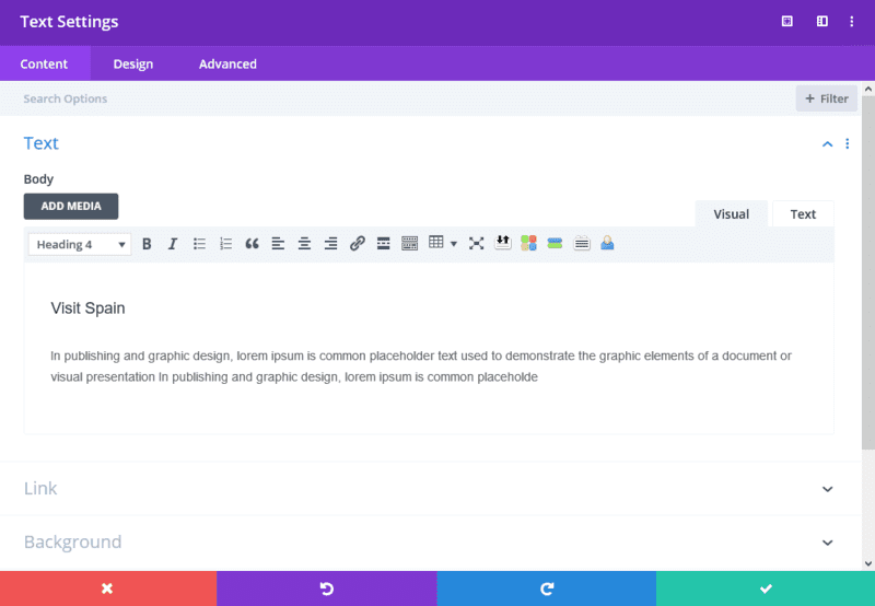
Add a text module to each column
These text modules will be our actual blurbs that you see before you hover over them and they start “disappearing”. You can put your own text for the heading and description.
As for the heading, I use h4 and for the description text, I use a paragraph.
Let’s also style our text:
– Heading 4 Font : Poppins
– Heading 4 Font Weight: Semi Bold
– Heading 4 Font Style: TT
– Heading 4 Text Alignment: Center
– Heading 4 Text Size: 30px
– Heading 4 Text Color: White
– Text Font: Poppins
– Text Font Weight: Light
– Text Text Color: White
– Text Text Size: 15px
– Text Alignment: Center
– Text Font: Poppins
Responsive adjusments (for mobile and tablet):
– Heading 4 Text Size (tablet): 20px
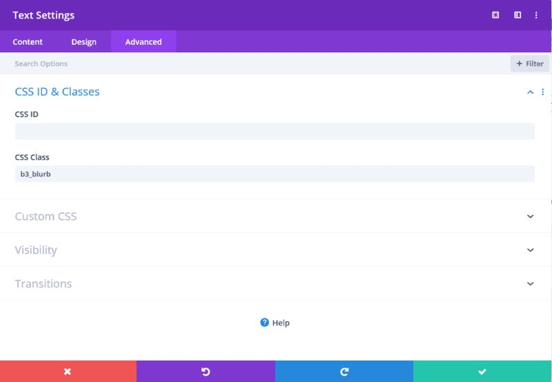
Add custom class to each text module
We will need the class for our custom CSS. I used b3_blurb but you can use your prefered name.

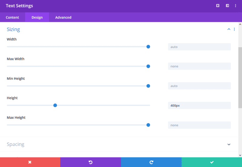
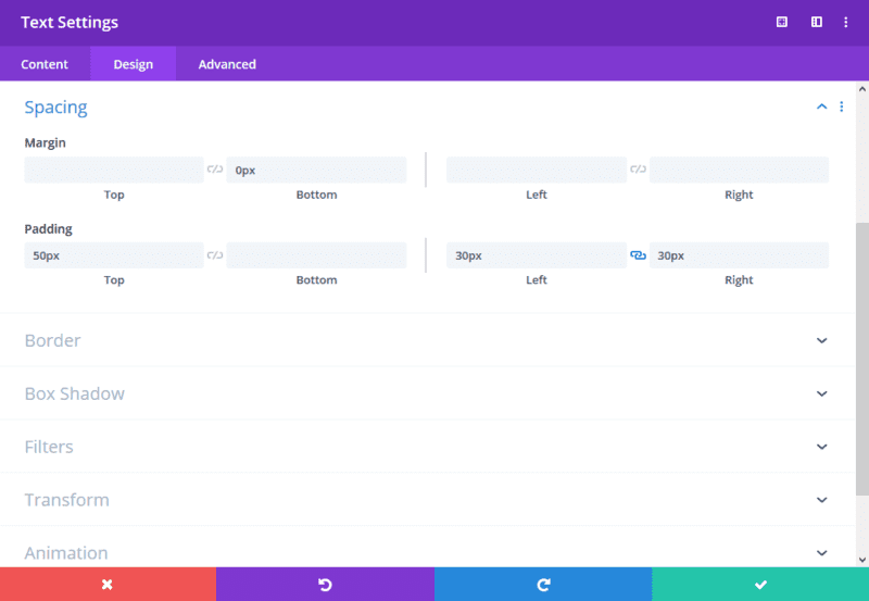
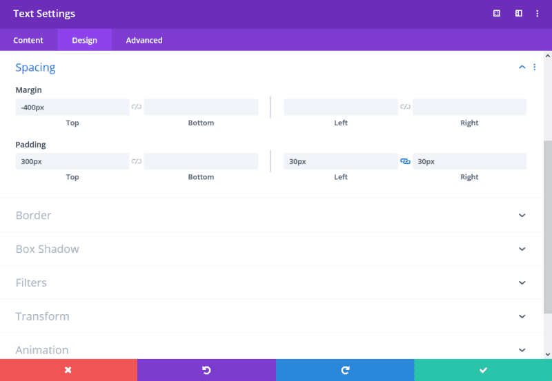
Add padding and height to the text modules
In this step, we will add some padding to the module so that we have our text on the bottom and better see our background image which we will add in the next step.
Go to the “Design” tab of the text module settings, click on “Spacing” and add Top-Padding: 300px and both Left-Padding: 30px and Right-Padding: 30px.
We also want to make sure that all of our text modules have the same height (we will also find it useful later on). My text modules have 400px height but you might want to have a different one when you decide to use more text or change your text’s size.
Go to the “Design” tab of your text module, click on “Sizing” and set the “Height” to 400px.

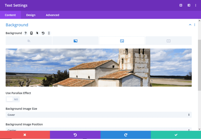
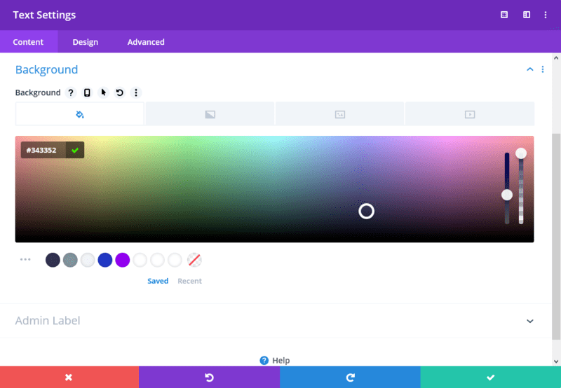
Change background of the text modules
In this step, we will upload the images we want to use for background. In the Text module settings, go to Background and upload your image.
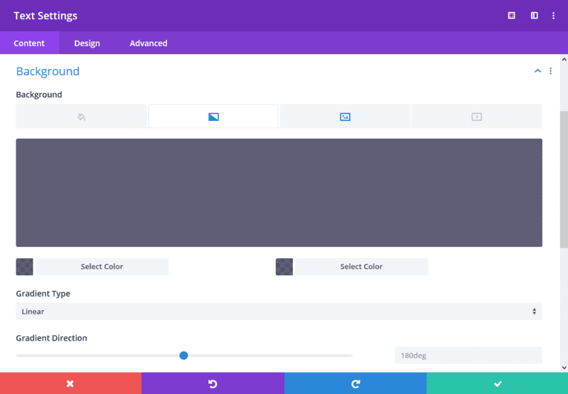
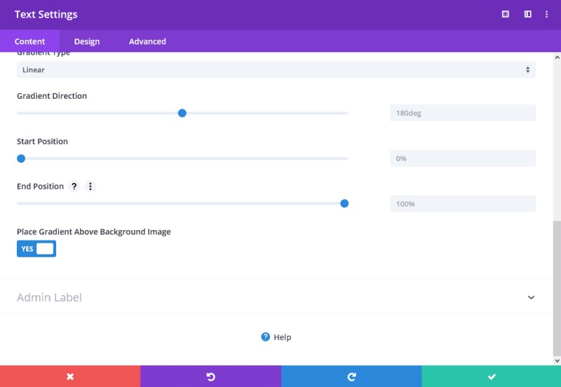
Once the image is uploaded, we will add a gradient background and place it above the background image. Simply choose both gradient colors to rgba(52,51,82,0.78) and say “Yes” to “Place Gradient Above Background Image“.
Great! Now we have our “front” face of the “blurb”! Let’s create the content we will see when we hover on them.
Add other 3 text modules
For displaying the hover content, we will also use a text module as a basis.
Add 3 text modules and move them above the ones we already have. Our row should now look like this:
Add heading and description
For these 3 new text modules, we will also add a heading text and a description. I used the h4 tag for heading and paragraph for description again.
Let’s also style our text:
– Heading 4 Font : Poppins
– Heading 4 Font Weight: Semi Bold
– Heading 4 Font Style: TT
– Heading 4 Text Alignment: Center
– Heading 4 Text Size: 30px
– Heading 4 Text Color: White
– Text Font: Poppins
– Text Font Weight: Light
– Text Text Color: White
– Text Text Size: 15px
– Text Alignment: Center
– Text Font: Poppins
Responsive adjusments (for mobile and tablet):
– Heading 4 Text Size (tablet): 20px
Add background, padding and change height
We will add a background color to the new text modules we just created. I used #343352 but you can use your own color.
Also, we need our new text modules to have the same height as the initial ones (in my case 400px). Go to the “Design” tab of your text module, click on “Sizing” and set the “Height” to 400px.
As for padding, we will use just 50px to Top-Pading and 30px for both Left-Padding and Right-Padding. We don’t want to use more Top-Padding because we need to have some space for the button we will insert later. You should adjust your paddings to the length of your heading/description text though.
Go to “Design” Tab of your Text module settings, click on “Spacing” and add the values I mentioned above. Don’t forget to set 0 for Margin-Bottom as we don’t want to have any space under the module.
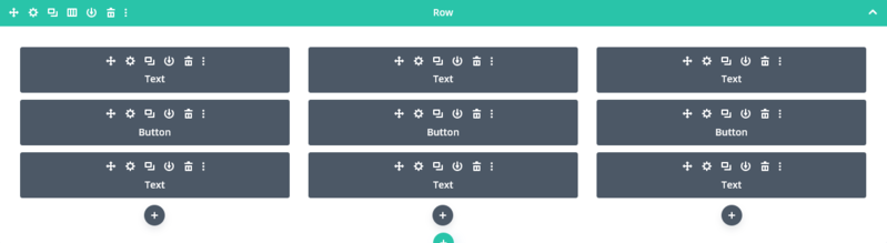
Add a button between the text modules in each column
Now, we will add a a button that will appear on hover. In each column, we will need one just between the two text modules we already have. Our row will look like this:
Let’s style our button:
– Use Custom Styles For Button: Yes
– Button Text Size: 16px
– Button Text Color: White
– Button Background: #cbccad
– Button Border Width: 0
– Button Border Radius: 2px
– Button Letter Spacing On Hover: 1px
– Button Font: Poppins
– Button Font Weight: Light
– Padding-Top: 15px
– Padding-Bottom: 15px
– Padding-Left: 30px
– Padding-Right: 30px
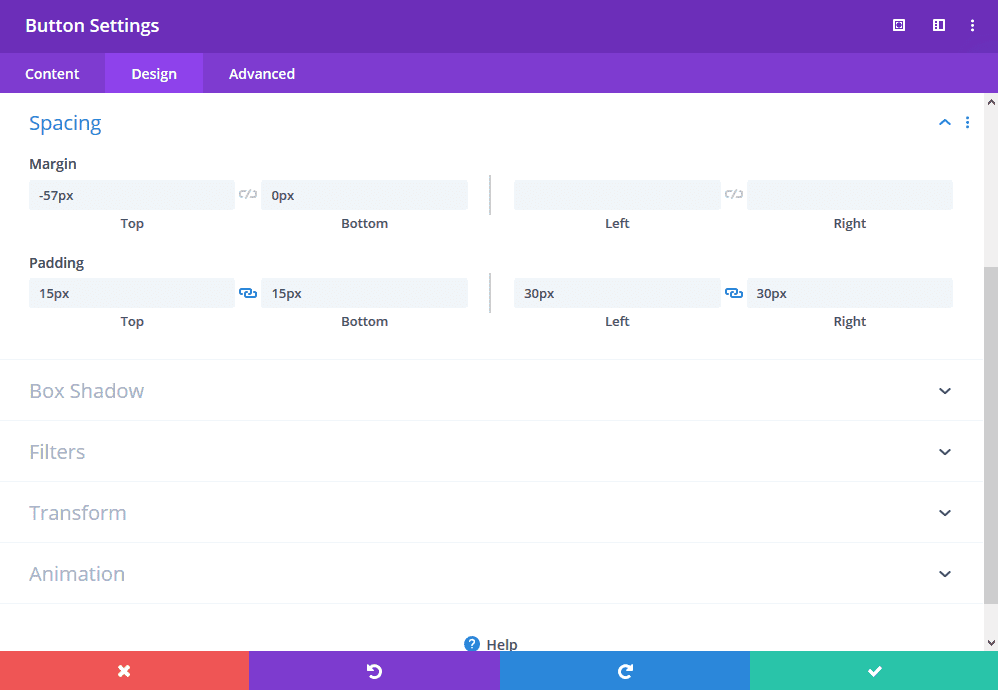
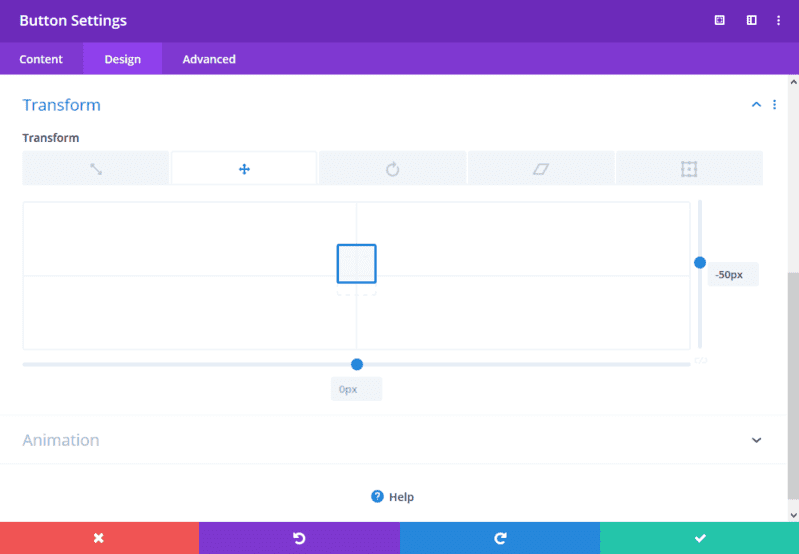
Move the button upwards
In this step, we want to move our button upwards so that in appears on our text module which will be visible only on hover.
In order to do that, let’s set a negative margin to our button so that the button’s bottom border is exactly on the same line as the text module’s bottom border. The rest of the way upwards, we will achieve with a transform → translate option.
If your text sizes and paddings are the same as mine ones, you should set the following values to achieve the effects:
– Margin-Top: -57px
– Transform: TranslateY: -50px
Follow the images below if you have some issues:
Move bottom text modules upwards
Now, we are going to make a very important step – move the “front” text modules upwards. We will actually cover the other text modules and with CSS, we will change the opacity of each depending on the hover.
Since we use the same height for all of our text modules and the two in a column don’t have a space between them, we will use a negative margin with the same value as the height of our text module. Since I used 400px as the height, we need to use Margin-Top: -400px.
Go to the bottom Text module settings → “Design” tab and click on “Spacing“. Add Margin-Top of -400px
We did this step as one of the last ones because from now on, the work with the Visual Builder might be a bit challenging. However, we can always use our Backend Builder!
Add Custom CSS
The only thing we are missing now are the animations which make the “blurbs” so exciting. You can add the following CSS code to your child theme’s stylesheet or any other place that suits your needs. In the demo for download, you’ll find the CSS code in a code module as the last module in the layout.
First, let’s hide our front text module with our background image on hover. We will also include a nice “desappearing” effect and give some time frame to the animation with transition.
|
1 2 |
.b3_column:hover .b3_blurb { opacity: 0; transform: scale(.7); transition: all .5s ease-in; z-index: 0; } |
When we end hovering, we also want to see the same smoothness when our front text module is “appearing” back. In order to do that, we need to give it some transition.
|
1 |
.b3_blurb { transition: all .5s ease-in; transition-property: transform, opacity; } |
The last part of our CSS will make our button clickable. Therefore, we need to increase a z-index of our button that will “overwrite” our text module which we don’t see but in fact, it’s still there.
|
1 |
.b3_column:hover .et_pb_button { z-index: 50!important; } |
That’s it! Thank you for your attention! I hope you enjoy this tutorial as well as I did! If you like it, please leave a comment below.
Richard Pruzek
I created my first website at the age of 14, and started to feel very passionate about web design immediately. Since then, I have used every opportunity to learn more from the world of html, CSS, JavaScript, PHP, UX, UI, e-commerce and more. In my free time, I do sports, spend time with friends and check news in the aviation industry which is my another big passion.
Get Divi Icons PRO today!
We have a sweet deal for you! You can get the best icon plugin for Divi with a 10% discount! Use the coupon code DIVIICONS10 at checkout!


Hi Chris,
Great tutorial and it looks great. However, you for got to mention that the non-hover text module will need to have it’s z-index increased (in the download you set yours to 542).
It took me about an hour to figure out why my hover was not working and I finally figured it out when I downloaded your layout and compared each setting for each module.
Thanks again,
D
Hi Richard,
I’m having a hard time with the last bit of CSS making the buttons clickable? It’s set to 50 but they’re still not clickable.
Any ideas?
Thanks
I have a question about your CTA section. I like the way it starts narrower and expands to full width. I would like to have a section that expands from the center and reveals to full width. How would you approach this?
I wanted to follow up in case I was not clear enough in my comment. I like your CTA section. What I really love about it is how the height is fixed and the expansion only happens from the left and right. This isn’t the case with the normal scroll effect. How did you get it to do that? Also, I would like it to start in the middle and expand out.
I guess you don’t have the answer.