20 Brilliant And Helpful Graphic Design Tips For Non-Designers

There is no doubt that you need talent for graphic design. But you don’t have to get a degree to acquire the necessary skills to create amazing designs for your social media, blog posts, or for just about any project. You only have to follow some of the best practices in design.
Before, you needed to hire a graphic designer to produce what you need. However, today it’s a whole new ball game. If you can get your creative juices flowing, and you have the patience to learn how to utilize a graphic design software or two, you will be able to produce awesome visuals by yourself.
Whatever your design skill level is, you can start designing the perfect graphics for your needs in no time by simply following these 20 epic tips for non-designers.
Have A Design Plan In Place
Most people usually plan their design mid-way through their graphic design process, but it should be the first vital step. You don’t have to make the planning stage long, it will only take about a minute or two of your time. You can accomplish your project much quicker if you have an idea of what you want to achieve on the get-go.

Do Your Research
Once you have your design plan and all the details you need in place, do your research. Whether it’s resources, facts, materials, or objects, researching will ensure your graphics will look well-thought-out.

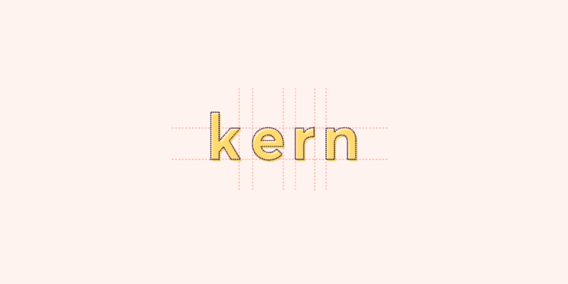
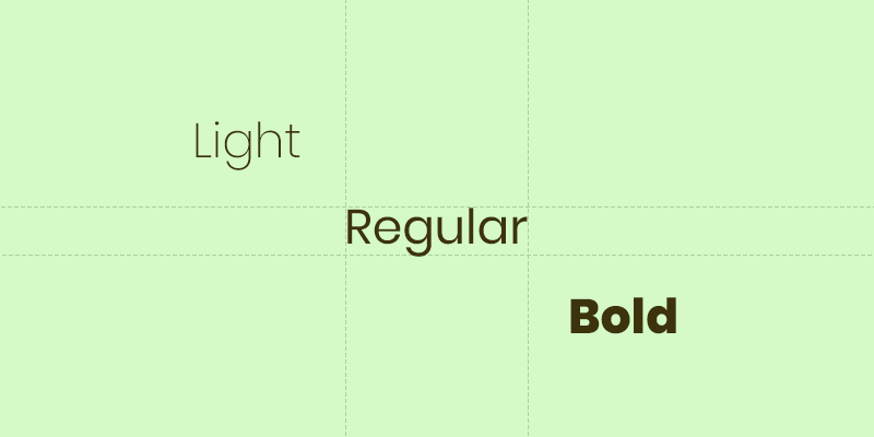
Do Not Get Carried Away With Your Fonts!
The ideal number of fonts is 1 and a max of 2 for your heading, subtitles, and body text to keep you from worrying about which combinations will look great.
Choose easy-to-read typefaces to make your graphic design simple, and yet effective. Our eyes will have a hard time scanning multiple font faces, so make sure to go with a simple family of fonts. Also if you do need to use several fonts, use one for your header and another for the body.

Be Clever When Choosing Your Color Palette
Your color scheme will play a big role in the outcome of your project. Some of the best graphic designs use beautiful colors that work well together. When choosing a color palette, go for something with 1 to 3 primary colors, as well as an extra 1 to 3 secondary colors that complement and contrast each other.
You can also use various tones of the same color or if you want to be bold, you can try these 25 stunning gradients. You can achieve consistency by playing around with its brightness or contrast. When using finer fonts on a colored background, you need to make the words are more distinct for clarity and readability.
Take A Risk And Scale
Scale is a technique you can implement to typing, compositional features, or shapes that require a bit of balance. You can enhance it by using suitable colors while ensuring that the fonts will look good when you increase their size.

Do Not Hesitate To Use White Space
As they say, less is more, so don’t be hesitant to use white space or leave a blank in your graphic design. There are times when a design has too much info in it, you can avoid clutter and enhance your design by applying some white space. It’s a simple concept that a lot of professional designers and major companies like Apple use.

Be Mindful Of Other Elements And Give Them Enough Space
If you have dead space, not to be confused with white space, you can fill it out with letter spacing. If a text is taking up a lot of space, you can align or condense the words. However, make sure you don’t reduce the spacing of the letters too much to the point where it’s difficult to read. Also, be careful when increasing the spacing between letters, as too much can make them seem disconnected from one another.
Align Objects Properly
Aligning your objects can help keep the elements of your graphic design look presentable even if they come in different sizes. Proper alignment can also provide your images with a professional and sophisticated look.

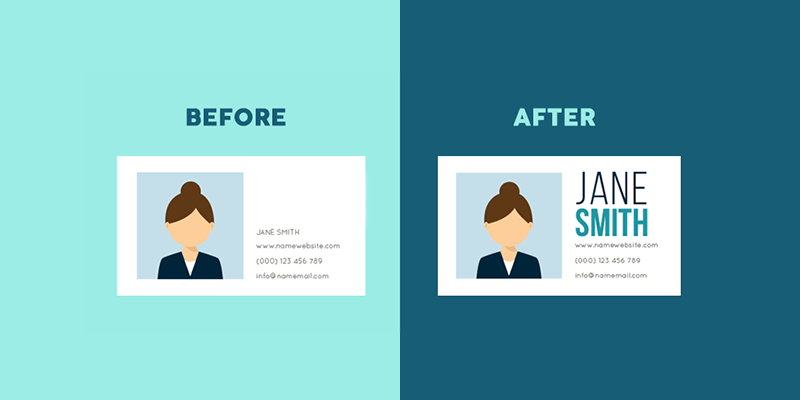
Let Your Font Do The Talking
Choose a font face that conveys the message of your content. A font with round edges usually conveys a friendly tone, while geometric fonts with hard edges like sans serifs are powerful and solid. On the other hand, if you want to evoke sophistication and elegance, opt for serifs.
If you’re looking for inspiration, check out our Divi font combos that can give your graphics a little personality.
Keep It Within The Family
Implementing a font family to your text will give your design visual uniformity. Give yourself options by using a font face that comes with a range of variants like bold, italic, and condensed.
Add Attitude With Contrast
You can add some attitude to your graphic design and make specific elements stand out by utilizing contrasts to your advantage. There are many ways on how you can create contrast, from using contrasting fonts, colors, and even contrasting the amount of space between your design elements.

Clean, Clear, And Crisp
Adjust the brightness level of your background image to offset text color by pumping up its contrast. This is a good way to make your design clear and readable. You can also use it to create a solid cut-out effect by applying a black or white text over your image.

Simplicity Is Beauty
Keep your graphic design simple and keep your basics in mind. Ensure that each element has a purpose on the overall design. Keep your colors, fonts, frames, and shapes to a minimum number. Make your words sharp and easy on the eyes by utilizing a combination of tonal hues.

Create A Sense Of Order With Alignment
Using lines or embellishments to anchor items on your images can create a sense of overall order. It also helps in the composition and balance of your design.
You can apply lines on an image by applying them around a block of text to anchor them. You can also use a line as a separator between different elements on your image to give a feeling of coordination and planning in your design.
Be Creative And Original
Challenge your creativity, imagination, and graphic design abilities to produce original graphics. Don’t be afraid to experiment and innovate by choosing and mixing various types of filters and fonts. And as much as you’d want to follow the latest trends in design, try to create something that communicates your unique style and who you are as a designer to give your work a personal touch.

Organize Content Using Hierarchy
The most significant part of your design’s message should be its most dominant visual feature. To see how the element hierarchy changes and which one will grab attention right away, apply your graphic with scale or color.
Create A Design Mood Board
You can create a simple mood board in a grid that includes a collection of visual pieces, color swatches, and images. It’s a useful practice that can help you find a common theme or color scheme that you can apply to your project.

Trial And Error
Nobody is perfect, and it’s okay to make mistakes. They’re an essential part of the entire learning experience and what will make a non-designer like you great. Design, in general, is all about trial and error, and the creative process, is usually never complete, so make sure to push your skills and designs to the limit. If you’re not satisfied with something, you can always click the undo button.

Follow Your Design Rules
These rules are not specific, but rather what you’ve chosen throughout your design in terms of a set of particular colors, textures, etc. If you’re all set with your choices, stick to them and avoid doing something that will contradict them. Make sure to stay consistent to ensure you’ll achieve consistency in your overall design.
Don’t Forget To Take A Break
Take a little break from time to time to revive your creative juices. You can boost your energy, productivity, and refresh your mind with relaxation. If your eyes and mind are getting tired, grab a snack, sit in the park, or walk a bit to revitalize your vision and reinvigorate your brain.

Graphic design should not overwhelm you, and it doesn’t have to be difficult. Simply follow these simple tips for non-designers, be creative, and challenge your design skills to come up with innovative ideas, and you’ll see yourself producing amazing designs in no time. Hopefully, we’ve inspired you to start designing today! Let us know by leaving a comment below.
Aileen Cuaresma
Aileen is a Technical and Creative writer with an extensive knowledge of WordPress and Shopify. She works with companies on building their brand and optimizing their website. She also runs a local travel agency with her family. On her free time, she loves reading books, exploring the unknown, playing with her two adorable dogs, and listening to K-pop.
Use coupon code SLIDER15 at checkout!


I love your articles. My newsfeed is so busy but I actually stop and read yours. I’m one of those non-designers so I NEED design tips for non-designers. 🙂 A few more examples for design-challenged folks like me would make this post one that I would return to over and over. As for now, I’ll have to do more research on some of the items because I just need a little more help and info.
thank you so much for the appreciation and I’m glad to have helped you…good luck and don’t forget to have fun designing which is what matters most
Your Post is very nice.
Wish to see much more like this. Thanks for sharing your information!
Nice post! I think concept is a core element when looking to design a website which has to make a connection with its consumer and that is why create graphic design. I manage a film production business, and my work sometimes goes toward graphic design and visual assets, rather than just the moving image. Since we are working on our business branding images with the best graphic design Sunshine Coast, here I got valuable tips to implement in our business designs.
Very Nice Tips Which You have Shared Thanks U So Much.
Some great tips. From my design research the font used has more of an impact than I thought, definitely a tip I have learnt. Thanks for sharing.
Thanks for the information!
good one keep it up!
Great article! I’ve found that using white space is extremely intimidating. I always try to fill it up just a little bit or it gives me anxiety. I will have keep working on overcoming that.
Its really amazing post such a good post.
Thanks for the useful information! Your blog is beneficial for us and also for those who are searching for web design resources.
Informative article. If you want to be a professional graphic designer then you must know this Nothing can be done without good knowledge. I liked the tips. Hope to share something like that again. Thanks.