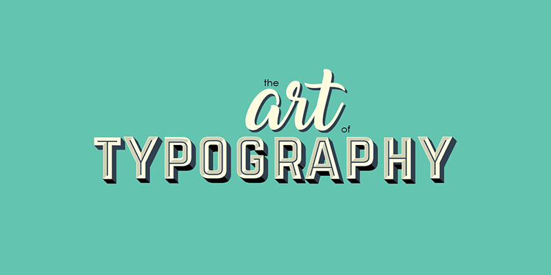
20 Basic Rules Of Typography Every Designer Should Know

Typography is an art in itself. Good typography is what sets apart a professional design from an amateur one. Not only can it stimulate the interest of your audience, but it can also help ensure they read the message you want to convey.
One of the most satisfying and vital elements of graphic design is typography. You will not be successful in your design career if you don’t have an understanding of some of its fundamental rules. You’ll easily look like an amateur if you get things wrong. It’s vital to follow certain principles of typography since nothing says newbie more than using a lot of font faces, unreadable text, lack of kerning and stretched fonts.
No matter how extensive your design experience is, it’ll be beneficial on your part to revive your knowledge about the basic typography principles. Consider learning stuff such as the structure of certain typeface or where it originated. These things can help enhance the meaning of your designs. Additionally, your potential clients will find it impressive if you’re knowledgeable about your craft. It’s also your responsibility to know everything about typography.
Once you have an idea of the rules, you’ll find it easier to break them. If you want to further expand and enhance your skills, here are 20 of the most vital principles of the art of font that you should know.
Back To Basics
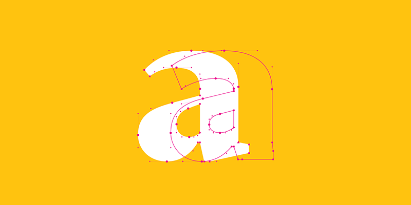
Studying every little thing about the art of typography is the first step you need to take to make it more effective. It’s a combination of art and science, so expect it to be quite elaborate.
Each font face has its own distinct vocabulary, central specifications, and accurate measurements that you should always take into consideration. And similarly to various forms of design, you’ll be able to get away with breaking rules if you know them by heart.
Also, the only time it’s acceptable is if you intentionally do it to produce something relevant. Make sure to set aside some of your time learning and studying the art to have a better understanding of it.

Understand Font Communication
Do not just randomly select your fonts. It should not merely be a process of browsing through your typeface catalog and choosing something you think looks good. You will not achieve an efficient result this way because there’s a psychology behind choosing typefaces.
It is essential to ensure that the fonts you use for your designs connect to your readers. It’s not just about ensuring your copy is written impeccably. You have to ensure that every font face you choose is suitable for your target audience as well. For example, elaborate and colorful fonts do not fit a lawyer website. They’re more appropriate for a kid’s birthday invitation.

The Kerning Element
One of the biggest sins in the design industry is poor kerning. It’s a crucial skill that you need to master right away.
So what is kerning anyway and why is it important in design? Kerning can help tune the space between characters finely to produce texts that are even and arranged well. It may not seem significant, but having an exceptional kerning can make a whole lot of difference.
Often, kerning errors are subtle and unnoticeable, especially with long paragraphs or sentences. However, a poor kerning job on a logo or headline can ruin your entire design instantly.

Know Your Limits
All designers are guilty when it comes to using too many fonts and styles, especially when they’re still newbies. It’s a common slip in the design world. If you want to incorporate your design with multiple fonts, limit it to a maximum of three.
You can use each type and size for your headline, body, and subheadline. Try to be creative by using fonts from different families. Just make sure your font pairings are cohesive. People may also think that you made the mistake of using very similar typefaces and that you were simply not careful with your design.
Practice Proper Font Alignment
The concept of alignment is vital in typography. The alignment options you have are left, right, center, and justified. Most non-designers usually opt for either justified or center aligned.
Left aligned or flushed left is the easiest position for our eyes. The right alignment or flushed right will only look nice when using it properly in your design. On the other hand, justified is a designer’s worst nightmare.
Make sure to look out for ragged lines when using both left and right alignment. These are even more obvious when using center alignment badly. You can fix this by making some adjustments to the length of the lines.

Use Visual Hierarchy
You can emphasize the importance of a certain line of text by using the typographic hierarchy. It’s an excellent way to establish the order in which you want your readers to get information from your design.
You can do it by guiding their eyes through a visual hierarchy. Your audience may find it difficult to find valuable information right away in your design by not using font hierarchies.

Why You Need To Work With Grids
Understanding and using design grids is critical. Grids help you ensure that all the details on your design, no matter how big or small, are utilized to create visual and logical harmony. It’s also a way to make every element unified and cohesive. However, you don’t need to work with grids on every project. But it’ll be beneficial on your part if you have an idea of why and how you can use them, especially if your project involves typography.

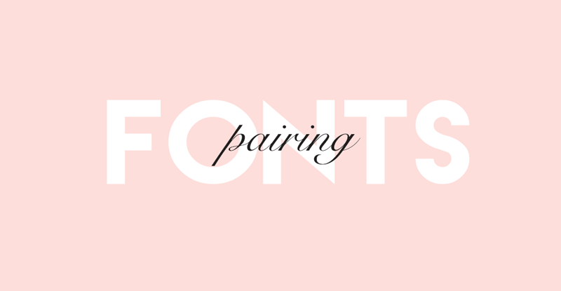
Be Smart With Your Font Pairings
Using font combinations can make your design layouts even more compelling. Nevertheless, you want to avoid using too many typefaces which may result in a design with too much going on. Multiple fonts will not only distract your readers but also confuse them and move their attention away from the most significant elements of your design.
The rule of thumb is to keep your font usage to a maximum of three, one for your title, body, and another for the subheading. The only exception is when the text of your design is long. If that’s the case, you may use one to two more typefaces.
Choose A Superb Secondary Typeface For Your Font Combination
Your design’s readability will rely considerably on your choice of font pairing. You want to make sure that your selection of typefaces complement each other when you have a heading and subheading to create a visual hierarchy.
Additionally, try to avoid using two fonts that contradict or those that look almost the same to the point where there’s almost no distinction. Both your primary and secondary typefaces should be captivating but can still maintain the consistency of your design.

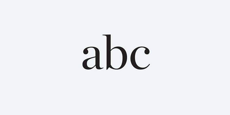
Know How To Measure
Measuring typography is essential to show the entire width of a text block. It’s especially significant in web design. Keep in mind that fonts are not created equally, so different typefaces will take up various space rations on a web page.
When combining fonts, ensure that their heights (known as x-height), are the same. Set width or the width of a character is what will cover the whole body of a letter, plus the space after it. On the other hand, the point system refers to the arrangement typically utilized for measuring fonts.

Make Readability Your Top Priority
No matter what design project you’re working on, its message must be easy to read. Make sure to avoid combining dark text with a dark background. It’s also a big no-no to use a small font face over an image with high contrast. All your efforts will go down the drain even if your design is stunning if you have an illegible text.

Be Wise When Selecting Colors For Your Font
Be careful when choosing a color palette for your design since it’s a powerful tool for designers. When deciding a color scheme for your fonts, use color psychology to better understand which colors will work best for your graphic design.
There are also certain guidelines and rules you should follow when using colors. Although you can produce unique and beautiful designs by letting your creative juice flow, your font colors should not distract your readers from the message of your design.

Know About Typography Widows And Orphans
You can easily level up your design by knowing how to determine and get rid of typographical widows and orphans. Widows are lines of text that are a part of a paragraph but have made their way to the next column. Orphans are similar, but the difference is that only a single word is left on its own. Avoiding them in any designs that are centered is very difficult and they are almost inevitable. Therefore you have to learn how to manage them properly.
There are some techniques you can use to deal with widows and orphans. You can modify line length by manually editing the text to eliminate the issue. Another way is to adjust the column size or text box to allow the font to move around the widows and orphans.

Do Not Stretch Fonts
This is one of the most basic typography rules that many designers often overlook. Careful attention to details is given when creating a typeface. Stretching them will take away their value and efficiency. Choose a wide or tall font face to make your text a bit wider or taller without distorting it.

Use White Space
White space is an invaluable design tool that can help emphasize the special elements of your design. Use it smartly, and it’ll give your projects numerous beneficial effects. Not only does it help your design breathe, but it allows you to create more focus on a certain portion of your graphic. Furthermore, your design will achieve an effortless level of sophistication.
Typography Is An Art
Always think and treat typography as an art and not merely fonts you can use to complement your graphics. The creation of typefaces is complex, thus, it requires an artistic level, making it a valuable asset to your collection of designer tools.
It’s not only about constructing plain texts but more of treating typography as an art form. To create distinctive graphics, think about how you will be able to turn those beautiful fonts into the hero of your designs.
You also don’t need to limit yourself to the current fonts you have. There are plenty of typefaces available online which you can explore. Do a bit of research to find the best ones suitable for your design aesthetics and needs. Then elevate their feel and look by adding some fun and cool effects such as lines, swirls, or textures.
Think Twice About Following A Design Trend
Design trends come and go with the snap of your fingers. They may be popular today but forgotten tomorrow. Do not be quick to join the bandwagon of the latest trends in design since once its excitement fades, your work will quickly become ineffective and old.
When designing, try to produce something that can stand the test of time and will be relevant for years to come. Nonetheless, you still have to be aware of the popular and trending fonts dominating your niche. Study them so that you’ll understand why they’re prevailing. Studying trends is all about learning how to evaluate different design components. Carefully consider them, but don’t be too quick to incorporate them to your project.

Find The Appropriate Tools
Know the right tools for the right job. At the same time, know which tools you should stay away from. There are numerous typography apps available online that can help you find the best tools for specific styles. Some of the most popular design softwares are from Adobe. They do come with a steep price tag though. Fortunately, there are cheap or free alternatives to Adobe Illustrator that are just as good.

Always Check Your Grammar
One of the trickiest and confusing design components is probably grammar. It comes with a lot of rules which you may not know. But if you want your designs to look even more professional, make the effort to learn various grammar rules related to design.
Give extra attention to the most common grammar pitfalls such as double spaces following punctuation, dashes and hyphens, and ampersands. There are also several guidelines you need to follow for sentence structure type of designs.
Correct grammar is a subtle and yet powerful tool that can elevate the professionalism of your designs to a different level. It will show that you’re paying careful attention to details, which your prospective client will find impressive.

Be Inspired
Studying illustrations of font face in existence is an excellent way for you to learn how to produce typography that’s not only appealing but efficient as well. Find out the reason why they’re so effective and engaging. There are plenty of inspirational articles online about designing that you can read. There are also websites where you can find design inspiration for your web project.
Additionally, you can ignite your passion for design within your surroundings. When you’re in the mall, look for graphics and fonts on ads that get your attention. Find inspiration from those that make you want to get out of your comfort zone.

Knowing and understanding these typography rules can help improve your skills and every component of your design. Constantly practicing is the key to honing your skills and mastering these guidelines easily. You’ll be able to grasp how all of the rules work by actually applying them. So, start practicing today and let us know how it went by leaving a comment below!
Aileen Cuaresma
Aileen is a Technical and Creative writer with an extensive knowledge of WordPress and Shopify. She works with companies on building their brand and optimizing their website. She also runs a local travel agency with her family. On her free time, she loves reading books, exploring the unknown, playing with her two adorable dogs, and listening to K-pop.


Excellent article, Aileen!
Thanks heaps Derek!