Your brand voice is strong on your website. As the marketing tool that is ‘always on’, it can speak for you and convey the tone of your business, through its language, colours and the typefaces used for headlines and body text.
If you are still contemplating your brand, this article may be helpful in learning how colours communicate.
How To Choose Colors and Fonts That Fit Your Brand
You will want your website to complement and echo your branding, speaking a consistent language and tone across all your media.
We all are familiar with the way type can communicate an emphasis, mood or tone. Pupcat is playful and casual, Copperplate evokes strength, Optima is clean and authoritative. They way you combine headline and body fonts on your website can assist in delivering your brand messaging and voice to your visitor.
The AIGA style rules for using font combinations are:
• a maximum of three fonts is allowed,
• the combination of fonts should not be such a drastic difference that it distracts from the message, and
• if you have a lot of text, your viewers will appreciate your use of a serif font (such as Times) as opposed to a sans-serif font (such as Verdana), because it is less of a strain to read text that has ‘feet’ to support the letters and is easier on the eyes.
The Divi theme contains many pre-loaded fonts that can be used for headlines and body text on your Divi website. Let’s take a look at some combinations:
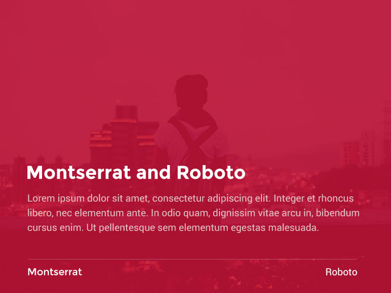
Monserrat typeface is versatile because it is sturdy, but not too strong. Although it is a sans-serif font, it appears to have structure that makes it easy to read. With Montserrat as a headline font, using Roboto as a body font echoes the headline without being too distracting.
2
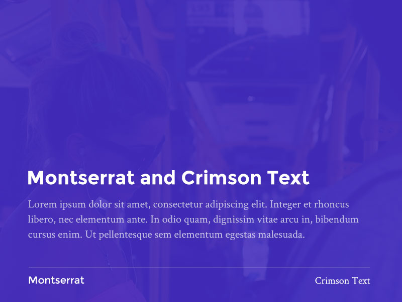
Montserrat and Crimson Text
Combining Monserrat with Crimson Text sets a nice contrast between strong sans serif and a lighter serif font.
3
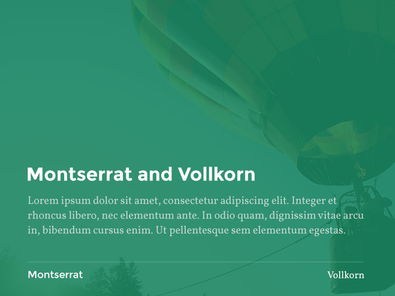
Montserrat and Vollkorn
Using Vollkorn as a body font supports the Montserrat heading font, and has tighter kerning (letters close together) and a taller x-height (height from baseline). You may want to adjust the line height (space between lines of text) to let the paragraphs breathe a little.
4
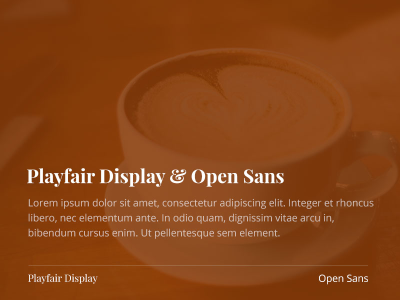
Playfair Display and Open Sans
This font combination is a playful contrast of sans serif and a serif font. Experiment with switching headline and body text, and find the combination that speaks for your brand.
Another nice contrast of serif and sans. This set would benefit from an exaggerated treatment of the header (very large) with the sub-header or body font at regular or medium size.
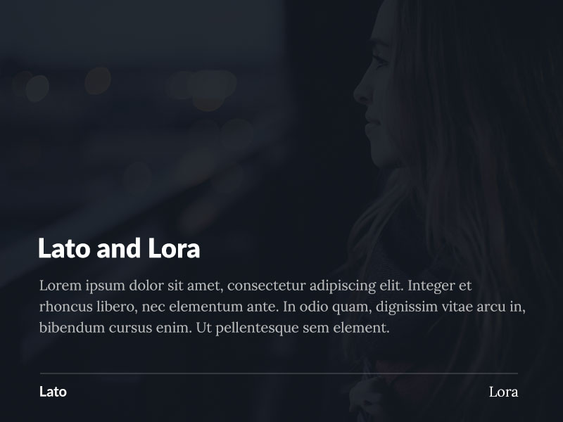
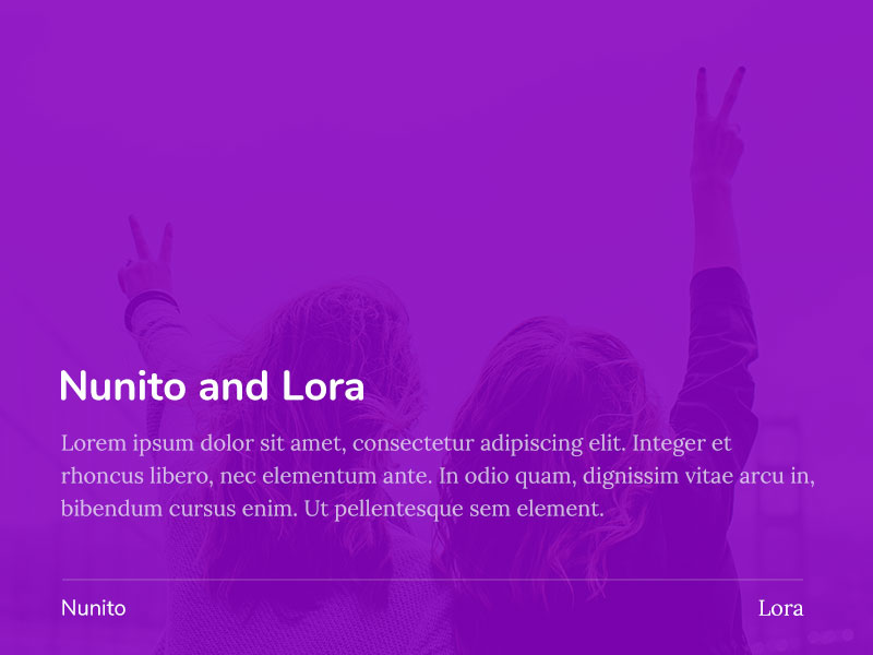
Nunito has a rounded look and contrasts in weight (how semi-bold or light the letters appear) with the lighter weight and prominent serif of Lora.
7
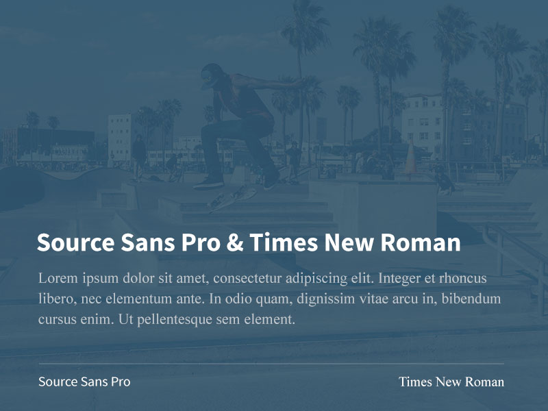
Source Sans Pro & Times New Roman
A modern sans serif and more traditional font, this combination allows you to reach toward modern while retaining the reading comfort of Times.
A nice combination of sans serif and serif within the same family.
9
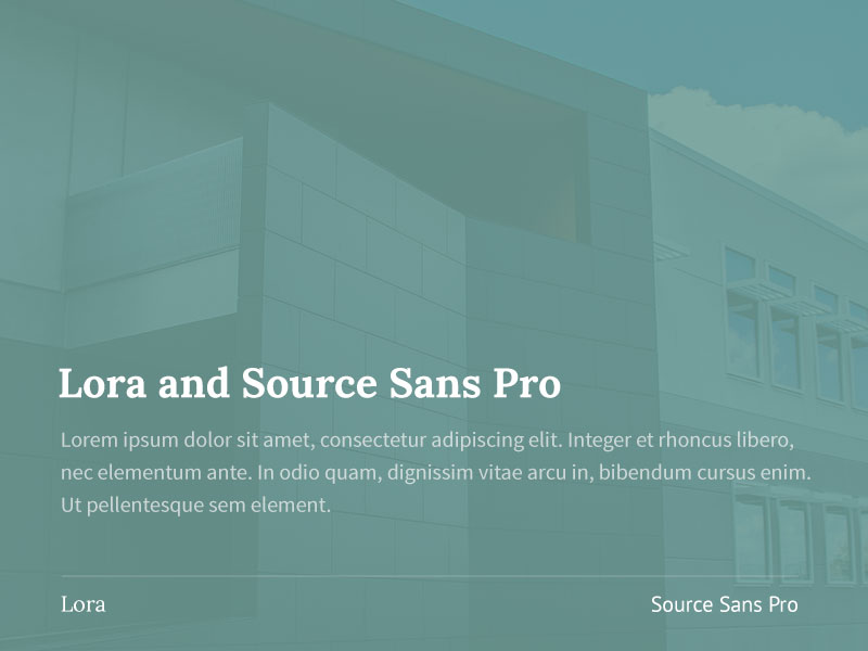
Lora and Source Sans Pro
10
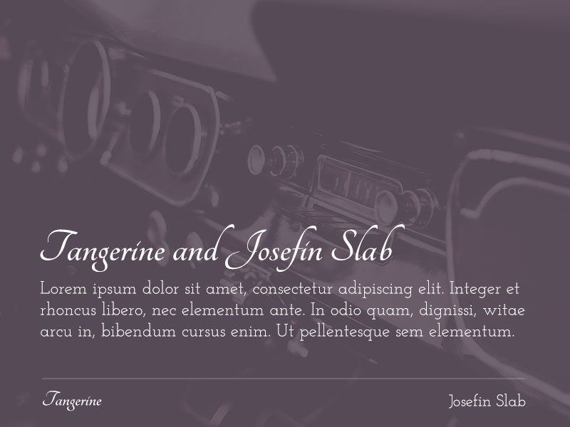
Tangerine and Josefin Slab
The serif body font Josefin Slab provides a light but solid base for the more fluid headline, Tangerine.
11
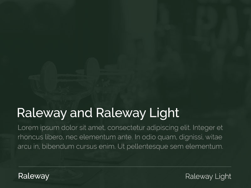
Raleway and Raleway Light
A nice family combination of a headline and body font in one style, echoing one another and presenting a unified voice.
12
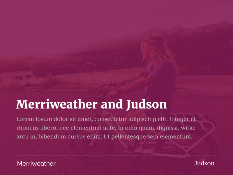
Merriweather and Judson
In normal use, one would not combine two serifed fonts, but the chunkiness and gravity of Merriweather in the headlines and navigation perfectly complements the more traditional but lighter weight Judson in the body and small caps menu text.
Divi provides many popular typefaces to assist you in making your website communicate. Don’t be afraid to experiment with the size, italics and colours of your typeface to complement your logo and website layout.
Tari Donohue is a branding agent and designer from Portland, Oregon, US, and works primarily with wineries, farms and epicures. Her website work is done in Wordpress and Squarespace. She has designed over 40 websites and authored four themes. Her photography is often featured in the websites she designs.


Thanks for that article! Very interesting and I’ll be bookmarking.
Great article!! Tnx!!
Question: How did you made the awesome fullwidth action of the Divi Estate 1.2 is here section? Would love to know this 🙂
Hey Jan. There is a tutorial available on ET blog: 🙂
How to Create an “Expanding” CTA like Elegant Themes
Hi Maciej! Tnx so much for the link!! Looks really great!
Do you have any updated for the new divi font updates. They recently came out as of this year of 2017. Thank you great article
Hi Jasmin,
Thank you for leaving your comment on our website.
Indeed ET Team has updated fonts module very recently and there is much more fonts to be chosen from. Unfortunately we don’t have a post featuring new font combinations. Please sign up to our newsletter to be informed when publish such a post 🙂
Thank you much for this useful collection!
These are gorgeous! Thank you for putting these together. I love Divi, but wish they would have these combinations as standard selection within the WordPress theme.
Great article, I find scrolling through Divi’s various fonts to be tedious at best. This is a handy reference to have thanks!
This is super helpful, thank you! One thing I need clarification on is the rule re: serif vs. sans serif. There’s a contradiction in the text above. Read in the intro under the AIGA rules: “…if you have a lot of text, your viewers will appreciate your use of a serif font (such as Times) as opposed to a sans-serif font (such as Verdana), because it is less of a strain to read text that has ‘feet’ to support the letters and is easier on the eyes.” I assume you meant to say viewers will appreciate your use of a sans serif font. Thanks for confirming! I have some long posts and this would be helpful to know.