12 Impressive Websites Using Parallax Scrolling Effect


There are two kinds, in fact. One way to achieve this effect is the CSS Method, where the background image is fixed, and the other elements on the website scroll normally. The True Parallax Method creates the more exact parallax effect in that it makes different elements scroll at different speeds. This excellent article written by Jason Champagne for Elegant Themes will give you more information on how to achieve the parallax effect in Divi.
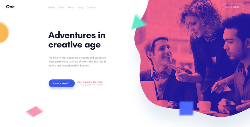
This simple tool can be used to create a striking and unique website. Below, we list 12 outstanding results of using the parallax effect. Just remember, you CAN have too much of a good thing. If you overdo it with the parallax effect, your website may appear chaotic and annoying.
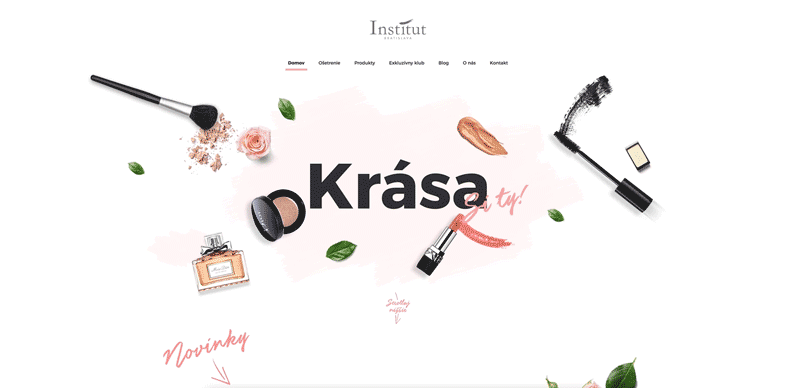
Institut Bratislava
The effect is subtle and intriguing. Small elements over the background image start moving at a slightly different speed when you scroll down, creating an impression of three-dimensional depth.
Type + Pixel
Here, the parallax effect only begins as you scroll further down the page. It is craftily used in the section entitled “Agency reinvented” to imply the branding agency’s ability to be inventive and think out of the box.
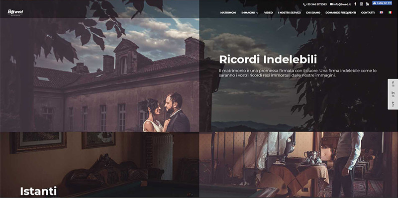
B#wed
The whole website’s design is based on the parallax scrolling effect. It is used to display wedding pictures in an eye-catching way, turning the homepage into an excellent portfolio sample.
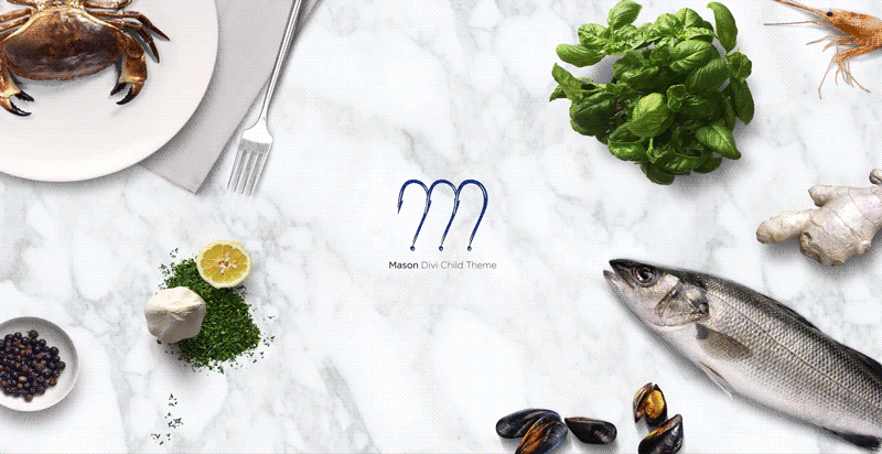
Mason Divi Child Theme (A Girl and Her Mac Design)
The ingenious header consists of separate elements, which shoot to the corners of the screen as you scroll down. The content of the website scrolls over a seamless, fixed background. The overall impression is professional and striking.
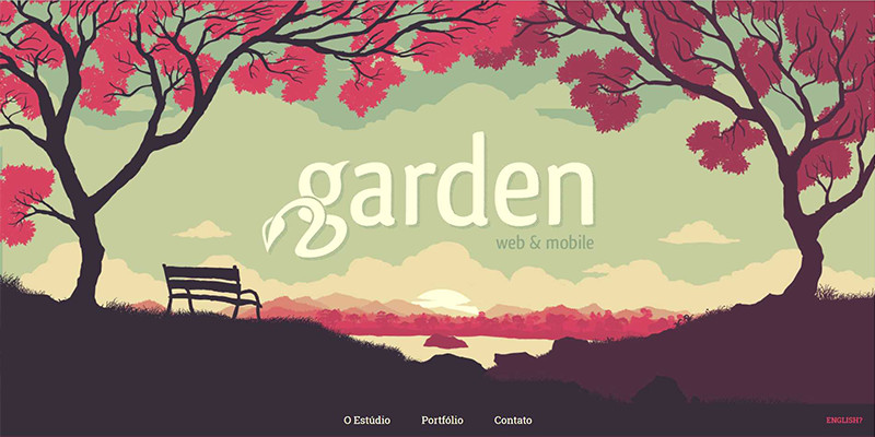
Garden
This delightful example of parallax scrolling showcases the web-design studio’s skills and good taste. The simple parallax effect executed in this way resembles an animation of a mysterious garden.
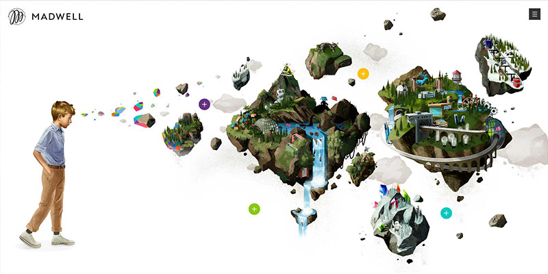
MADWELL
This is not strictly parallax effect, as there is no scrolling involved. The beautifully animated elements follow the movement of your cursor. Elements move at different speeds, providing the image with depth and a sense of distance.
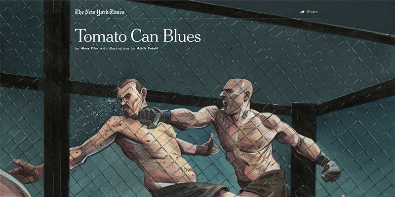
Tomato Can Blues, NYTimes
Short story illustrations use parallax effect to give an impression of movement. Is this the new word in online comics?
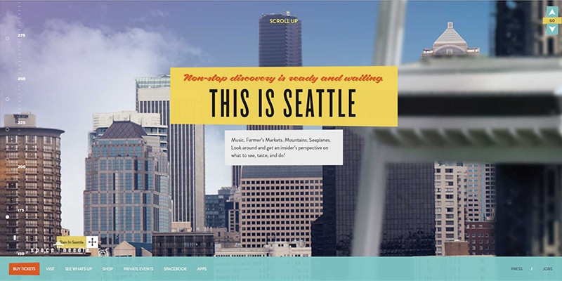
Space Needle
It’s a classic! The website uses the parallax scrolling to present the wonders of Seattle. You start at the bottom, so you have to scroll up instead of down to see more.
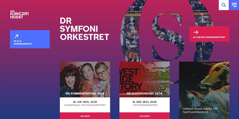
DR K3NC2R1 HUS4T
The most striking elements of this website are the hollow letters, through which you can see fragments of pictures. These pictures scroll at a different speed from other elements, providing a subtle and interesting experience.
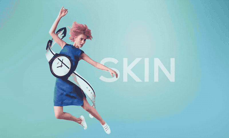
Skin by Swatch
As you scroll down to look at the almost life-size pictures of watches, the delicate header and the logo fly away using the parallax scrolling effect. As you scroll, the watches move smoothly over a fixed gradient background.
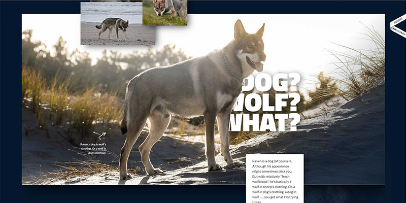
Wolfdog Raven
The whole website uses different effects which can be achieved with parallax. There are the hollow letters, behind which you can see a picture scrolling at a different speed; there is the amazing effect of words sliding from behind a wolf. The gallery consists of columns of pictures which scroll at slightly different speeds. The overall effect is very consistent and interesting.
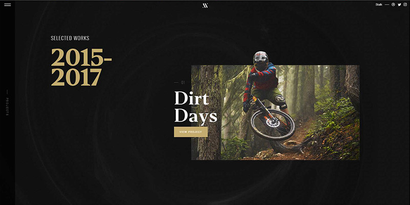
Nathan Riley
As you scroll down, the smoke over the black background swirls chaotically. And when you stop scrolling – the animated smoke moves still, at a more leisurely pace. The intro “Good things come to those who scroll” is an excellent example of using the parallax effect as an element of branding. What follows is the portfolio.
Edyta Gaida
Edyta, also known as Englishwriterka, is a Copywriter and a Creative Writer. She takes pride in creating the textual identity of Polish brands abroad. In her free time, she writes a Young Adult novel in English and takes care of her family, which has now four members, including a puppy. She is Silesian, lives in Poland, writes in English, and loves all things Korean. The world is her mollusk.
Use coupon code SLIDER15 at checkout!


I’m amazed by this work, wow! Great article thanks for inspiration 😉
Thank you Jacob! Have a great day 🙂
Oh wow, thanks for finding these! Looks like some of them can’t be done with Divi without additional coding, like #11 and #12.
I like number #3 and #7 but number #4 is awesome. How has that been done? That would make a nice tutorial!
Then #8 is really cool but counter intuitive
Absolutely loving what people can do with websites. Thank you for the inspirations. My favorites is #6 and #8. It’s something completely different to the day to day designs that you get.
Love them all! What I would like to know, how do you show these on the web? Have you converted these to GIFs that animate? Or another way. A tutorial would be great!