Create Minimalistic Mobile Menu with Divi
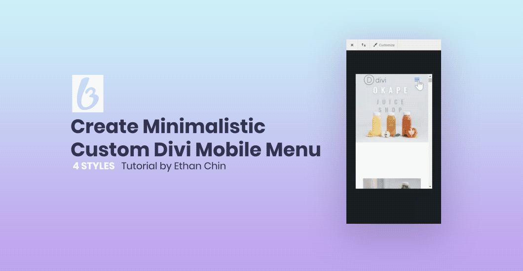

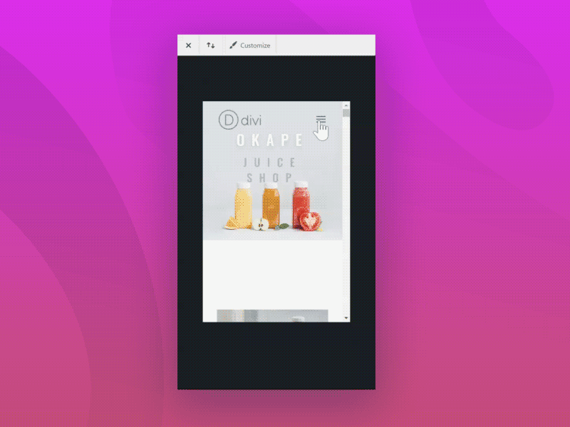
Let’s face it – Divi’s mobile menu is boring. No matter how well designed your Divi website is, the default mobile menu that the Divi theme uses will always give it away. It just doesn’t look that good. Some people have some success using CSS to make basic customizations to make the mobile menu look a little nicer. In this WordPress CSS tutorial, I’m going to be sharing with you three original designs I came up with to spruce up your Divi mobile menu. Enjoy!
The code I will be sharing below is pure CSS. That’s right. No custom JavaScript, no plugins, no nothing. All these designs for your website’s mobile menu are achievable with just a few (dozen) lines of CSS code. I purposefully wrote the code as lean as possible. Those who know me will know I am a major speed geek when it comes to my websites. I like using as little code as possible when customizing my Divi websites.
Awesome! How do I add this code to my Divi website?
I always recommend using a child theme. There are a bunch of guides on how to make a Divi child theme floating around the internet, a couple of free tools to generate one and a bunch of places to buy a premium one. Take your pick. Regardless of what you choose, I always always recommend using a child theme and the accompanying stylesheet when customizing the Divi theme. It’s just good practice.
If, for whatever reason, you decide you don’t want to use a Divi child theme, you can always just copy and paste the code into the Theme Customizer → Custom CSS field. It’s not the best way of adding custom CSS, but it can get the job done.
Here’s a good tool for generating a free Divi child theme.
Can I use these Divi menu designs with a million links?
Yes and no. I created these designs using flexbox in order to align the links to either the middle or bottom. Problem is they don’t work very well with overflowing content.
There is a way around it, of course. Instead of display: flex, you can use display: block. Doing so will allow the menu to work better with overflow content, but you will lose the alignment of the links.
To move the links down a bit, you can use code like this:
|
1 2 3 4 |
#mobile_menu .menu-item:nth-child(1) a { margin-top: 320px; } |
The link animations can be altered to work with more links by adding extra code to control the animations delays, like so:
|
1 2 3 4 5 |
.opened #mobile_menu .menu-item:nth-child(x) a, .closed #mobile_menu .menu-item:nth-child(x) a { transition-delay: X00 ms; } |
I added animation code for up to 6 links, but if you really do have a million links like I know some Divi sites do (you know who you are), you can add animations to all of them with this trick.
Where did you get that background image in your designs?
I took that photo. Just in case you were curious. I personally don’t like using stock photo sites for personal projects. If I can, I try to take the photographs myself. Please do not hotlink my images. Use your own, there are millions of places to get free photos these days.
The Basics
Here’s the starting point. All three of my custom Divi mobile menu designs rely on this base styling to:
a) Make them fullscreen
b) Hide them when closed
c) Reveal them when you tap on the hamburger icon.
d) Change the menu icon to a X when open, so users know where to click to close it.
|
1 2 3 4 5 6 7 8 9 10 11 12 13 14 15 16 17 18 19 20 21 22 23 24 25 26 27 28 29 30 31 32 33 34 35 36 37 38 39 40 41 42 43 44 45 46 47 48 49 50 51 52 53 54 55 56 57 58 59 60 |
#mobile_menu, .opened #mobile_menu { position: fixed; display: flex; flex-direction: column; justify-content: center; min-height: 100%; max-height: 100%; z-index: 10; top: 0; border: none; overflow-y: auto; max-width: 100%; float: left; transition: all cubic-bezier(0.5, 0, 0, 1) 800ms; background: linear-gradient(rgba(0,0,0,0.5),rgba(0,0,0,0.5)),url( insert your image URL here ); background-size: cover; background-repeat: no-repeat; } .opened #mobile_menu { transform: none; } .opened #mobile_menu a { transform: none; opacity: 1; } .opened #mobile_menu .menu-item:nth-child(1) a, .closed #mobile_menu .menu-item:nth-last-child(1) a { transition-delay: 100ms; } .opened #mobile_menu .menu-item:nth-child(2) a, .closed #mobile_menu .menu-item:nth-last-child(2) a { transition-delay: 200ms; } .opened #mobile_menu .menu-item:nth-child(3) a, .closed #mobile_menu .menu-item:nth-last-child(3) a { transition-delay: 300ms; } .opened #mobile_menu .menu-item:nth-child(4) a, .closed #mobile_menu .menu-item:nth-last-child(4) a { transition-delay: 400ms; } .opened #mobile_menu .menu-item:nth-child(5) a, .closed #mobile_menu .menu-item:nth-last-child(5) a { transition-delay: 500ms; } .opened #mobile_menu .menu-item:nth-child(6) a, .closed #mobile_menu .menu-item:nth-last-child(6) a { transition-delay: 600ms; } .mobile_nav.opened .mobile_menu_bar:before { content: '\4d'; color: #fff; transition: all ease-in-out 300ms; z-index: 100; } .mobile_nav.closed .mobile_menu_bar:before { transition: all ease-in-out 300ms; } |
Keep this particular piece of code in mind.
|
1 |
background: linear-gradient(rgba(0,0,0,0.5),rgba(0,0,0,0.5)),url( insert your image URL here ); |
You will need to specify the URL for the background image you want to use.
If you’d rather use solid color instead of a background image, you can switch it out for:
|
1 |
background-color: rgba(0,0,0,1) |
That will set it to a solid black background color. Feel free to play around with it.
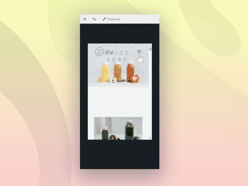
Fullscreen Divi Menu with Links Aligned to the Bottom
First step here is we’re going to change some code in the previous part. Woops. Simple thing really, just swap justify-content: center; for justify-content: flex-end; .
This will position the links at the bottom of the menu.
Also, bit of a warning. This first style uses flex-box to position the links at the bottom of the menu. The problem here is that it doesn’t work very well with overflow contents, hence you should only use this style if you have a truly simplistic menu.
5 or 6 links at most.
|
1 2 3 4 5 6 7 8 9 10 11 12 13 14 15 16 17 18 |
/* Menu container animations */ .closed #mobile_menu { opacity: 0; pointer-events: none; transform: scale(1.2); transition-delay: 600ms; } /* Menu links animations */ #mobile_menu a { transform: translatex(-90px); opacity: 0; transition: all cubic-bezier(0.5, 0, 0, 1) 800ms; text-align: left; } |
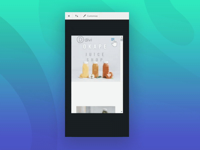
Fullscreen Divi Menu with a Fade In/Up Effect
This is a simple menu design I came up with that uses CSS transition delays to stagger the fade effect on the links so they appear one after the other, instead of all at once. The menu itself also fades in and up in the same direction as the links, which I think is a nice compliment. 🙂
|
1 2 3 4 5 6 7 8 9 10 11 12 13 14 15 16 17 18 19 |
/* Link animations */ #mobile_menu a { transform: translatey(100%); opacity: 0; transition: all cubic-bezier(0.5, 0, 0, 1) 800ms; } /* Menu animations */ .closed #mobile_menu { opacity: 0; pointer-events: none; transform: translatey(48px); transition-delay: 600ms; } |
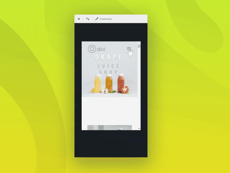
Simplistic, Fullscreen Divi Menu with Minimalistic Fade In Effect
This design is for ya’ll who want a super simple, no frills Divi mobile menu. Just fade in/out.
Looks particularly good for minimalistic websites that want something that isn’t too explosive. 😛
|
1 2 3 4 5 6 7 8 9 10 11 12 13 14 |
#mobile_menu a { transform: none; opacity: 0; transition: all cubic-bezier(0.5, 0, 0, 1) 800ms; } .closed #mobile_menu { opacity: 0; pointer-events: none; transform: none; transition-delay: 600ms; } |
Fullscreen Divi Menu with a Slide In Effect
Last one!
This last one has an interesting “parallax” effect, as you can see in the GIF.
|
1 2 3 4 5 6 7 8 9 10 11 12 13 14 15 16 17 18 19 20 |
/* Menu animations */ .closed #mobile_menu { opacity: 0; pointer-events: none; transform: translatex(-100%); width: 0px; transition-delay: 600ms; } /* Link animations */ #mobile_menu a { transform: translatex(-90px); opacity: 0; transition: all cubic-bezier(0.5, 0, 0, 1) 800ms; text-align: left; } |
Bonus: Preventing the <body> from scrolling while the Divi mobile menu is open
The normal behaviour is that the body content will continue to scroll even when the Divi mobile menu is open. To prevent that, you can add this piece of Javascript to the Theme Integrations → <body> area.
|
1 2 3 4 5 6 7 |
<script> document.querySelector(".mobile_menu_bar_toggle").addEventListener('click', function() { var body = document.querySelector("body"); body.classList.toggle('noscroll'); }); </script> |
Then add this piece of CSS wherever you add CSS:
|
1 2 3 4 |
body.noscroll { overflow-y: hidden; } |
That should disable the <body> from scrolling, although iOS devices don’t respect the overflow property, so this doesn’t work on iOS devices.
To making the boring Divi mobile menu less boring
Divi’s mobile menu really kinda sucks. Some have had some good luck with it, others don’t really care and just leave it at the default setting. Hopefully this tutorial helped you with customizing your Divi menu a bit, so it’s not that boring. As you can probably tell, I really don’t like that mobile menu.
If you took my advice and used my code as a base to create a custom design, comment below! I’d like to see what custom designs for the Divi menu you can come up with! Or even if you just copied and pasted, comment below. I like to see my work be appreciated and used!
For more awesome tutorials and freebies please sign up to our newsletter list →

Ethan Chin
Ethan is a self-taught web developer who enjoys experimenting with code a lot. In his free time he can be found playing with PHP and Javascript to create cool stuff for the web. When he isn't coding, he can often be found photographing beautiful landscapes around the world.
Use coupon code SLIDER15 at checkout!


I would love to know how you do the one on this site in addition to the way it sticks on scroll
I didn’t code the menu for this site. But looking at it, I would imagine it is using CSS fixed positioning to make the menu button stay on scroll.
Divi WP theme is an awesome WP theme in both overall design and functionality — but I’ve always cringed at their mobile menu. Your mobile menu styling tutorial / tips in this post go a very long way to solve this Divi shortcoming.
Thank you so much for this brilliant tutorial.
Hi Ethan, this is ace! Amazing mobile menus without a plugin, just how I like it!
Thanks a million!
Steven
Amazing tutorial, Ethan! Congrats!
I like the fact you can insert your own background image into the mobile menu.
This is an awesome tut. Was trying it for a sideproject, and ended up using it on my main site. 😀
Thanks Ethan for an awesome tutorial! How do I add color to the Active mobile link? thanks
Awesome menus!
Menu opening transition works only first time, closing transition works everytime.
Any ideas how to fix it?
I updated the code. It should work now.
Hi, it looks like there is a little bug when the menu gets bigger with a submenu. Submenu get a huge margin or padding over it’s head. Could you please check it? Is there any way to fix it? I would appreciate it 🙂
I mainly designed my code to work with minimalistic menus, so I didn’t really test it on sites with large submenus.
This an excellent piece of work. I commend you!
However, I have a few issues:
1) I’m not seeing the ‘X’ to close the menu. (Actually, when the menu is open, I’m not seeing any kind of icon to close it.)
2) How can I change the text color of the menu items.
3) I have opted to do set my page template to ‘blank’ and use the Full Width Menu module, instead. (I’ve done this so I can add my own mega-menu for desktop.) However, your CSS only works on the in-built top bar menu (which my pages won’t have, as they’re set to page template ‘blank’.) So, my question is, how can I change this to make it work on the Full Width Menu module as well as/instead of, please?
Many thanks.
I had the same issues and i found this following code for the text:
.opened #mobile_menu a {
color: #EE3307;
font-size: 24px;
}
And can’t make the “X” thing too 🙁
Done!
I added the mobile code and a Z-index to this part:
@media only screen and (max-width: 980px) {
.mobile_nav.opened .mobile_menu_bar:before {
content: ‘\4d’;
color: #EE3307;
transition: all ease-in-out 300ms;
z-index: 11;
}
}
hi, i also have the same problem but even with your solution i can’t see the “X”.
I tried to set the z-index to 999 but it still doesn’t show.
Any suggestions?
Hello,
Great article, thank you!
However, I have the same issues as Jae:
1. When I change a view from desktop to mobile, it automatically shows me a mobile menu (instead of showing hamburger and then see the result after clicking on it)
2. I also can’t see the close icon (it seems it somewhere behind the menu because I’m moving the cursor and can’t even click on it)
Please, fix the code 🙂
Great tutorial! I really love it!
I did but isn’t working well, just de X close btn doesn’t work.
Somebody know whats wrong?
url: https://backtoraw.mx/inicio/
it’s hidden under the menu. Bring it forward by adding a z-index to this bit.
.mobile_nav.opened .mobile_menu_bar:before {
content: ‘\4d’;
color: #fff;
transition: all ease-in-out 300ms;
z-index: 100;
font-size: 50px;
}
I have a Mega Menu and want to specify an entirely different menu. Any pointers? How can I use my secondary menu?
I really love your templates and decided to use No.3.
Everything works fine. Opening and closing the menu for the fist time works well with the fade-in effect.
But when I reopen the menu then the fade-in effect is gone.
What can I do to have this effect at every opening and closing the menu?
Hi Sara,
I solved it by forcing the display rule with !important, as below:
#mobile_menu, .opened #mobile_menu {
display: flex!important;
}
Hope it can help you!
These are fantastic! Any tips on how these could be implemented on menus built with the Divi Theme Builder?