How to Add an Eye-Catching Blur Effect to Divi’s Blog Module
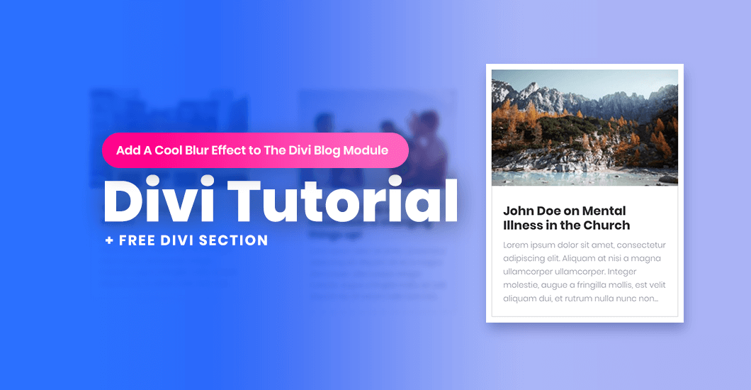

Hover effects can transform your Divi modules into interactive and fun elements. This tutorial for Divi allows you to transform the default Divi Blog module into an interactive section with an awesome design. Simply follow our step-by-step guide or download the .json file for immediate use, you’ll be able to enhance the overall look and feel of your Divi site blog in no time!
In this tutorial, we will add a bit of custom CSS and JS code to our Divi site. As a result, our single blog post will get focused on mouseover while the rest of the boxes will get blurred. This technique will help you get user attention to the hovered element and will make your Blog module more engaging and unique.
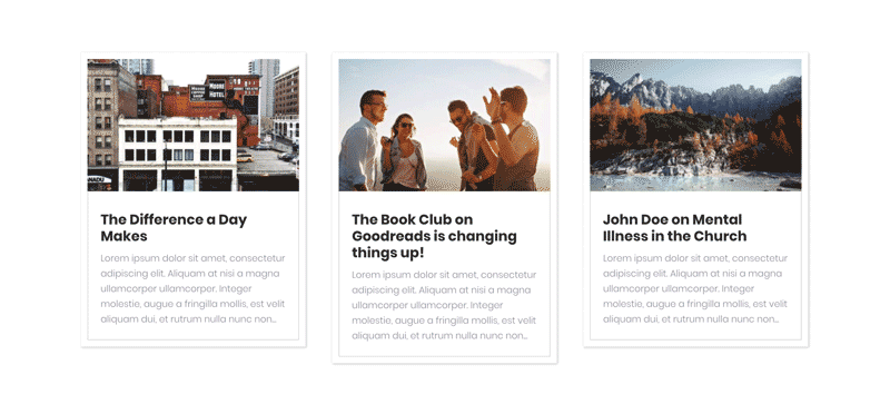
Check out the Live Demo here. It’s essentially just a Blog module, but the animation makes it look really cool. If you’d like to know how to achieve the same look for your Blog module, keep reading as I’ll show you how! I’ve tried to keep the technique as simple as possible so it’s easy to follow along.
Download Free Divi Section .JSON file
You can follow this tutorial or download the ready to use .json file with the sample section that you can import to your Divi Library and use in no time! Subscribe to download free section →


Setup the section
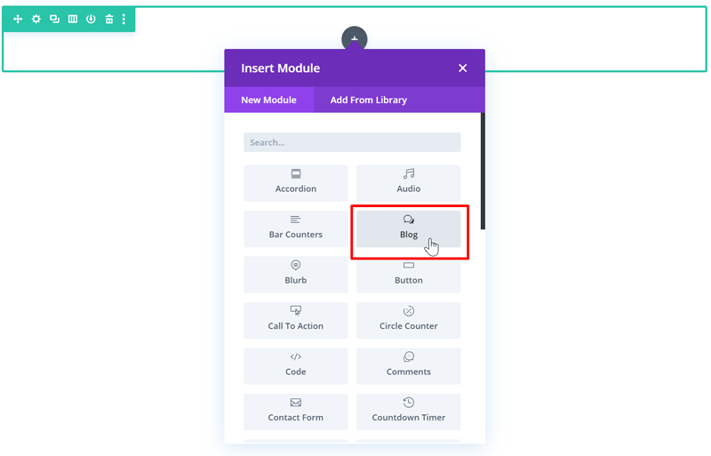
Add a section with 1 column and add the Divi Blog Module to the page.
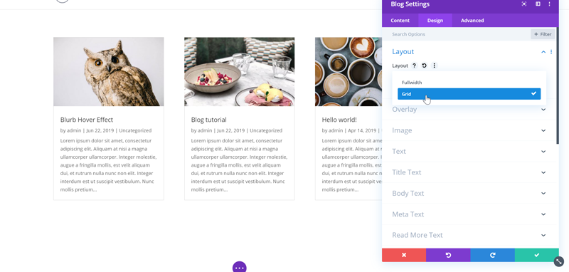
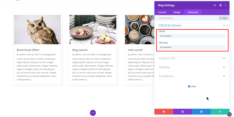
Set the blog layout to Grid
Open Blog Module settings and in the Design tab select Grid layout.
Then in the Advanced under CSS ID & Classes add “ib-container” as CSS Class and CSS ID.
Click Save and exit the Divi builder.
Add the CSS
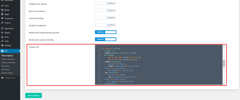
In this step we need to add custom CSS. We will target 2 elements. For a single post on mouseover we will add the zoom effect and a custom shadow. For other posts we will add a blur effect using the CSS filter. Copy the CSS code below and go to Divi→Theme Options, scroll down and paste the code in “Custom CSS” field. Click Save.
|
1 2 3 4 5 6 7 8 9 10 11 12 13 14 15 16 17 18 19 20 21 22 23 24 25 26 27 28 29 30 31 32 33 34 35 36 37 38 39 40 41 42 |
.ib-container article{ z-index: 1; -webkit-backface-visibility: hidden; box-shadow: 0px 0px 0px 10px rgba(255,255,255,1), 1px 1px 3px 10px rgba(0,0,0,0.2); transition: opacity 0.4s linear, transform 0.4s ease-in-out, filter 0.4s ease-in-out, box-shadow 0.4s ease-in-out; } .ib-container article img{ height: 200px !important; } .ib-container article.blur{ box-shadow: 0px 0px 20px 10px rgb(255,255,255); -webkit-transform: scale(0.9); -moz-transform: scale(0.9); -o-transform: scale(0.9); -ms-transform: scale(0.9); transform: scale(0.9); filter: blur(5px); } .ib-container article.active{ -webkit-transform: scale(1.05); -moz-transform: scale(1.05); -o-transform: scale(1.05); -ms-transform: scale(1.05); transform: scale(1.05); box-shadow: 0px 0px 0px 10px rgba(255,255,255,1), 1px 11px 20px 10px rgba(0,0,0,0.3); z-index: 100; opacity: 1; } |
Add JavaScript
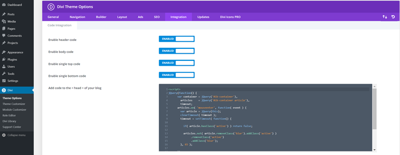
In this step, we will add JS code that will add separate classes to the default and mouseover element. Copy the code below, go to Divi → Theme Options and select the Integration tab. Paste your JS code in “Add code to the < head > of your blog” field and click Save.
|
1 2 3 4 5 6 7 8 9 10 11 12 13 14 15 16 17 18 19 20 21 22 23 24 |
<script> jQuery(function() { var container = jQuery('#ib-container'), articles = jQuery('#ib-container article'),timeout; articles.on( 'mouseenter', function( event ) { var article = jQuery(this); clearTimeout( timeout ); timeout = setTimeout( function() { if( article.hasClass('active') ) return false; articles.not( article.removeClass('blur').addClass('active') ) .removeClass('active') .addClass('blur'); }, 65 ); }); container.on( 'mouseleave', function( event ) { clearTimeout( timeout ); articles.removeClass('active blur'); }); }); </script> |
Save and you’re done!
In this tutorial you learned how you can accomplish blur effect with CSS and JS. This technique can be used to achieve the same effect with any other Divi module.
Let us know in the comments below if you liked this free tutorial and section! Your feedback gives us motivation to create new products and freebies. And if you have any suggestions about what we could make for you next, please let us know!
Mansoor Jadoon
A WordPress Enthusiast who enjoys all things WordPress. Spends most of his time hanging out in different WordPress help and share groups, providing help and learning new things every day. A techy at heart, Self-taught WordPress Expert and Freelancer!
Get Divi Icons PRO today!
We have a sweet deal for you! You can get the best icon plugin for Divi with a 10% discount! Use the coupon code DIVIICONS10 at checkout!


Looks amazing, great work 🙂 Can this work with blurbs also?
Thanks Mansoor. Beautiful and easy effect to be integrate. I’ll try it!
Thanks!
Works well…
Nice effect.
Very nice Mansoor. This gives good focus to the individual blog that the reader could be interested in.
Great article and why this is messed as default feature with Divi itself. Great work expecting more from you. Thank you
Thanks, cool effect. I used your code with some modifications for a more subtle effect.
I also had to remove the image height restriction in the CSS code as it was squashing down all my blog post images. Was there a specific reason that the image height restriction was set to 200px?
Wow, absolutely love this effect. My own personal feedback is that it would be awesome if we remove the padding, the grey line and also to equalise the rows. Please see an example here: https://www.beyond-co.com/media/insights/. Would there be a way of taking how it looks here and adding this effect? Also, if you don’t mind me asking when you’re adding to CSS Class and CSS ID, what happens if there is already a code in there? For example, I currently have “et_blog_grid_equal_height” in there. Thanks!
Your code is very amazing and looks good.
in my solution i had to do one fix at css line 16 from:
.ib-container article img{
height: 200px !important;
}
to:
.ib-container article img{
height: 100% !important;
}