18 Cool Websites Built with Divi

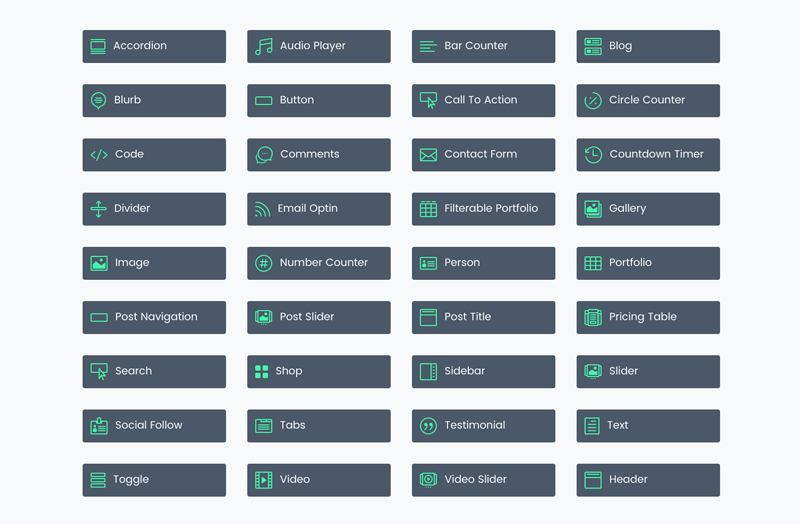
Divi features a wide range of modules that have UX in mind – assisting the visitor in experiencing the website.
We know Divi has these modules already built into every theme:
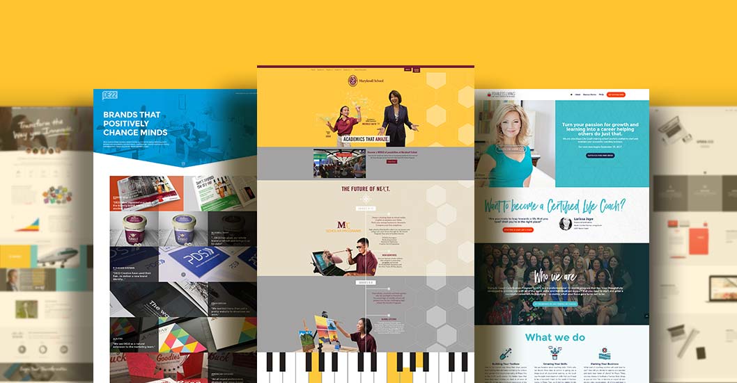
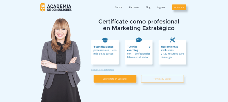
This academy website makes good use of several Divi modules, and adds unique flair without a lot of distracting movement. The Courses page is highly engaging, and uses a hover icon to open the toggle with more information. The “reverse zoom” on the headers for each course create interest.
Good, consistent colour scheming ties the site together nicely. The secondary menu presents company information, leaving the main navigation to the “selling” items: services, pricing, etc. This company is not afraid of long webpages(which is a new preference among mobile users), and takes advantage of some animation, making each section of the page unique in some way. The three sets of pricing modules for each service is a great idea.
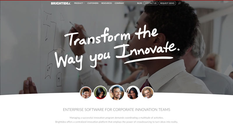
This corporate consulting website presents a lot of information in a clean, uncluttered style. The stop motion/ video slider on the homepage is an instant attention-getter. The iconographic dropdown menu for Products is innovative, as is the presentation of clients in a filterable portfolio, linking both still photo and video to a deeper information page.
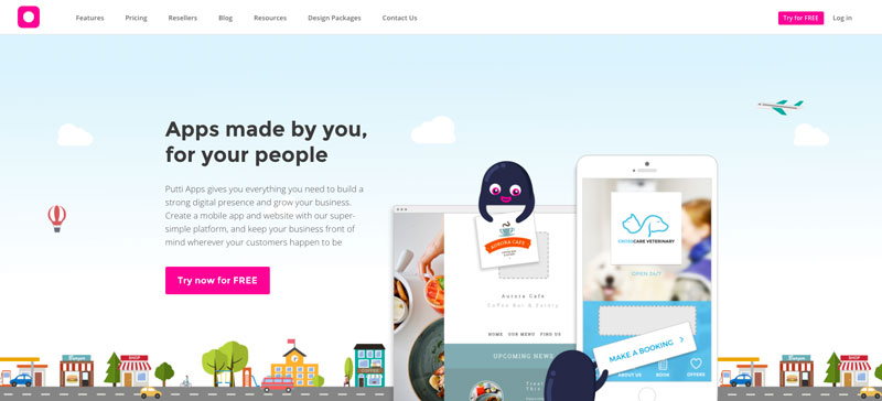
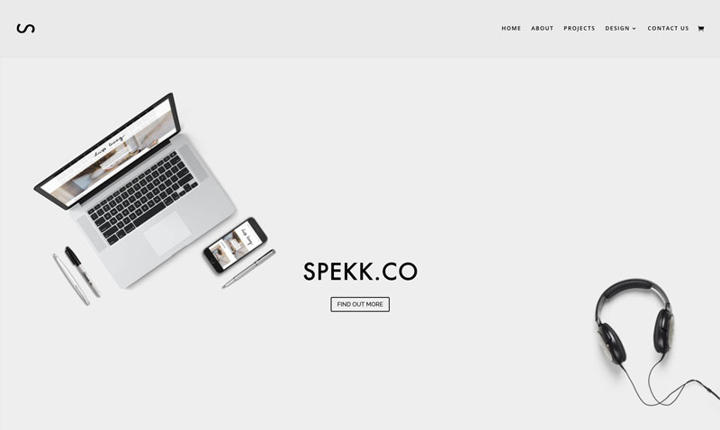
This app developer makes good use of the blurb modules and presents what appears to be a daunting subject – creating your own mobile app – in a playful style. The consistent use of circular persona graphics and the same slide-in animation keep the visitor focused on the information presented.
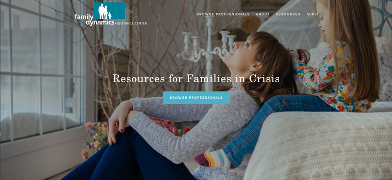
A clean, simple site that presents information with calm colours and content. The dual filter for choosing an attorney is quite smart, and each single profile page presents all details – even scheduling, intake information, and pricing.
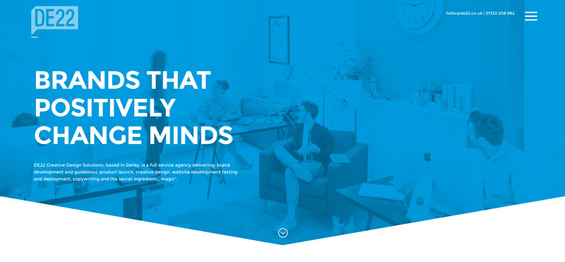
A clever navigation icon that works equally well on mobile and desktop. The pages are typical in their design, so the user can stay oriented, and the mosaic gallery (with hover colour changes) links to a similar mosaic presentation of each project.
Such a cool, clean and clever homepage, featuring services in a tight mosaic of blurbs that (down arrow) link to a further area on the homepage, which, upon clicking ‘Learn More’, takes you to a page dedicated to that subject. Further, the link there takes you to an actual example of the service performed. Many clever adaptations to Divi modules here.
This site is not terribly attractive, but it takes good advantage –almost too much – of the one-page idea, presenting services and links outside to show their true talent with a variety of services. The creative links to each photographer’s own home page are attractive and open in a new page;
Love the timed animation of the various elements in the homepage slider. The middle section is confusing, without a 1-2-3 action to go with the 1-2-3 blurbs. The other pages echo the homepage design, which is great for continuity, and also feature services. The ‘hamburger icon’, normally reserved for mobile screens, employs a great pull-out menu that keeps the main header clean so the logo has precedence.
This site makes very good use of the one-page design concept, complete with sliders that present the information in a cohesive way.
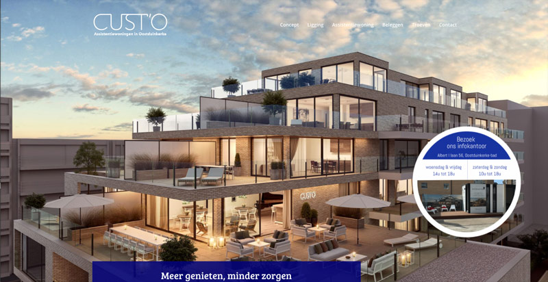
A very complex single page site, the circular graphic will someday link to an outside property webpage, and for now, the homepage menu, instead of scrolling to the portion of the homepage, presents instead a portion of the (long) home page as a separate page.
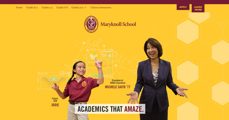
A dynamic theme for schools or specific educational endeavors, each page shows off a great hero image, details presented in a graphic fashion, and a sidebar with interactive details that lead the visitor deeper into the site. The application interface is quite detailed, with ‘automatic dropdown menu’ and captures all information for a comprehensive student application.
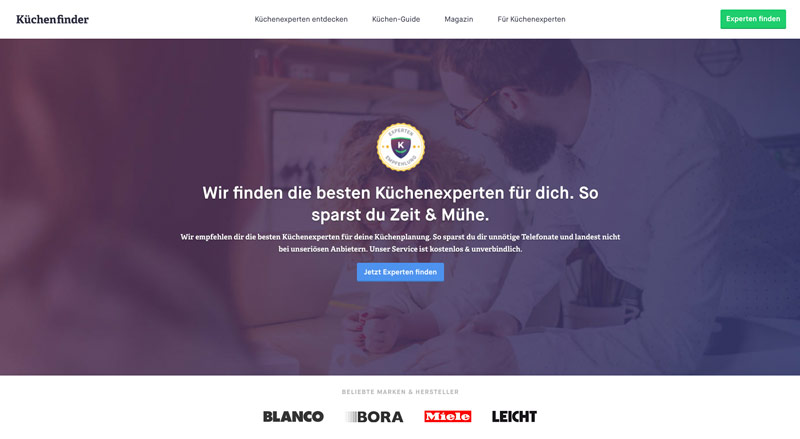
This kitchen design website offers deeper and deeper detailed information, in addition to augmented galleries, to give the user a real sense of what it would be like to work with the kitchen designer. An attractive blog repository page shows many posts and categorized solutions for kitchen design.
Great blurbs that rotate from title text to “more info”, complete with a ‘Learn More’ link.
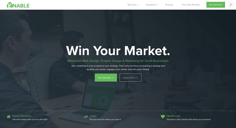
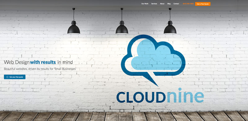
This site makes good use of its information structure: the home page ‘above-the-fold’ gives the user a menu of the site, two communication interfaces and the ability to one-click to get a quote for web design.
The information about offerings is not presented in a very organized way, leaving the visitor feeling a bit disoriented (do we want WordPress? Do we want a free quote?), and the circles-with-icons are not links to tell us more.
The functionality of Divi’s great modules is well represented here, but it’s not clear to see the company’s offerings with the convoluted UX stream.
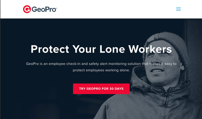
This site is accurately presented, with overviews, details and even more details, focusing on geo solutions for teams, alone and very-alone workers. Each section utilizes sliders and CTA (call to action) buttons to engage the visitor with more details.
The site homepage is comprehensive, featuring a home page that is loaded with videos and graphic links to artist profiles. Also, the homepage menu is already a ‘hamburger’ (3 lines) menu, so the popup menu is readily available for visitors to explore more of the site than the home page.
The filterable portfolio action filters to the Talent profile is attractively presented with an auto-play video, mosaic stills and biography graphics, with popup social media links and contact info, and an equal mosaic for contact info, agent, and press.
A beautiful use of parallax in video and stills, presenting a text overlay with a link to a page with a representative video gallery.
A clean, consistent site that lets the viewer control their experience and not lose their place on the site.
A clean site that uses clever parallax as the background to some image png transparencies. Further, each category has its categorized blog posts summarized on the page, and aside contact information.
Additionally, each social media icon has a great galaxy rollover, to attract interaction.
Tari Donohue
Tari Donohue is a branding agent and designer from Portland, Oregon, US, and works primarily with wineries, farms and epicures. Her website work is done in Wordpress and Squarespace. She has designed over 40 websites and authored four themes. Her photography is often featured in the websites she designs.
Use coupon code SLIDER15 at checkout!


Good collection. Especially third and fourth.
I’m glad you like it Ajay 🙂
Thanks for the shoutout, Tari! I had no idea my team was getting a shoutout (#2) It’s awesome to see how others are pushing Divi’s design into unique directions. Kudos all!
Great line up of websites, I got lots of inspiration from here. Thanks for sharing these.
Hey Olga, I’m glad to hear it was inspirational 🙂
Cool collection. Well chosen.
This is a great collection 🙂 Thanks a lot Tari for adding ADC (#1) to this list. I’m glad you liked it.
Maciej, #7 SPEKK:CO – one feature has me baffled (note: I am a beginner)
Can you help me understand how they built the laptop mockup with the scrolling screen view?
I find that pretty cool, yet I fail to put the puzzle together…
Thanks!
P.S: Genuinely enjoy and appreciate the clarity of your other articles, they have been very instructive.
Hi Jasper,
Thank you for your message!
Indeed, it is very nice effect. I think you could try to setup column background and then place an image module (laptop with transparent screen). You would also need to setup column paddings to 0 so image takes the full width and height of the column. It should work 🙂
Great collection
Lovely websites and some really great examples of spacing utilised correctly, good use of fonts and colours!
I’d love to add one or two to this list – although the ones already up here are amazing!
Excellent collection, thanks for sharing.